kage
kage
kilo.ai
Design analysis
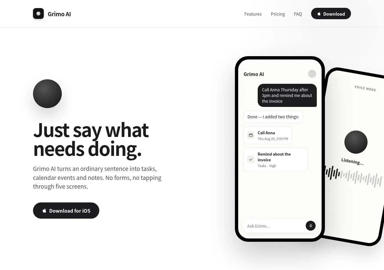
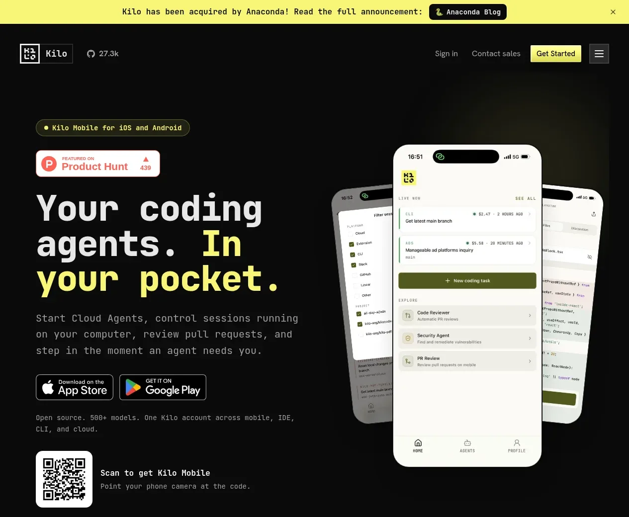
The hero pairs a large left-aligned promise and download actions with overlapping phone mockups on the right, plus a QR-code scan affordance below.
Prompt preview
## Reference images

Study these alongside the description below: hierarchy, rhythm, spacing, colour. Build for the product you are asked about, using this design language.

- Component: https://kage-design-assets.t3.tigrisfiles.io/components/kilo-code-for-ios-and-android/a36b68a0-c268-4b03-b068-c86b233a401a-1789538727-1.webp
- Full page it was cut from: https://kage-design-assets.t3.tigrisfiles.io/screenshots/kilo-code-for-ios-and-android/a36b68a0-c268-4b03-b068-c86b233a401a-1789538626553-full.webp
- Component on Kage: https://kage.design/component/kilo-code-for-ios-and-android-hero

## Before you start
Ask the user what their product, brand, target platform, and primary conversion goal are, then apply the principles below to that product rather than copying this reference.

Create a dark, wide hero section directly below the navigation. Use a two-column desktop layout: the left column contains a small rounded eyebrow, optional social-proof badge, an oversized 64–78px headline with a highlighted accent phrase, concise supporting copy, platform download badges, and a QR-code prompt; the right column contains layered device/product visuals that extend naturally into the hero whitespace. Use near-black #090a09, off-white #f0f0eb, muted gray #999b94, and a vivid acid-yellow accent around #f2f35a. Keep the content within a 798px max-width container with generous top and bottom padding. Let visual layers overlap without making text unreadable, and collapse to a centered single column on mobile. Buttons and download badges should have clear hover/focus states.

Never: use logos, product names, copy, illustrations, or imagery from the reference.