 kage
kage
kinetics.colorion.co

Design analysis
A long catalog section organizes many interactive UI experiments into repeated three-column cards, with a clear section heading and consistent labels, demos, descriptions, and view-code affordances.
Prompt preview
## Reference images

Study these alongside the description below: hierarchy, rhythm, spacing, colour. Build for the product you are asked about, using this design language.

- Component: https://kage-design-assets.t3.tigrisfiles.io/components/kinetics-colorion-co/61078688-965b-4221-9177-b73292c8438b-1789374950-2.webp
- Full page it was cut from: https://kage-design-assets.t3.tigrisfiles.io/screenshots/kinetics-colorion-co/61078688-965b-4221-9177-b73292c8438b-1789374925728-full.webp
- Component on Kage: https://kage.design/component/kinetics-colorion-feature-grid

## Before you start
Ask what kind of interaction patterns the user's product should showcase, which categories matter, and what visual system the brand uses. Then build an original catalog section using these reusable rules.

Create a long dark catalog section with a heading row: a bold uppercase category title on the left, a small progress/count label on the right, and generous separation from the preceding hero. Below it, use a responsive three-column grid on desktop that collapses to two and then one column on smaller screens. Keep cards equal-height where practical, with 8–10px gaps and consistent 16px internal padding. Each card should include a tiny mono-like identifier at the top, a centered interactive demo area, a bottom title, one short description, and a subtle 'view details' affordance. Use charcoal cards (#18181a) on a near-black page (#0d0d0f), 1px borders (#29292c), 8px radius, soft inset or ambient shadows, and off-white headings with muted gray metadata. Reserve orange (#ff9900) for active controls and occasional emphasis; use cool gray, muted green, blue, and red only as purposeful state colors.

Make demos feel tangible: buttons can press, toggles can spring, sliders can drag, counters can update, and focus states should be visible. Preserve a steady vertical rhythm across many rows, with category headings or dividers when the catalog changes theme. Ensure keyboard and reduced-motion support. Avoid overcrowding cards with code; expose details progressively through a modal, drawer, or dedicated action.

Never: copy the reference's card names, product name, exact demo designs, copy, logos, illustrations, or imagery.
More components
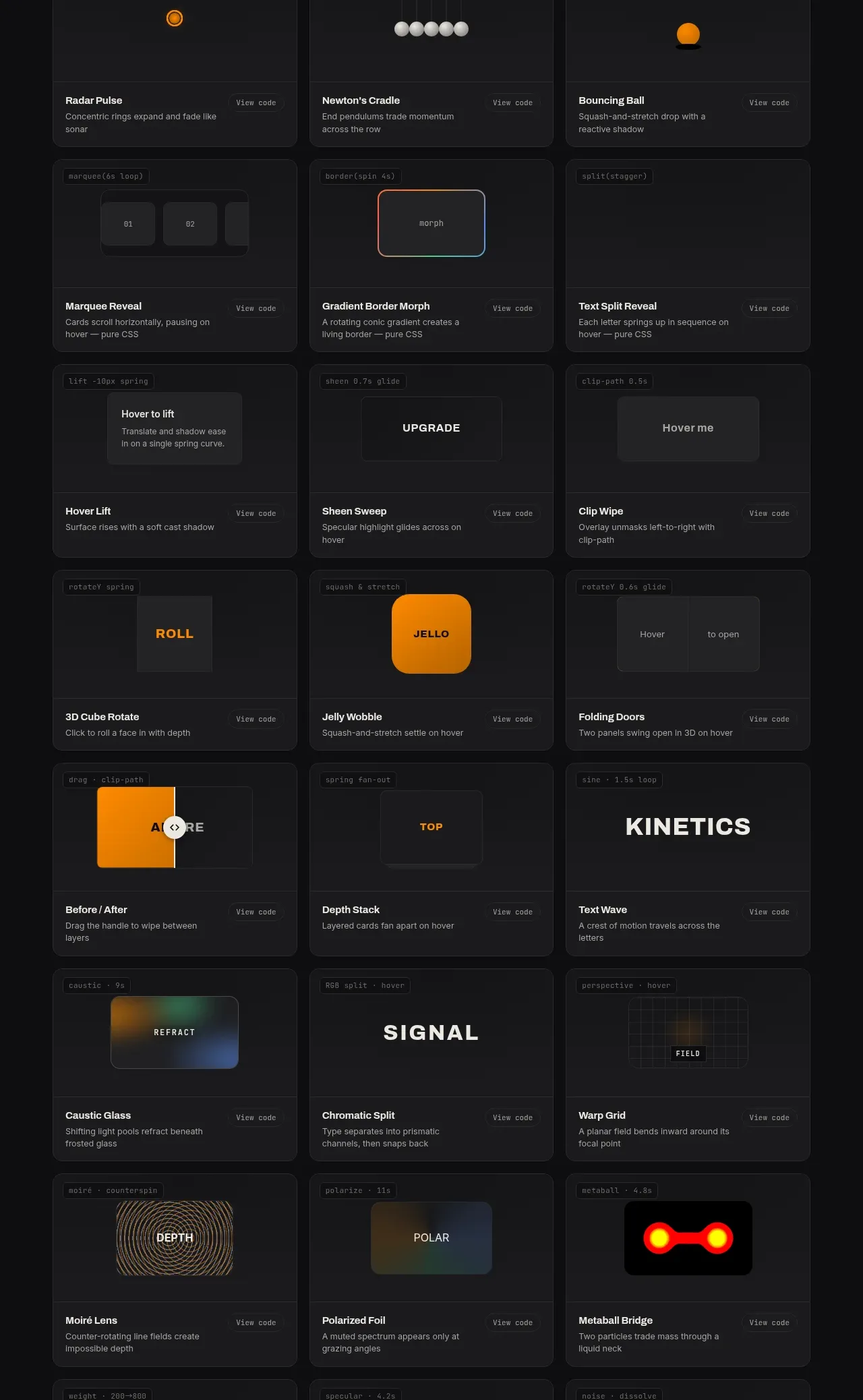
 Surface and motion pattern library
kinetics.colorion.co · Feature grid
Surface and motion pattern library
kinetics.colorion.co · Feature grid
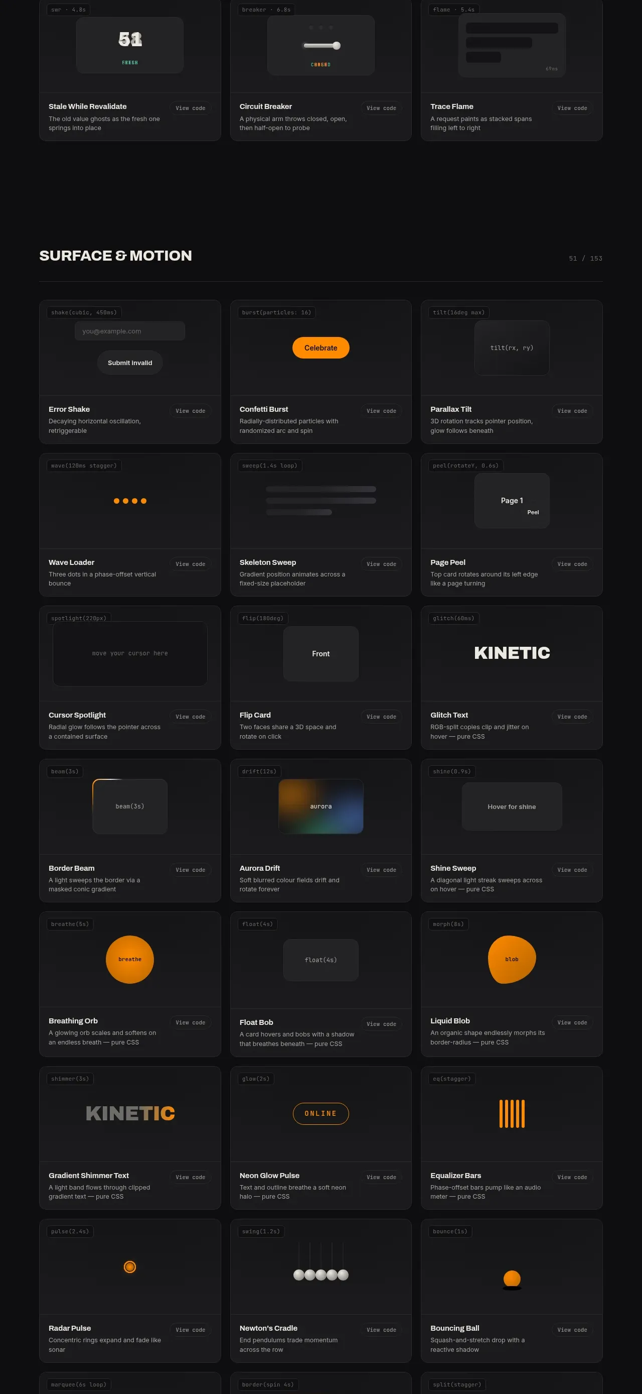 Feedback and state pattern library
kinetics.colorion.co · Feature grid
Feedback and state pattern library
kinetics.colorion.co · Feature grid
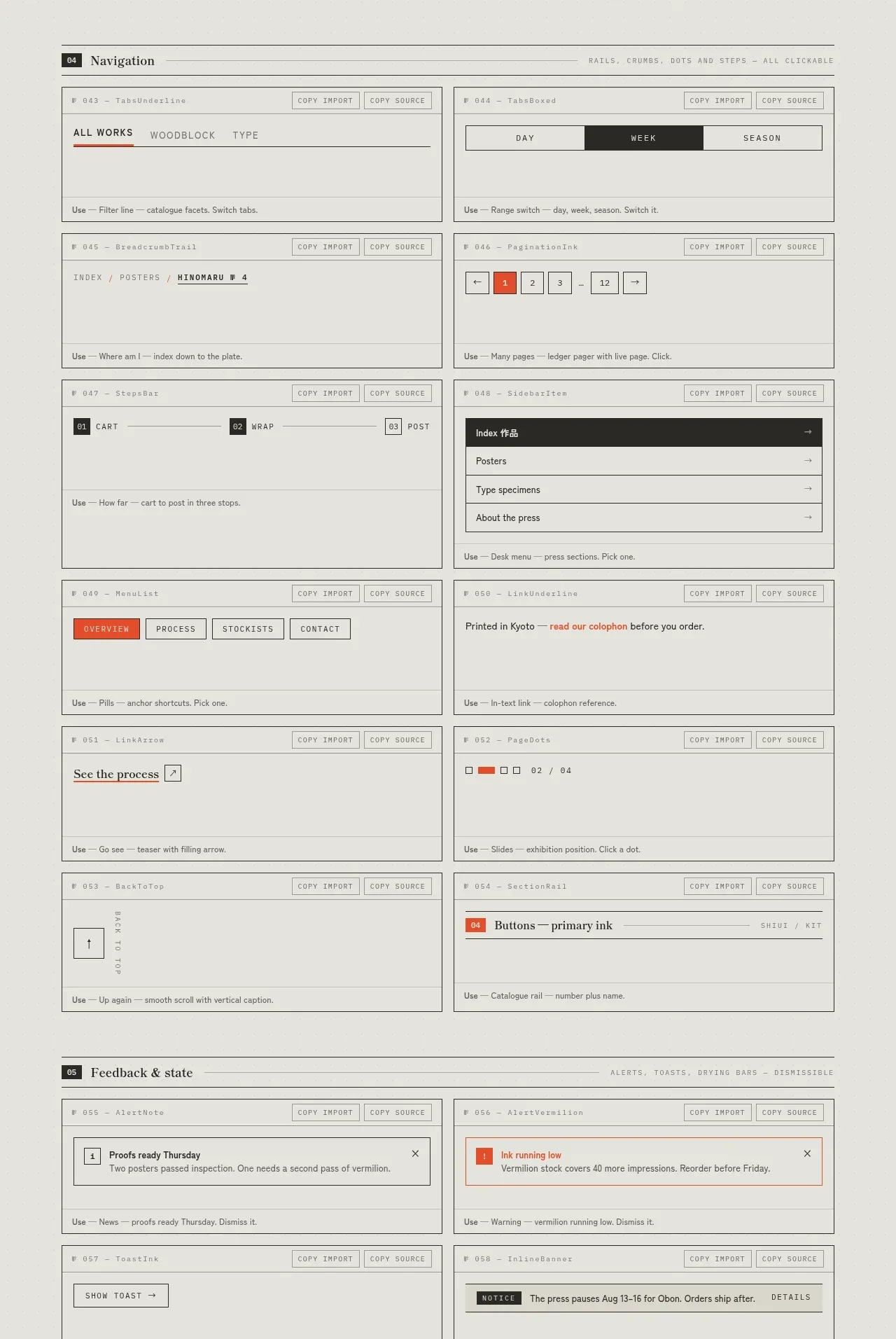
 Navigation patterns inventory
SHIUI · Feature grid
Navigation patterns inventory
SHIUI · Feature grid
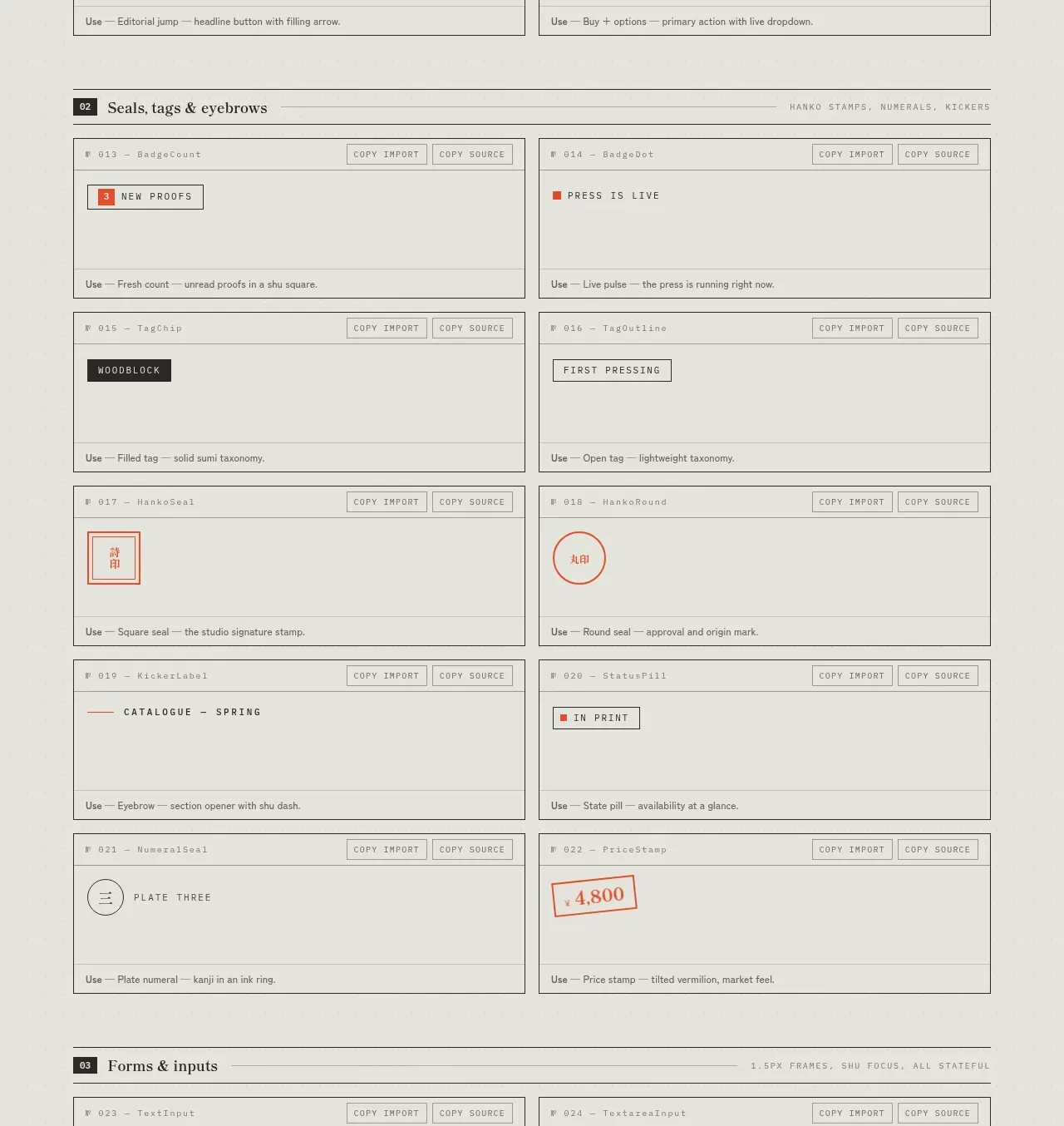 Seals, tags and eyebrows inventory
SHIUI · Feature grid
Seals, tags and eyebrows inventory
SHIUI · Feature grid
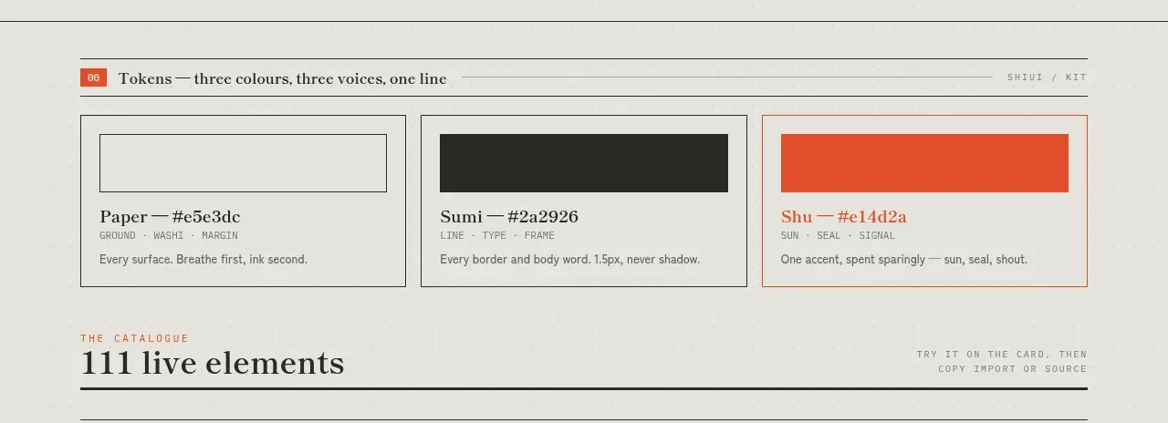 Colour and element catalogue
SHIUI · Feature grid
Colour and element catalogue
SHIUI · Feature grid
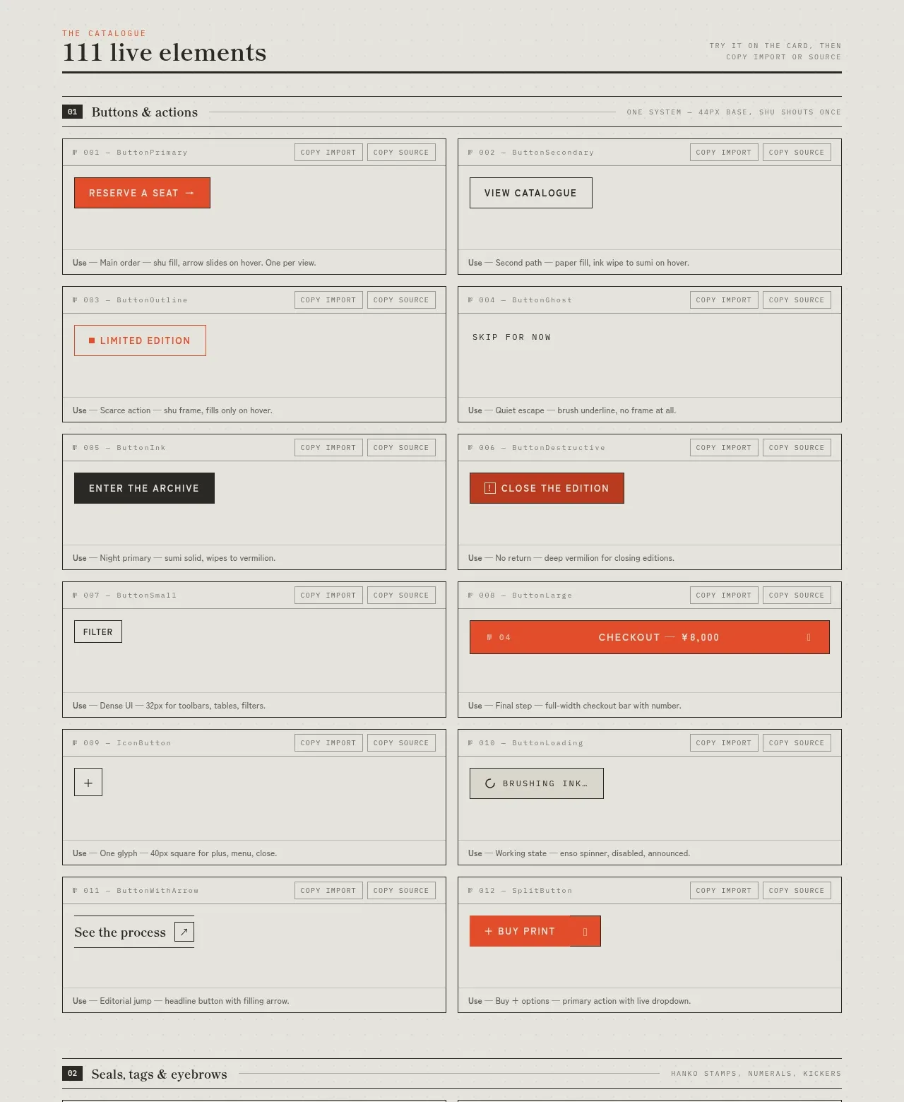 Buttons and actions inventory
SHIUI · Feature grid
Buttons and actions inventory
SHIUI · Feature grid