 kage
kage
kinetics.colorion.co
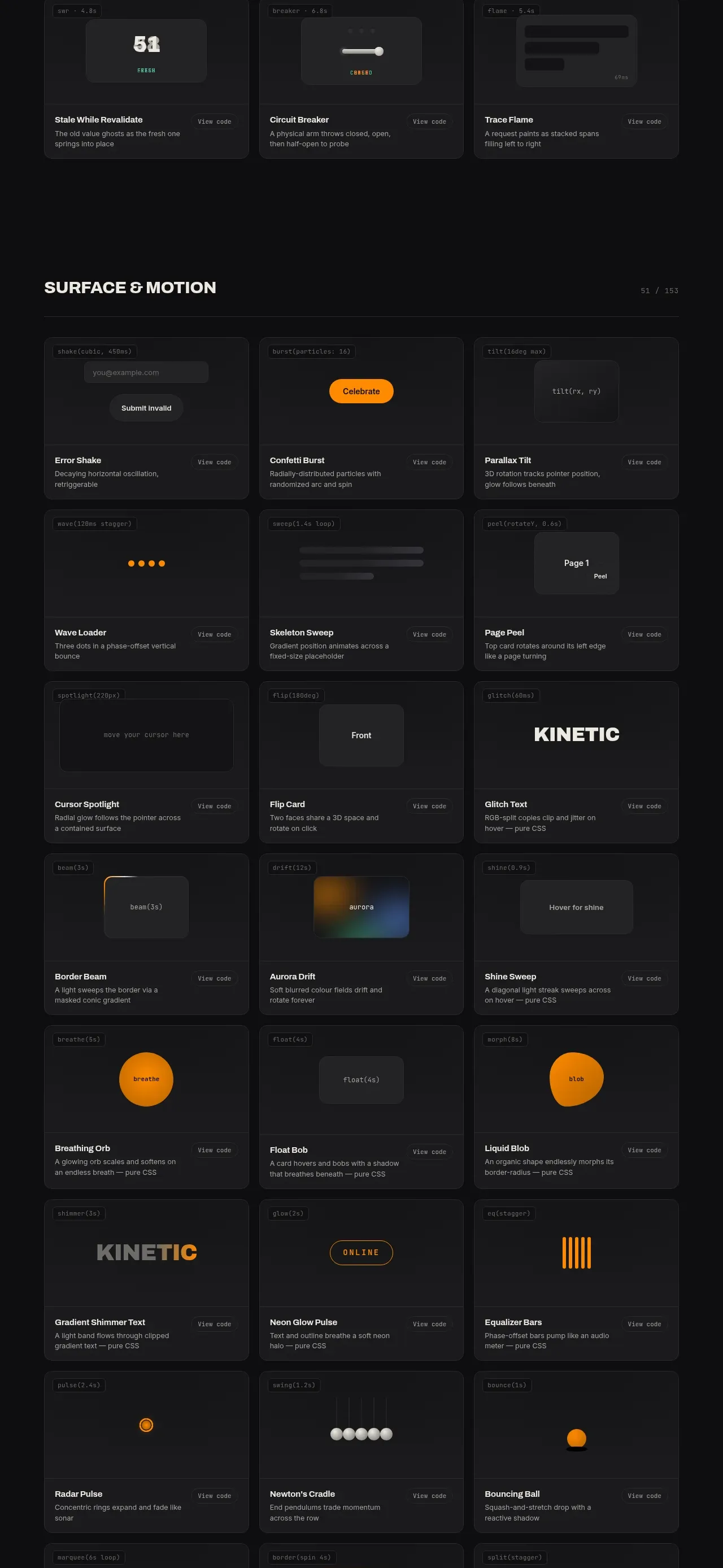
Design analysis
A second catalog band shifts from input mechanics to feedback, loading, status, progress, and system-state patterns while retaining the same three-column card grammar.
Prompt preview
## Reference images

Study these alongside the description below: hierarchy, rhythm, spacing, colour. Build for the product you are asked about, using this design language.

- Component: https://kage-design-assets.t3.tigrisfiles.io/components/kinetics-colorion-co/61078688-965b-4221-9177-b73292c8438b-1789374951-3.webp
- Full page it was cut from: https://kage-design-assets.t3.tigrisfiles.io/screenshots/kinetics-colorion-co/61078688-965b-4221-9177-b73292c8438b-1789374925728-full.webp
- Component on Kage: https://kage.design/component/kinetics-colorion-feature-grid-2

## Before you start
Ask what product states users need to understand, which system feedback is important, and what tone the brand should convey. Apply the following system to create an original feedback catalog.

Build a dark section that starts with a strong uppercase heading and a small count/progress indicator, followed by a three-column responsive card grid. Focus the demos on feedback states: loading, validation, success, failure, progress, notifications, badges, skeletons, activity, and status. Every card should have the same dependable anatomy: tiny technical label, centered demo surface with one clear state, title, concise explanatory sentence, and a low-contrast details link. Use a page background around #0d0d0f, cards around #18181a, borders #29292c, radius 8px, and 12–16px internal spacing. Typography should be compact and hierarchical: 10px mono metadata, 11–12px muted description, 12–13px semibold title, and a 22–34px display value only when the demo requires it.

Use color semantically rather than decoratively: amber-orange (#ff9d00) for attention, teal/green (#4fd1a1) for success, muted red (#e56b76) for error, and slate gray (#77777b) for inactive states. Include transitions, hover states, and accessible live-region behavior for changing status. Keep each card visually calm even when demonstrating motion.

Never: copy the reference's card names, product name, exact demo designs, copy, logos, illustrations, or imagery.
More components
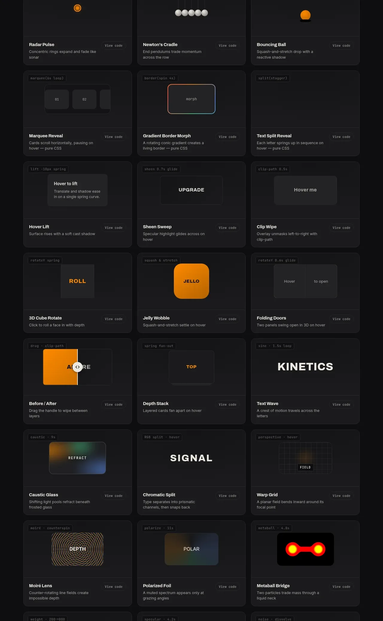
 Surface and motion pattern library
kinetics.colorion.co · Feature grid
Surface and motion pattern library
kinetics.colorion.co · Feature grid
 Interaction and input pattern library
kinetics.colorion.co · Feature grid
Interaction and input pattern library
kinetics.colorion.co · Feature grid
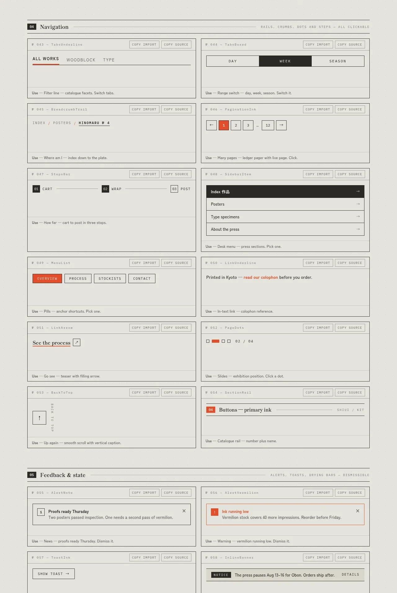
 Navigation patterns inventory
SHIUI · Feature grid
Navigation patterns inventory
SHIUI · Feature grid
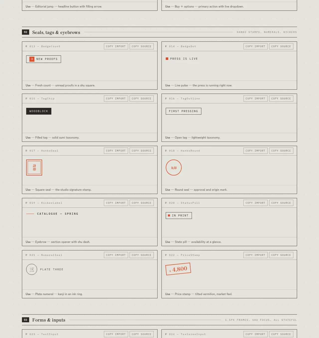 Seals, tags and eyebrows inventory
SHIUI · Feature grid
Seals, tags and eyebrows inventory
SHIUI · Feature grid
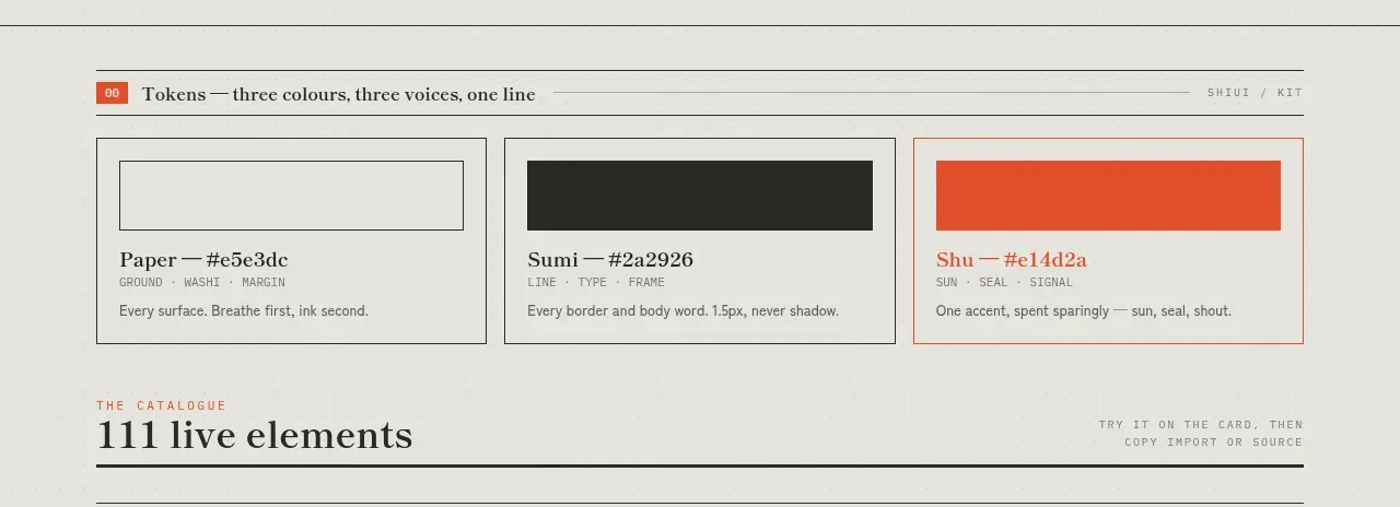 Colour and element catalogue
SHIUI · Feature grid
Colour and element catalogue
SHIUI · Feature grid
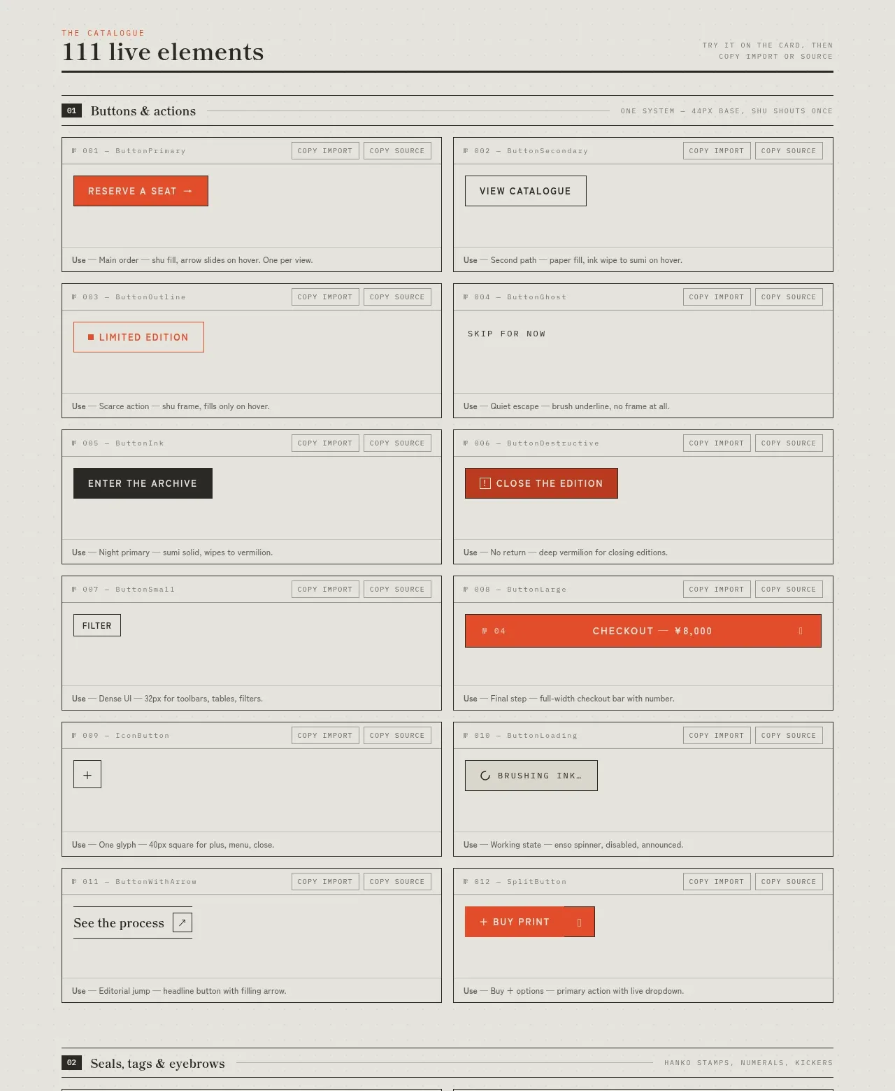 Buttons and actions inventory
SHIUI · Feature grid
Buttons and actions inventory
SHIUI · Feature grid