 kage
kage
uselateron.com
Design analysis
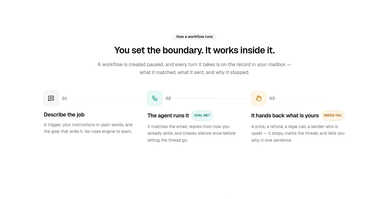
The section turns a complex agent workflow into three sequential actions, with a strong headline and short explanations aligned on a clear horizontal rhythm.
Prompt preview
## Reference images

Study these alongside the description below: hierarchy, rhythm, spacing, colour. Build for the product you are asked about, using this design language.

- Component: https://kage-design-assets.t3.tigrisfiles.io/components/lateron-v2-the-agentic-email-plaftform/0ff3184e-0d5c-46ea-8012-61473093bd6c-1790402771-3.webp
- Full page it was cut from: https://kage-design-assets.t3.tigrisfiles.io/screenshots/lateron-v2-the-agentic-email-plaftform/0ff3184e-0d5c-46ea-8012-61473093bd6c-1790402643023-full.webp
- Component on Kage: https://kage.design/component/lateron-v2-the-agentic-email-plaftform-feature-grid

## Before you start
Ask what the user's product workflow is and what three steps best explain its value. Use the following design logic for that product.

Build a centered explanatory section with a small eyebrow, a bold two-line headline, and a concise paragraph above a three-column step row. Connect the columns with a very subtle horizontal rule or visual rhythm. Each step should have a small numbered/icon marker, short title, and two-to-three-line explanation; use pale mint, amber, and neutral accents to distinguish states. Typography should be black #111, body gray #777, with 30–36px heading size, 14px body size, 72–96px vertical spacing, and no heavy cards. Stack the steps vertically on mobile.

Never: use logos, product names, copy, illustrations, or imagery from the reference.
More components

 Three-step process cards
godaylight.com · Feature grid
Three-step process cards
godaylight.com · Feature grid

 Use-case selector with vertical video preview
Spira Maxima · Feature grid
Use-case selector with vertical video preview
Spira Maxima · Feature grid

 Insights and enterprise model access
FastRouter.ai · Feature grid
Insights and enterprise model access
FastRouter.ai · Feature grid
 Solutions by organizational role
FastRouter.ai · Feature grid
Solutions by organizational role
FastRouter.ai · Feature grid
 Routing reliability and model collaboration
FastRouter.ai · Feature grid
Routing reliability and model collaboration
FastRouter.ai · Feature grid
 Goal-oriented product capabilities
FastRouter.ai · Feature grid
Goal-oriented product capabilities
FastRouter.ai · Feature grid