 kage
kage
uselateron.com
Design analysis
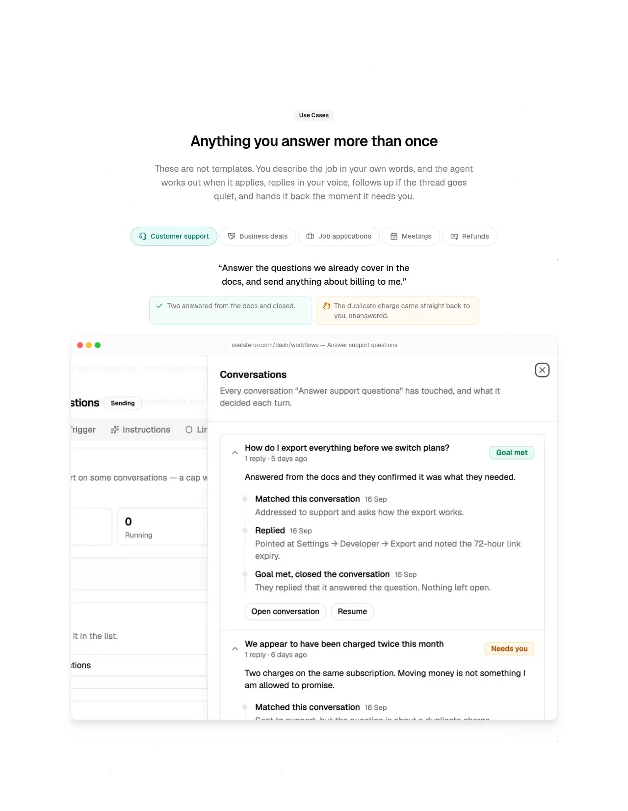
A category-chip row introduces repeatable use cases, followed by a representative conversation/product screen that makes the abstract automation feel tangible.
Prompt preview
## Reference images

Study these alongside the description below: hierarchy, rhythm, spacing, colour. Build for the product you are asked about, using this design language.

- Component: https://kage-design-assets.t3.tigrisfiles.io/components/lateron-v2-the-agentic-email-plaftform/0ff3184e-0d5c-46ea-8012-61473093bd6c-1790402772-4.webp
- Full page it was cut from: https://kage-design-assets.t3.tigrisfiles.io/screenshots/lateron-v2-the-agentic-email-plaftform/0ff3184e-0d5c-46ea-8012-61473093bd6c-1790402643023-full.webp
- Component on Kage: https://kage.design/component/lateron-v2-the-agentic-email-plaftform-feature-grid-2

## Before you start
Ask what recurring use cases the user's product supports and what interface artifact best proves them. Build an original version for that context.

Create a centered use-case section with a small eyebrow, a bold benefit-oriented heading, and a short explanatory paragraph. Add a horizontal pill selector with one pale-teal active chip and several white outlined chips. Under it, show a concise quote or instruction in heavier type, paired with small success and needs-attention status callouts. Finish with a large browser-like product mockup: neutral window chrome, a left workspace rail, a main list, and an open detail/conversation panel. Use #f8f8f8 backgrounds, #e5e5e5 borders, 8px radii, subtle shadow, and restrained teal #2a9d8f and amber #e9b949 states. Make the chips keyboard accessible and allow the mockup content to change on selection.

Never: use logos, product names, copy, illustrations, or imagery from the reference.
More components

 Three-step process cards
godaylight.com · Feature grid
Three-step process cards
godaylight.com · Feature grid

 Use-case selector with vertical video preview
Spira Maxima · Feature grid
Use-case selector with vertical video preview
Spira Maxima · Feature grid

 Insights and enterprise model access
FastRouter.ai · Feature grid
Insights and enterprise model access
FastRouter.ai · Feature grid
 Solutions by organizational role
FastRouter.ai · Feature grid
Solutions by organizational role
FastRouter.ai · Feature grid
 Routing reliability and model collaboration
FastRouter.ai · Feature grid
Routing reliability and model collaboration
FastRouter.ai · Feature grid
 Goal-oriented product capabilities
FastRouter.ai · Feature grid
Goal-oriented product capabilities
FastRouter.ai · Feature grid