 kage
kage
layernote.io
Design analysis
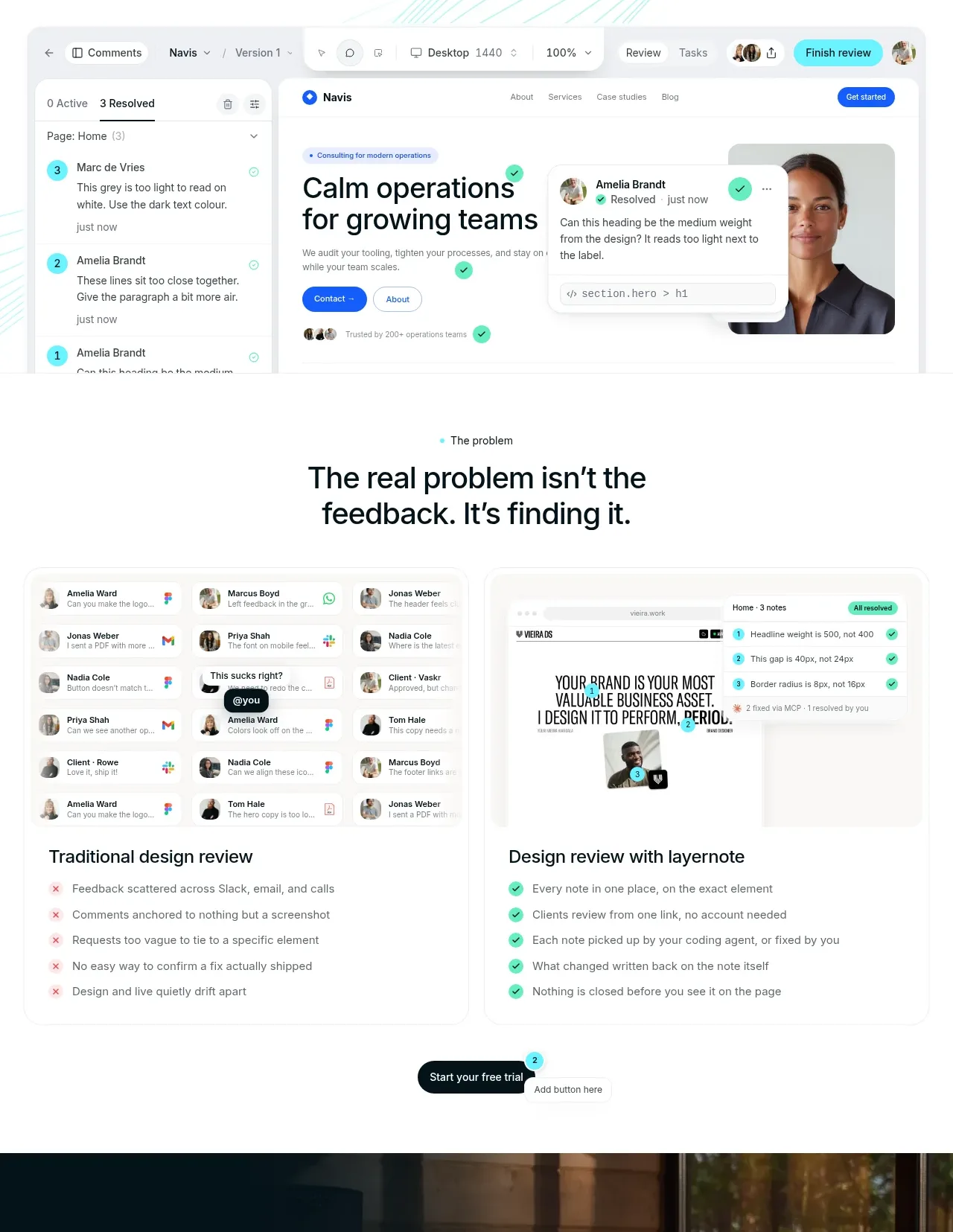
This section frames the pain as lost feedback, compares an old scattered workflow with a centralized one, and closes with a small CTA. The two-column comparison makes the product's value legible before the detailed feature tour.
Prompt preview
## Reference images

Study these alongside the description below: hierarchy, rhythm, spacing, colour. Build for the product you are asked about, using this design language.

- Component: https://kage-design-assets.t3.tigrisfiles.io/components/layernote/c87f4990-99cd-473d-ba2e-c718b2a2f8cb-1790402577-2.webp
- Full page it was cut from: https://kage-design-assets.t3.tigrisfiles.io/screenshots/layernote/c87f4990-99cd-473d-ba2e-c718b2a2f8cb-1790402512875-full.webp
- Component on Kage: https://kage.design/component/layernote-feature-grid

## Before you start
Ask for the user's product, target workflow, and the frustrating before-and-after transformation it provides. Build a tailored comparison section from those answers.

Create a centered section with a tiny cyan eyebrow, a two-line heading, and a short explanatory paragraph. Below it, use two equal visual columns: a muted “before” panel showing scattered channels and red decline markers, and a cleaner “after” panel showing one organized workflow with green check indicators. Give both cards a soft #fafbfa background, 1px #edf0ee border, 12–16px radius, and balanced internal padding. Use black #101516 headings, gray #707878 body text, pale red #f4d8d8 for problems, and mint #46d7b0 for resolved states. End with a centered pill CTA and plenty of breathing room. Make the comparison accessible with headings and text, not color alone.

Never use the reference's logo, product name, copy, illustrations, imagery, or exact visual assets.
More components

 Three-step process cards
godaylight.com · Feature grid
Three-step process cards
godaylight.com · Feature grid

 Use-case selector with vertical video preview
Spira Maxima · Feature grid
Use-case selector with vertical video preview
Spira Maxima · Feature grid

 Insights and enterprise model access
FastRouter.ai · Feature grid
Insights and enterprise model access
FastRouter.ai · Feature grid
 Solutions by organizational role
FastRouter.ai · Feature grid
Solutions by organizational role
FastRouter.ai · Feature grid
 Routing reliability and model collaboration
FastRouter.ai · Feature grid
Routing reliability and model collaboration
FastRouter.ai · Feature grid
 Goal-oriented product capabilities
FastRouter.ai · Feature grid
Goal-oriented product capabilities
FastRouter.ai · Feature grid