 kage
kage
layernote.io
Design analysis
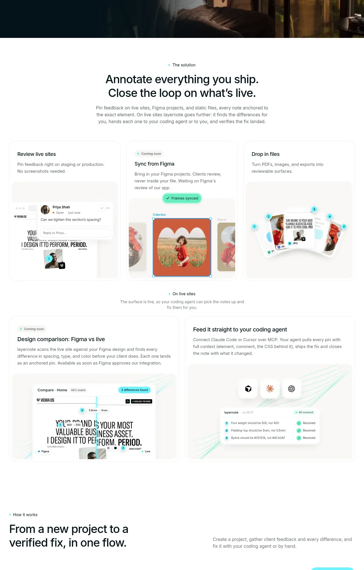
A solution headline introduces a sequence of visual feature cards and then transitions into a practical “how it works” flow. Repeated screenshots, concise labels, and alternating layouts help visitors scan a complex product.
Prompt preview
## Reference images

Study these alongside the description below: hierarchy, rhythm, spacing, colour. Build for the product you are asked about, using this design language.

- Component: https://kage-design-assets.t3.tigrisfiles.io/components/layernote/c87f4990-99cd-473d-ba2e-c718b2a2f8cb-1790402578-4.webp
- Full page it was cut from: https://kage-design-assets.t3.tigrisfiles.io/screenshots/layernote/c87f4990-99cd-473d-ba2e-c718b2a2f8cb-1790402512875-full.webp
- Component on Kage: https://kage.design/component/layernote-feature-grid-2

## Before you start
Ask what the user's core workflow steps are, what interfaces demonstrate them, and which audience should understand the feature tour first. Then build an original responsive tour.

Start with a centered solution statement: small cyan eyebrow, bold two-line heading, and a compact paragraph. Follow with a three-column card row for primary capabilities, then a wider two-column row for deeper integrations or outcomes. Each card should combine a short title, one or two lines of explanation, and a product UI placeholder or abstract diagram. Continue with a compact “how it works” intro and three-step progression using labels such as setup, capture, and resolve—but adapt labels to the user's workflow. Use 12–16px radii, very light #f7faf9 surfaces, #e9efed borders, black #101516 typography, cyan #55e5ed accents, and mint #45d6ac success markers. Keep card heights visually balanced, align media edges, and let the CTA sit at the end of the sequence.

Never use the reference's logo, product name, copy, illustrations, imagery, or exact visual assets.
More components

 Three-step process cards
godaylight.com · Feature grid
Three-step process cards
godaylight.com · Feature grid

 Use-case selector with vertical video preview
Spira Maxima · Feature grid
Use-case selector with vertical video preview
Spira Maxima · Feature grid

 Insights and enterprise model access
FastRouter.ai · Feature grid
Insights and enterprise model access
FastRouter.ai · Feature grid
 Solutions by organizational role
FastRouter.ai · Feature grid
Solutions by organizational role
FastRouter.ai · Feature grid
 Routing reliability and model collaboration
FastRouter.ai · Feature grid
Routing reliability and model collaboration
FastRouter.ai · Feature grid
 Goal-oriented product capabilities
FastRouter.ai · Feature grid
Goal-oriented product capabilities
FastRouter.ai · Feature grid