 kage
kage
layernote.io
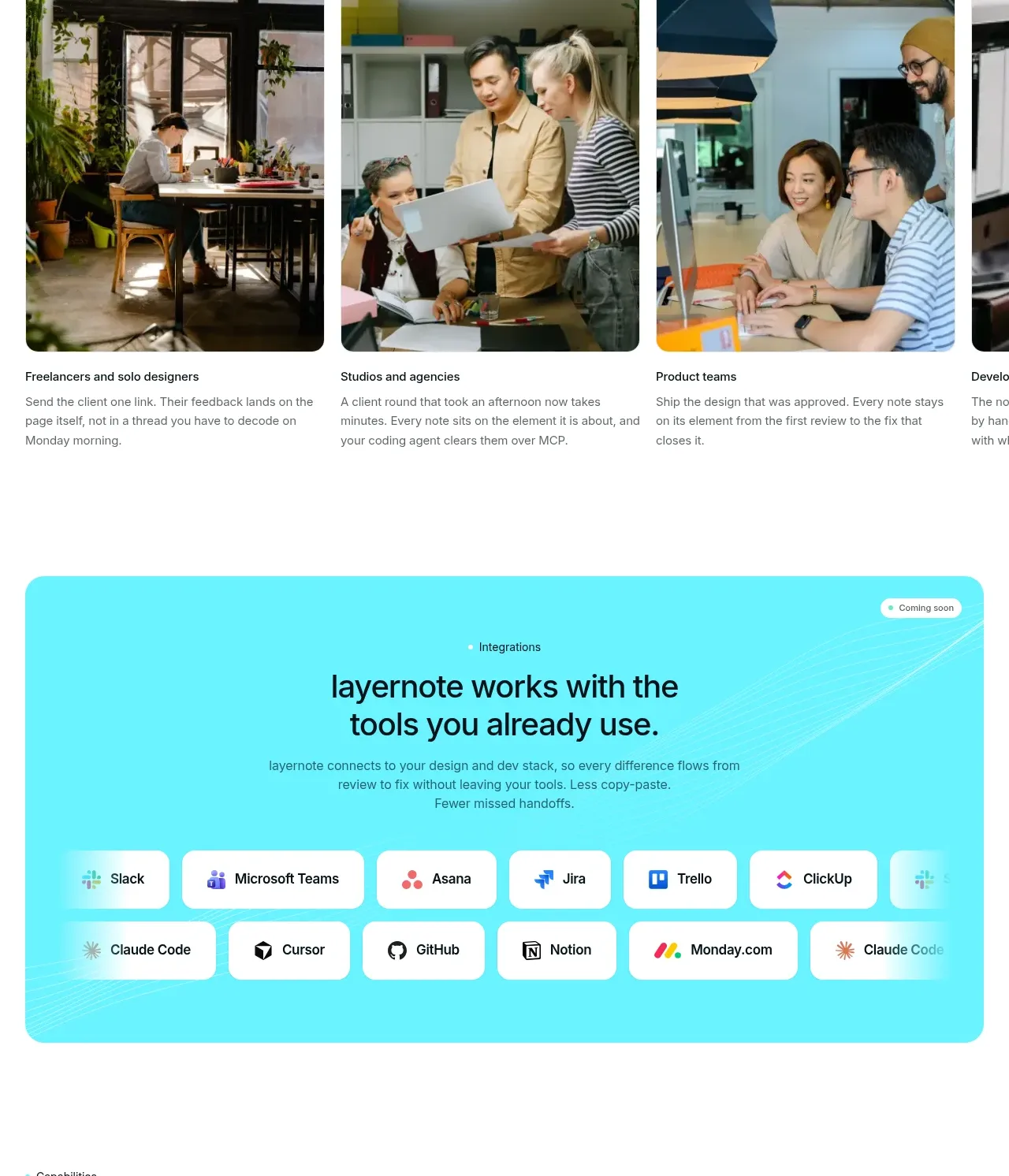
Design analysis
A follow-up product-tour section shows adjacent modules such as annotations, workspaces, and task boards in a row of translucent cards. The low-contrast UI previews communicate breadth without overwhelming the primary story.
Prompt preview
## Reference images

Study these alongside the description below: hierarchy, rhythm, spacing, colour. Build for the product you are asked about, using this design language.

- Component: https://kage-design-assets.t3.tigrisfiles.io/components/layernote/c87f4990-99cd-473d-ba2e-c718b2a2f8cb-1790402579-7.webp
- Full page it was cut from: https://kage-design-assets.t3.tigrisfiles.io/screenshots/layernote/c87f4990-99cd-473d-ba2e-c718b2a2f8cb-1790402512875-full.webp
- Component on Kage: https://kage.design/component/layernote-feature-grid-3

## Before you start
Ask what secondary modules surround the user's core product and what should be discovered after the main workflow. Then create a lightweight module showcase.

Use a left-aligned heading followed by a horizontal row of three or four equal cards. Each card has a small title, muted helper text, and a pale UI preview built from simple blocks, rows, badges, or an original product mockup. Keep the cards airy with #ffffff or #fbfdfc surfaces, 1px #edf1ef borders, 14px radius, soft shadows, and 20–28px padding. Use near-black titles, #7a8282 descriptions, and small cyan/mint status accents. Add arrow controls when the row overflows and include a short secondary CTA beneath it. Prioritize scanability and avoid decorative detail that obscures the module names.

Never use the reference's logo, product name, copy, illustrations, imagery, or exact visual assets.
More components

 Three-step process cards
godaylight.com · Feature grid
Three-step process cards
godaylight.com · Feature grid

 Use-case selector with vertical video preview
Spira Maxima · Feature grid
Use-case selector with vertical video preview
Spira Maxima · Feature grid

 Insights and enterprise model access
FastRouter.ai · Feature grid
Insights and enterprise model access
FastRouter.ai · Feature grid
 Solutions by organizational role
FastRouter.ai · Feature grid
Solutions by organizational role
FastRouter.ai · Feature grid
 Routing reliability and model collaboration
FastRouter.ai · Feature grid
Routing reliability and model collaboration
FastRouter.ai · Feature grid
 Goal-oriented product capabilities
FastRouter.ai · Feature grid
Goal-oriented product capabilities
FastRouter.ai · Feature grid