 kage
kage
layernote.io
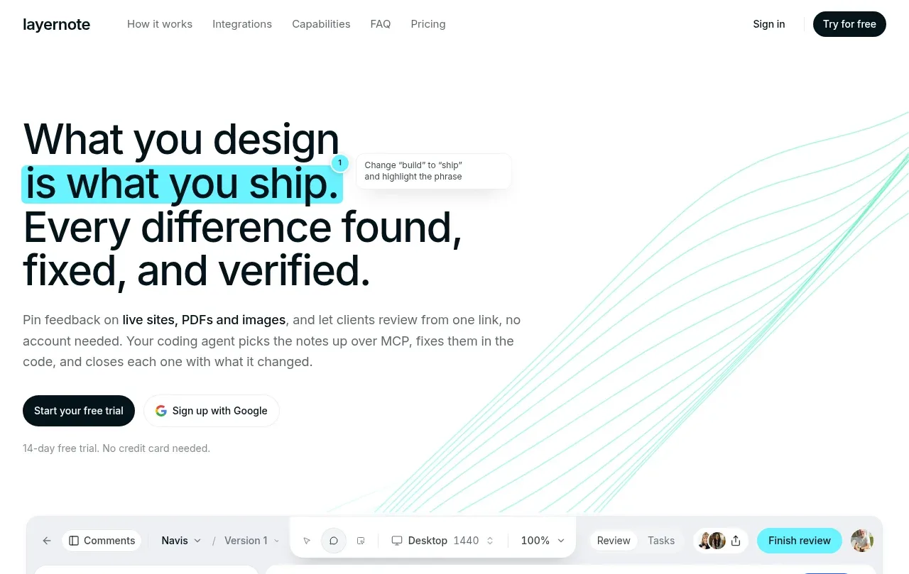
Design analysis
The hero leads with an unusually large, tightly stacked statement, highlights a key phrase in cyan, then explains the outcome and offers two signup paths. A faint directional line motif adds motion without competing with the text.
Prompt preview
## Reference images

Study these alongside the description below: hierarchy, rhythm, spacing, colour. Build for the product you are asked about, using this design language.

- Component: https://kage-design-assets.t3.tigrisfiles.io/components/layernote/c87f4990-99cd-473d-ba2e-c718b2a2f8cb-1790402576-1.webp
- Full page it was cut from: https://kage-design-assets.t3.tigrisfiles.io/screenshots/layernote/c87f4990-99cd-473d-ba2e-c718b2a2f8cb-1790402512875-full.webp
- Component on Kage: https://kage.design/component/layernote-hero

## Before you start
Ask what the user's product does, who needs it, and which action matters most. Then create a product-specific hero using these principles, not the reference's wording or imagery.

Use a left-aligned editorial layout with a max-width content column and generous top/bottom whitespace. Set a large black sans-serif headline with tight line-height, 48–64px desktop sizing, and selectively highlight one meaningful phrase with a bright cyan #56e7ef background or underline treatment. Follow with concise muted-gray supporting copy, a dark rounded primary CTA, a lighter alternate signup action, and a small reassurance line below. Keep the right side airy with very subtle abstract cyan linework or a CSS-only directional pattern. Use near-black #0b1112, text gray #6f7778, cyan #55e5ed, and soft borders #edf2f0. Stack everything cleanly on mobile and preserve a clear reading-to-action hierarchy.

Never use the reference's logo, product name, copy, illustrations, imagery, or exact visual assets.
More components

 AI workflow hero
Incredible · Hero
AI workflow hero
Incredible · Hero

 Decentralized energy statement
godaylight.com · Hero
Decentralized energy statement
godaylight.com · Hero
 Warm mission statement panel
godaylight.com · Hero
Warm mission statement panel
godaylight.com · Hero
 Photographic power-home hero
godaylight.com · Hero
Photographic power-home hero
godaylight.com · Hero
 Grid problem statement
godaylight.com · Hero
Grid problem statement
godaylight.com · Hero

 Product hero with download action and video
HyperFrames Studio (Desktop) · Hero
Product hero with download action and video
HyperFrames Studio (Desktop) · Hero