 kage
kage
layernote.io
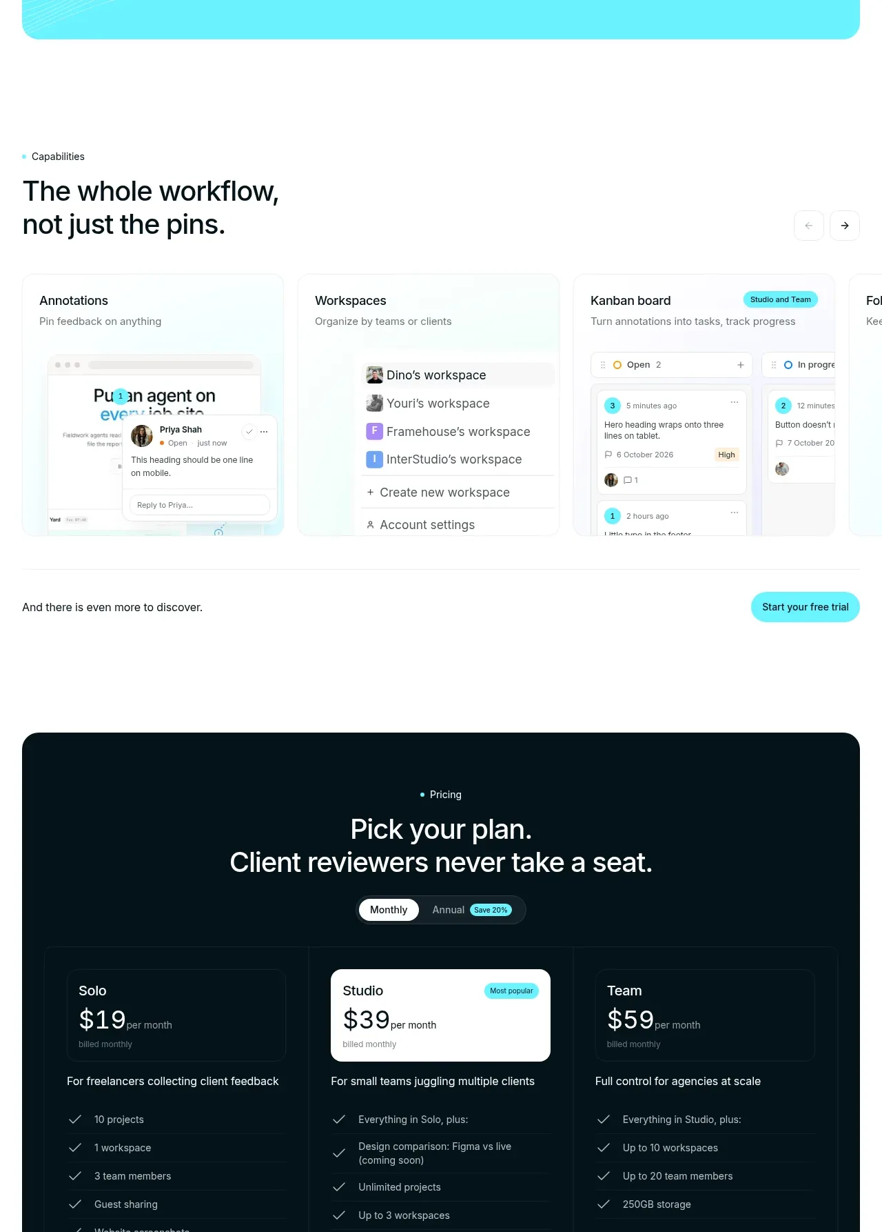
Design analysis
The dark pricing panel creates a strong visual change, introduces a monthly/annual toggle, and compares three plans with feature checklists and repeated trial buttons. The middle tier is emphasized as the recommended choice.
Prompt preview
## Reference images

Study these alongside the description below: hierarchy, rhythm, spacing, colour. Build for the product you are asked about, using this design language.

- Component: https://kage-design-assets.t3.tigrisfiles.io/components/layernote/c87f4990-99cd-473d-ba2e-c718b2a2f8cb-1790402580-8.webp
- Full page it was cut from: https://kage-design-assets.t3.tigrisfiles.io/screenshots/layernote/c87f4990-99cd-473d-ba2e-c718b2a2f8cb-1790402512875-full.webp
- Component on Kage: https://kage.design/component/layernote-pricing-table

## Before you start
Ask about the user's actual plans, pricing model, billing cadence, limits, and preferred conversion action. Never invent commercial claims; use placeholders until confirmed.

Build a dark rounded pricing panel using #06171d or another brand-appropriate near-black, with a centered eyebrow and two-line heading in white. Add a compact segmented monthly/annual toggle with a small savings badge. Present three equal plan columns separated by faint #18343a dividers; highlight the recommended middle plan with a white or bright-cyan surface and dark text while keeping the other plans dark. Each plan needs price, billing note, audience fit, feature checklist, and a full-width pill button. Use mint #4bd8b0 checks, cyan #57e4ed primary actions, 14–18px radii, and strong contrast. Make the toggle update prices and ensure buttons, keyboard focus, and mobile stacking work correctly.

Never use the reference's logo, product name, copy, illustrations, imagery, or exact visual assets.
More components
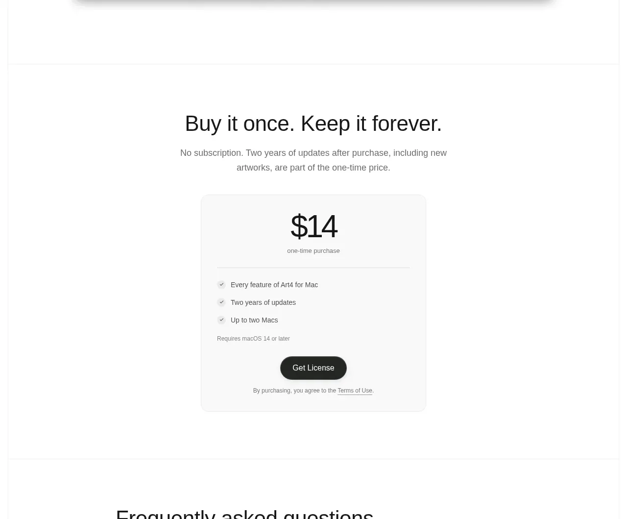
 Single purchase pricing card
Art4 · Pricing table
Single purchase pricing card
Art4 · Pricing table
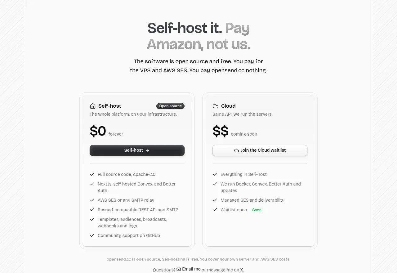
 Self-host versus cloud pricing
opensend.cc · Pricing table
Self-host versus cloud pricing
opensend.cc · Pricing table
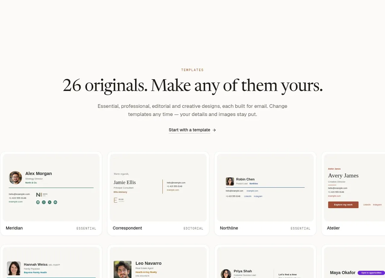
 Two-tier pricing table
esigna · Pricing table
Two-tier pricing table
esigna · Pricing table
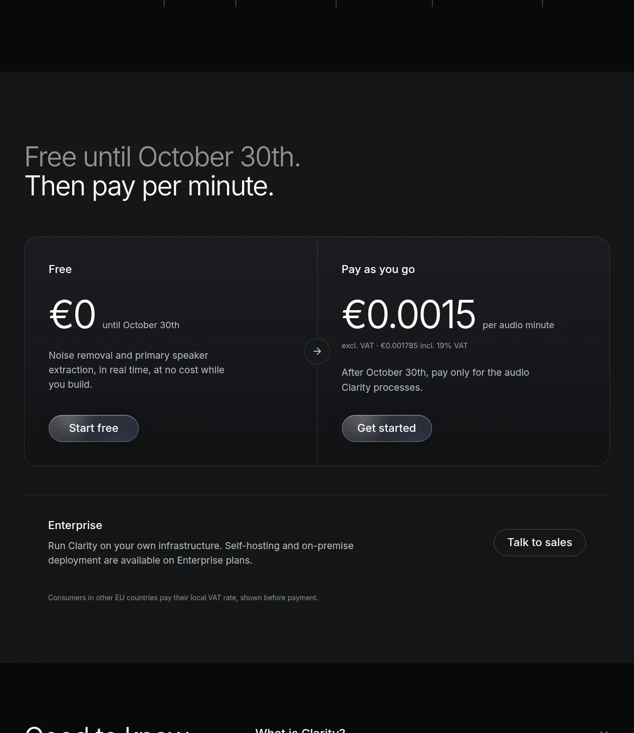
 Usage-based pricing
Clarity · Pricing table
Usage-based pricing
Clarity · Pricing table
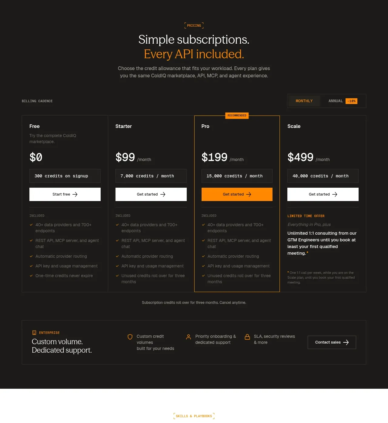
 Four-tier subscription pricing
ColdIQ x Slack · Pricing table
Four-tier subscription pricing
ColdIQ x Slack · Pricing table
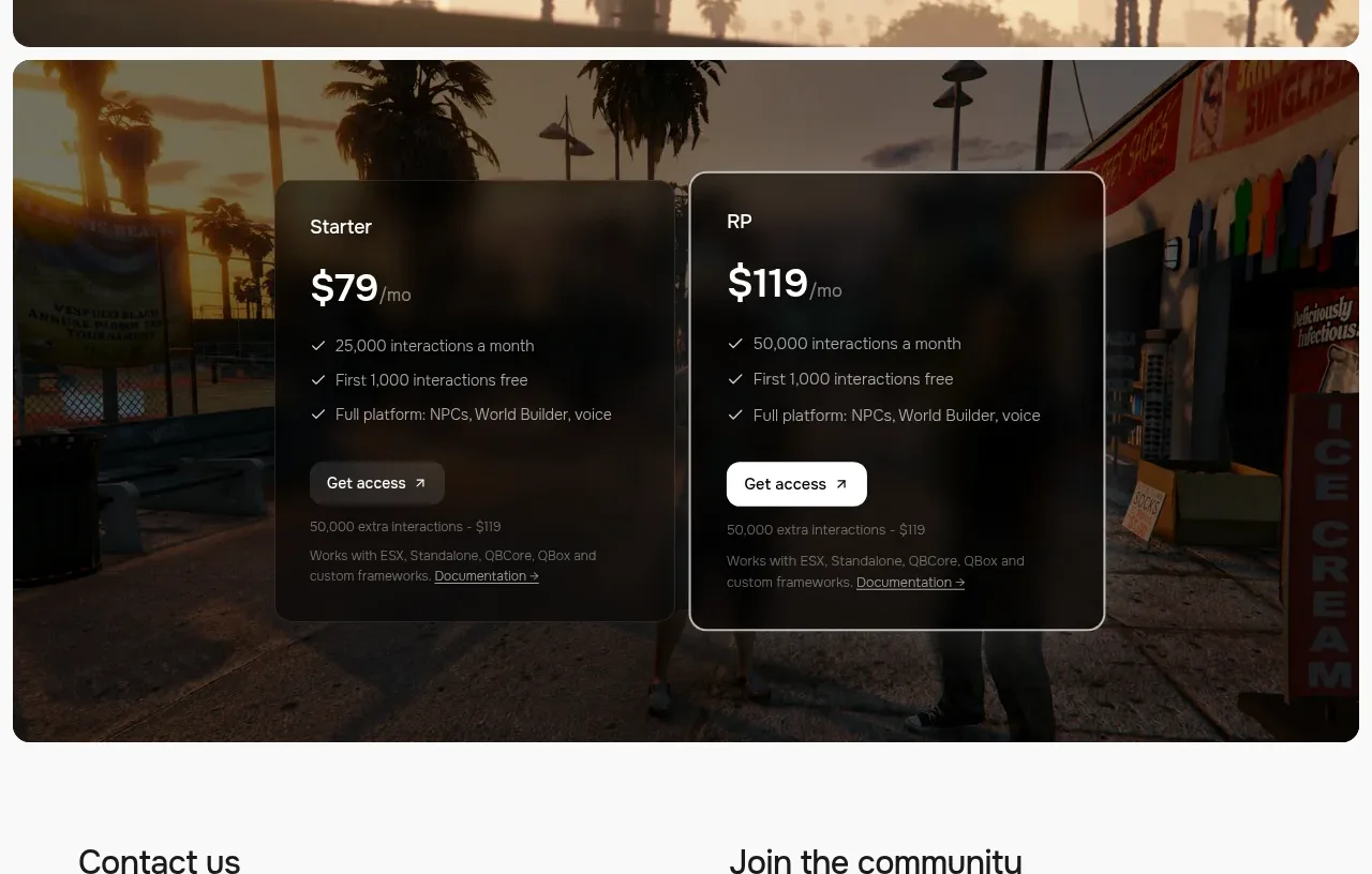
 Two-plan access pricing
Humalike x GTA RP · Pricing table
Two-plan access pricing
Humalike x GTA RP · Pricing table