 kage
kage
layernote.io
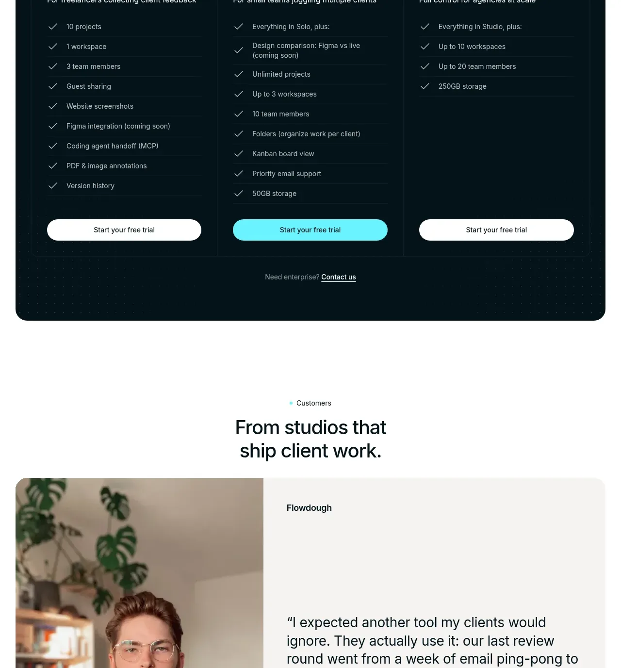
Design analysis
A centered customer heading leads into a large split testimonial card with portrait, quote, attribution, and carousel controls. The layout gives the customer story enough space to feel credible rather than decorative.
Prompt preview
## Reference images

Study these alongside the description below: hierarchy, rhythm, spacing, colour. Build for the product you are asked about, using this design language.

- Component: https://kage-design-assets.t3.tigrisfiles.io/components/layernote/c87f4990-99cd-473d-ba2e-c718b2a2f8cb-1790402580-9.webp
- Full page it was cut from: https://kage-design-assets.t3.tigrisfiles.io/screenshots/layernote/c87f4990-99cd-473d-ba2e-c718b2a2f8cb-1790402512875-full.webp
- Component on Kage: https://kage.design/component/layernote-testimonials

## Before you start
Ask who the user's credible customers are, what measurable or human outcome they experienced, and whether permission exists to use their identity and portrait. Build the component from approved material only.

Create a centered eyebrow and heading above a large two-column testimonial card. Put an authentic portrait or approved visual on the left with a consistent crop and 12–16px corner radius; put the quote, customer/company label, attribution, and optional role on a soft warm-gray #f5f5f2 panel on the right. Use large readable quote text, restrained secondary text, and generous 32–48px padding. Add discreet previous/next buttons and pagination dots below, with autoplay off by default. Keep the card horizontal on desktop and stacked on mobile, and use semantic blockquote markup and accessible labels for controls.

Never use the reference's logo, product name, copy, illustrations, imagery, or exact visual assets.
More components
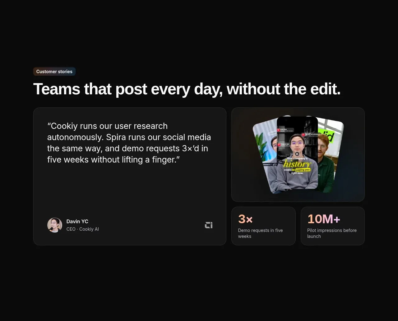
 Customer story and proof points
Spira Maxima · Testimonials
Customer story and proof points
Spira Maxima · Testimonials
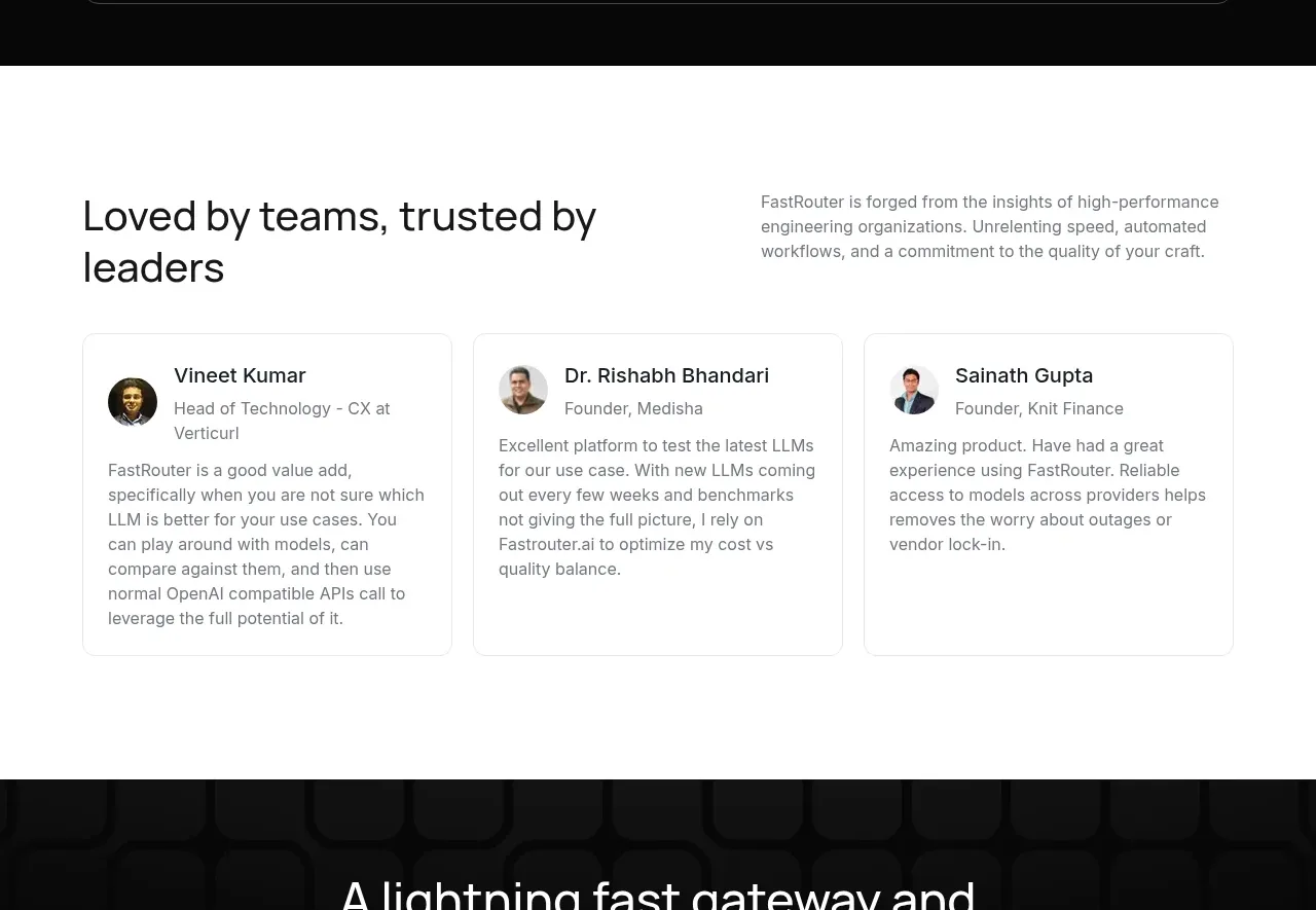
 Customer testimonial cards
FastRouter.ai · Testimonials
Customer testimonial cards
FastRouter.ai · Testimonials
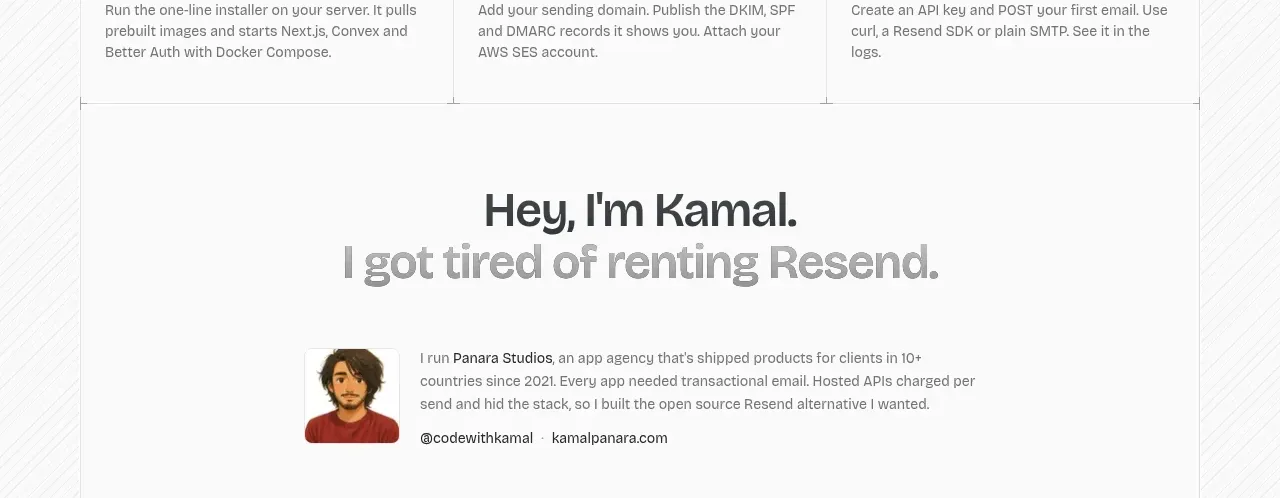
 Founder story
opensend.cc · Testimonials
Founder story
opensend.cc · Testimonials
P
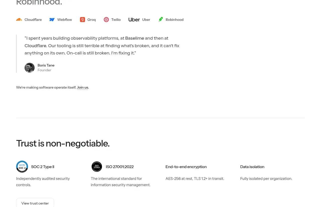
Founder testimonial
Polylane · Testimonials
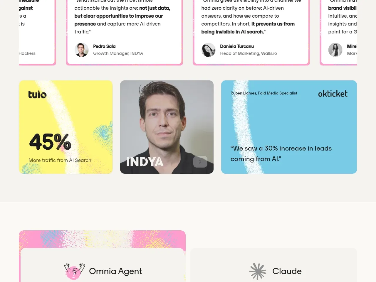
 Customer proof and outcomes
Omnia Agent · Testimonials
Customer proof and outcomes
Omnia Agent · Testimonials
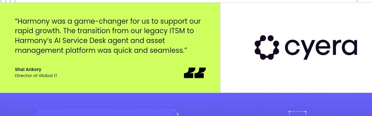
 Customer proof statement
Harmony · Testimonials
Customer proof statement
Harmony · Testimonials