 kage
kage
lleverage.ai
Design analysis
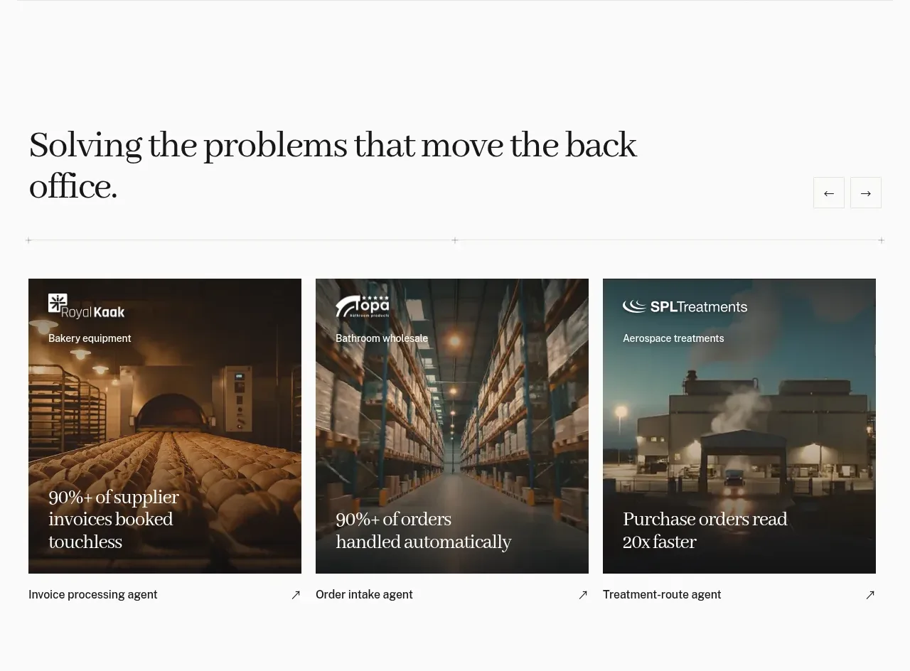
A large editorial heading introduces three image-led cards, each pairing a customer context with a quantified operational result and an agent label.
Prompt preview
## Reference images

Study these alongside the description below: hierarchy, rhythm, spacing, colour. Build for the product you are asked about, using this design language.

- Component: https://kage-design-assets.t3.tigrisfiles.io/components/lleverage/862048bd-3dd3-4c2e-9d3c-aadeb65c3eec-1792130578-3.webp
- Full page it was cut from: https://kage-design-assets.t3.tigrisfiles.io/screenshots/lleverage/862048bd-3dd3-4c2e-9d3c-aadeb65c3eec-1792130486253-full.webp
- Component on Kage: https://kage.design/component/lleverage-feature-grid

## Before you start
Ask what recurring problems the user's product solves and which proof points are safe to show. Apply the same information architecture with original content.

Create a case-study feature section on a warm white background. Start with a large serif heading on the left and restrained previous/next controls on the right, followed by a thin divider. Use three equal cards in a horizontal row with consistent gaps. Each card has a darkened 4:3 image area, a small customer/category label at top, and a large result statement anchored near the bottom; place the linked feature or workflow name below the image on white. Use editorial serif display type for outcomes and a clean sans-serif for metadata. Suggested colors: #F8F8F5, #17191A, muted gray #767873, and accent #C88A48. Add image zoom or overlay transition on hover and support horizontal scrolling on smaller screens.

Never: use the reference's logos, product names, copy, illustrations, imagery, or exact statistics.
More components

 Data-to-action engine
Salience · Feature grid
Data-to-action engine
Salience · Feature grid
 Actionable alert workflow
Salience · Feature grid
Actionable alert workflow
Salience · Feature grid
 Trust proof and core outcomes
Salience · Feature grid
Trust proof and core outcomes
Salience · Feature grid
 Three-step implementation flow
Salience · Feature grid
Three-step implementation flow
Salience · Feature grid
 What analytics misses
Salience · Feature grid
What analytics misses
Salience · Feature grid

 Workflow features and capabilities
CrewTower Mod for Claude Code · Feature grid
Workflow features and capabilities
CrewTower Mod for Claude Code · Feature grid