 kage
kage
lleverage.ai
Design analysis
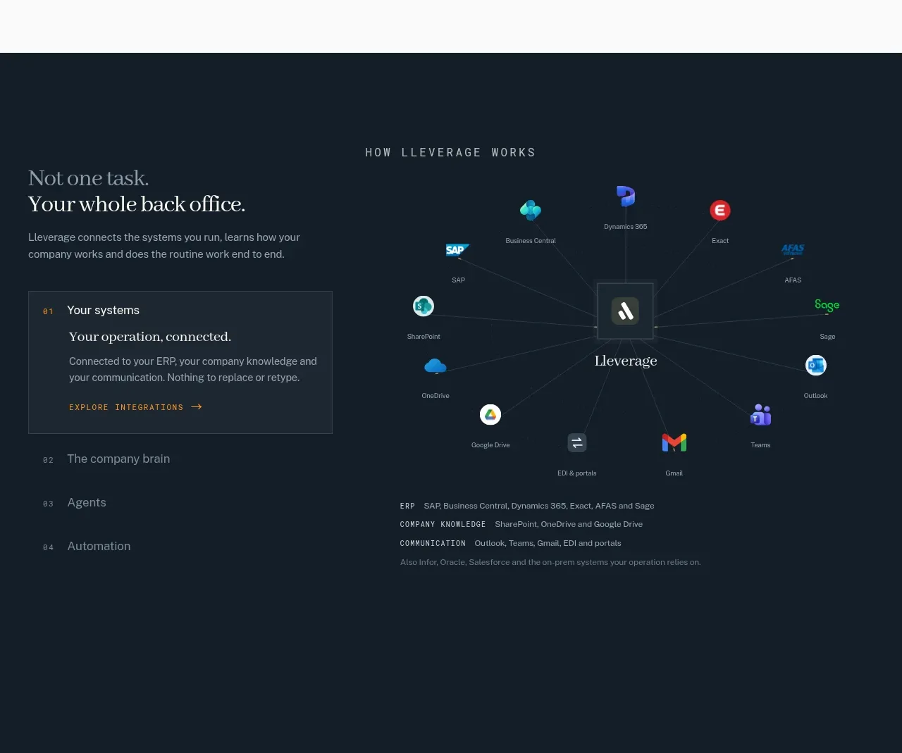
A dark platform section explains the product through a selectable list and a central ecosystem diagram connecting many systems to one operational hub.
Prompt preview
## Reference images

Study these alongside the description below: hierarchy, rhythm, spacing, colour. Build for the product you are asked about, using this design language.

- Component: https://kage-design-assets.t3.tigrisfiles.io/components/lleverage/862048bd-3dd3-4c2e-9d3c-aadeb65c3eec-1792130579-6.webp
- Full page it was cut from: https://kage-design-assets.t3.tigrisfiles.io/screenshots/lleverage/862048bd-3dd3-4c2e-9d3c-aadeb65c3eec-1792130486253-full.webp
- Component on Kage: https://kage.design/component/lleverage-feature-grid-2

## Before you start
Ask what systems your product connects, what your core platform concept is, and which integration story matters most. Translate that into an original diagram and interaction model.

Build a deep navy section using #111D28 or a close brand equivalent. Use a two-column layout: on the left, a small uppercase eyebrow, an editorial serif heading, explanatory copy, and a numbered list of 3–4 selectable concepts; on the right, a central hub connected by fine low-contrast lines to colorful system nodes. Use restrained glow only around the active hub, with small labels and recognizable-but-original placeholder app symbols. The active list item should sit in a bordered translucent panel (#1B2A37), reveal supporting copy, and expose an accent link. Keep typography white and blue-gray, with a single warm accent. Animate connections subtly on selection, preserve reduced-motion behavior, and provide a list fallback for accessibility.

Never: use the reference's logos, product names, copy, illustrations, imagery, or exact integration names.
More components

 Data-to-action engine
Salience · Feature grid
Data-to-action engine
Salience · Feature grid
 Actionable alert workflow
Salience · Feature grid
Actionable alert workflow
Salience · Feature grid
 Trust proof and core outcomes
Salience · Feature grid
Trust proof and core outcomes
Salience · Feature grid
 Three-step implementation flow
Salience · Feature grid
Three-step implementation flow
Salience · Feature grid
 What analytics misses
Salience · Feature grid
What analytics misses
Salience · Feature grid

 Workflow features and capabilities
CrewTower Mod for Claude Code · Feature grid
Workflow features and capabilities
CrewTower Mod for Claude Code · Feature grid