 kage
kage
lleverage.ai
Design analysis
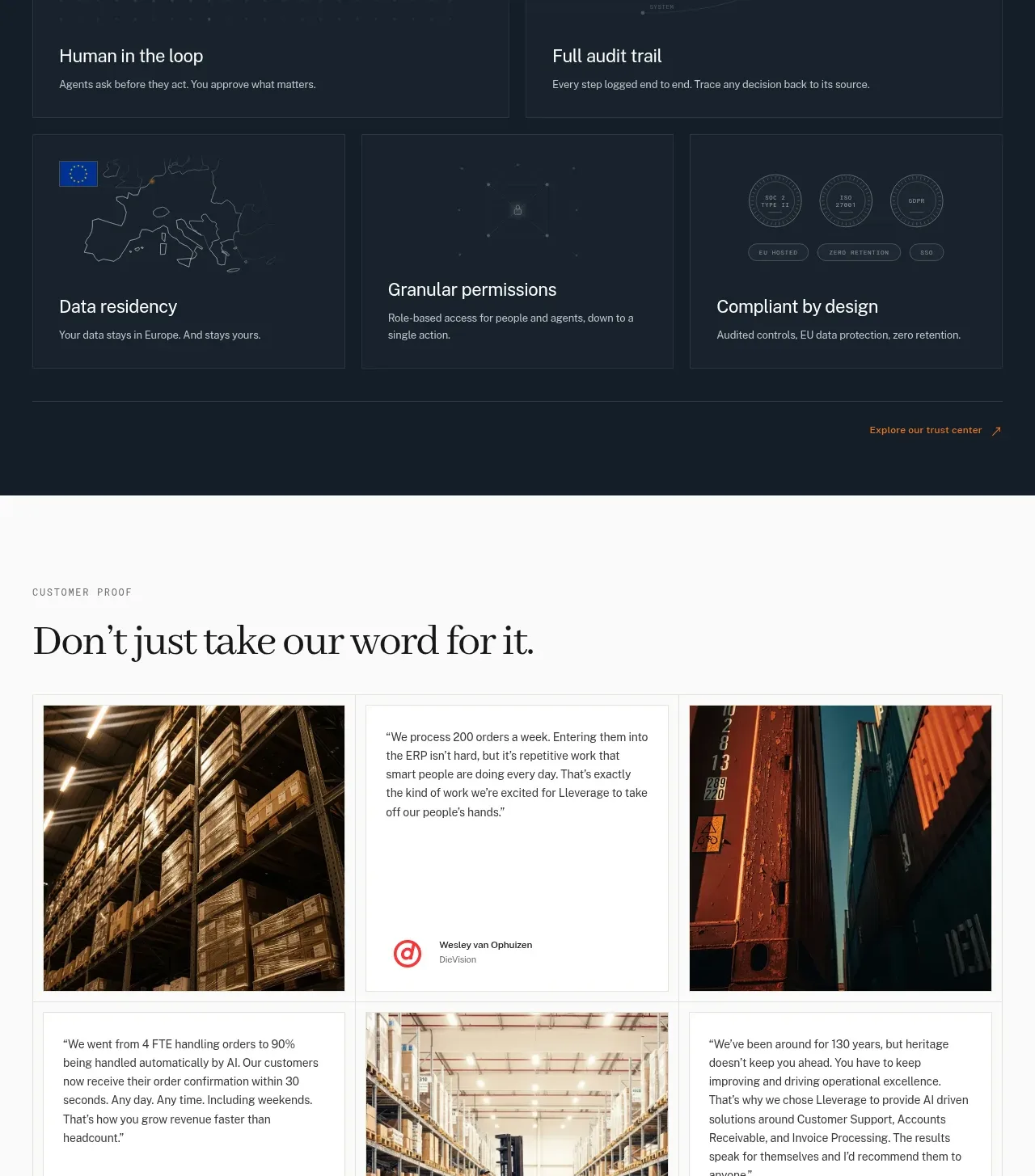
A dark trust section uses a concise promise, demo CTA, and a two-row card grid covering human oversight, auditability, residency, permissions, and compliance.
Prompt preview
## Reference images

Study these alongside the description below: hierarchy, rhythm, spacing, colour. Build for the product you are asked about, using this design language.

- Component: https://kage-design-assets.t3.tigrisfiles.io/components/lleverage/862048bd-3dd3-4c2e-9d3c-aadeb65c3eec-1792130580-7.webp
- Full page it was cut from: https://kage-design-assets.t3.tigrisfiles.io/screenshots/lleverage/862048bd-3dd3-4c2e-9d3c-aadeb65c3eec-1792130486253-full.webp
- Component on Kage: https://kage.design/component/lleverage-feature-grid-3

## Before you start
Ask what trust, compliance, permissions, and governance claims the user's product can substantiate. Build only truthful, product-specific equivalents.

Create a dark governance section with a short serif heading, a supporting paragraph, and an outlined or filled demo CTA at the top. Below, use a responsive card grid: two wide cards in the first row and three cards in the second. Each card should have a faint #22303D border, subtly different navy surface, an abstract low-contrast technical motif at the top, and a short title plus one-sentence explanation anchored toward the bottom. Use 20–24px card padding, 1–2px borders, 0–2px radius, white headings, blue-gray body text, and restrained orange/gold links. Maintain generous gaps and a final trust-center link. Cards should support hover border illumination without distracting motion.

Never: use the reference's logos, product names, copy, illustrations, imagery, or unverified compliance claims.
More components

 Data-to-action engine
Salience · Feature grid
Data-to-action engine
Salience · Feature grid
 Actionable alert workflow
Salience · Feature grid
Actionable alert workflow
Salience · Feature grid
 Trust proof and core outcomes
Salience · Feature grid
Trust proof and core outcomes
Salience · Feature grid
 Three-step implementation flow
Salience · Feature grid
Three-step implementation flow
Salience · Feature grid
 What analytics misses
Salience · Feature grid
What analytics misses
Salience · Feature grid

 Workflow features and capabilities
CrewTower Mod for Claude Code · Feature grid
Workflow features and capabilities
CrewTower Mod for Claude Code · Feature grid