 kage
loquime.com
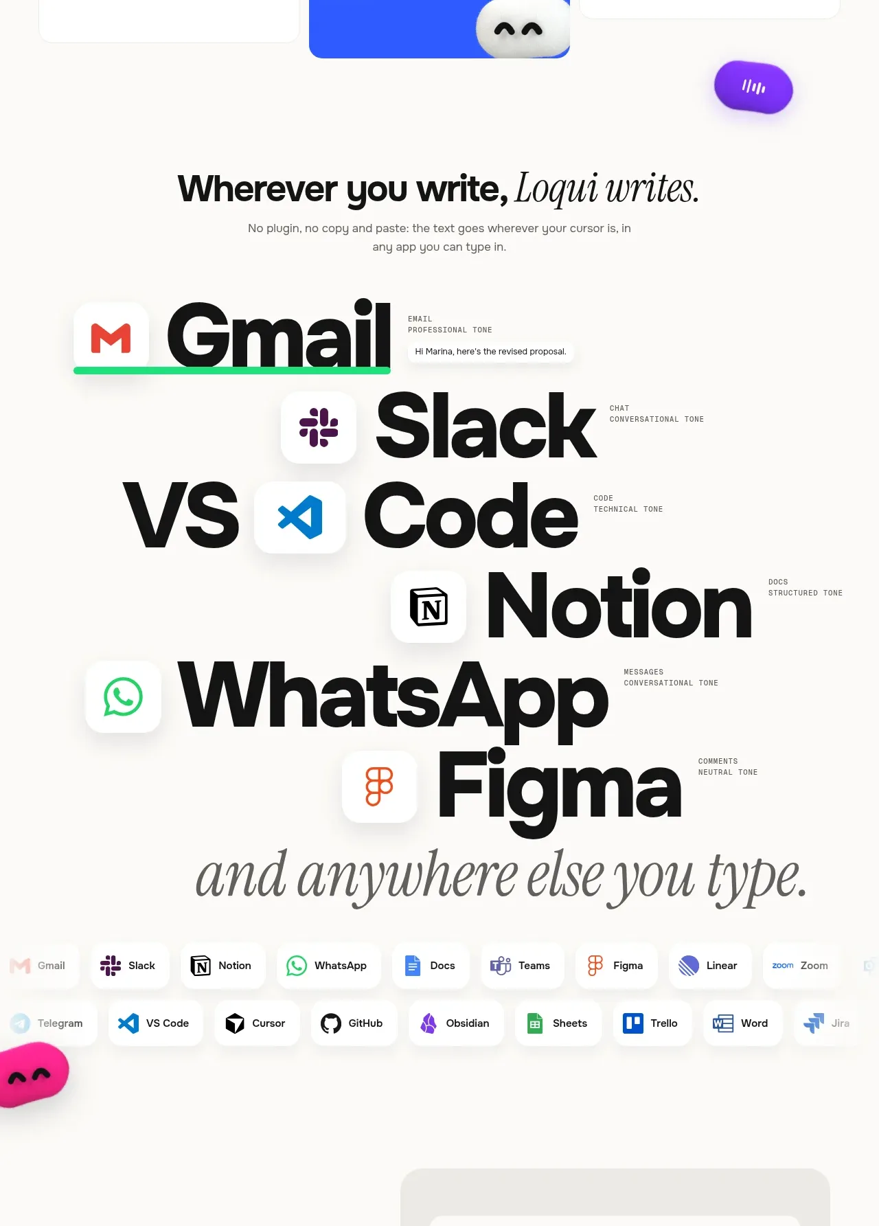
Design analysis
A large editorial statement transitions into oversized names and compact app chips, communicating breadth through typography rather than a conventional feature list. The section feels like a brand manifesto and an ecosystem proof point at once.
Prompt preview
## Reference images

Study these alongside the description below: hierarchy, rhythm, spacing, colour. Build for the product you are asked about, using this design language.

- Component: https://kage-design-assets.t3.tigrisfiles.io/components/loqui/a3dfb9eb-3572-4db1-a73a-a6d0266fe180-1793081140-3.webp
- Full page it was cut from: https://kage-design-assets.t3.tigrisfiles.io/screenshots/loqui/a3dfb9eb-3572-4db1-a73a-a6d0266fe180-1793080985787-full.webp
- Component on Kage: https://kage.design/component/loqui-feature-grid-2

## Before you start
Ask which environments your user's product supports and which integrations matter to customers. Translate that list into a visual ecosystem statement rather than copying any specific examples.

Build an ecosystem section with an editorial headline, a short explanatory sentence, and an oversized vertical list of generic environment categories or invented app labels. Use small icon tiles embedded beside the large labels, then finish with a compact row of integration chips below.

Design rules:
- Give the section substantial whitespace and let the oversized labels act as the primary visual.
- Combine a heavy sans-serif around 72–110px with a contrasting italic serif for the concluding phrase.
- Use #111111 text on #fbfaf8; use soft shadows and white icon tiles with 18–24px radii.
- Make labels slightly overlap or step vertically, while maintaining a clear left reading edge.
- The lower chip cloud should wrap naturally, with 8–14px gaps, 12–16px vertical padding, and pill or rounded-rectangle containers.
- Use muted grey for secondary descriptors and small accent colours only on category icons.
- On mobile, reduce label size and preserve the staggered editorial rhythm without horizontal overflow.

Never:
- Never use logos, product names, copy, illustrations, or imagery from the reference.
- Never copy the reference's exact type scale, app list, iconography, or wording.
More components
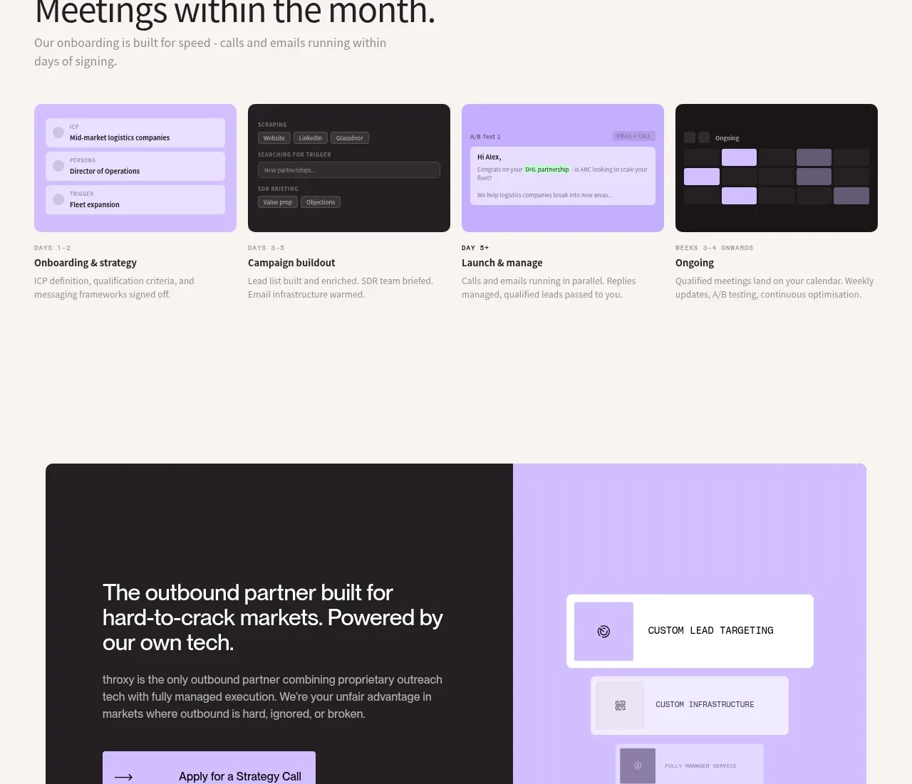
 Rapid onboarding timeline
throxy · Feature grid
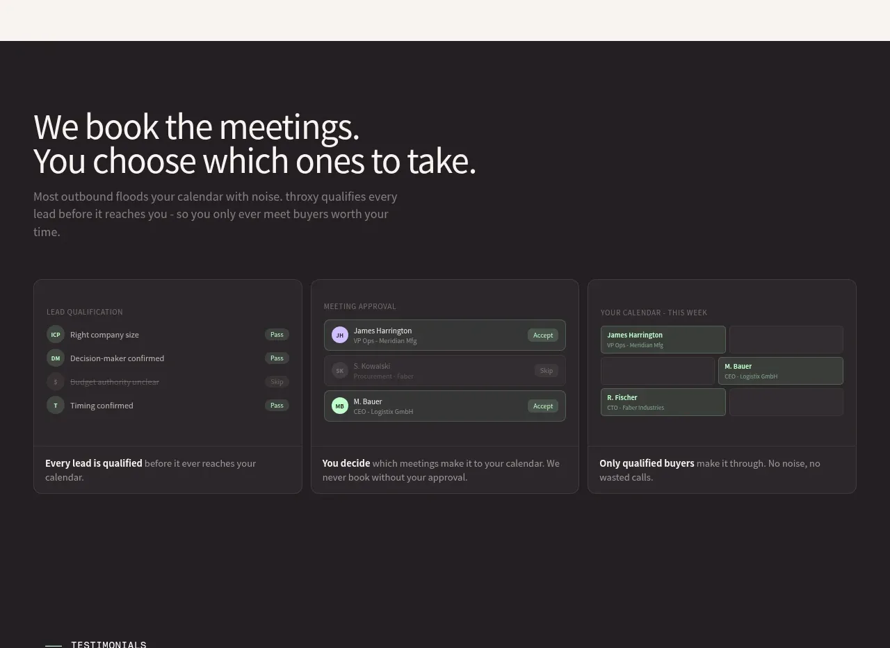 Qualification workflow cards
throxy · Feature grid
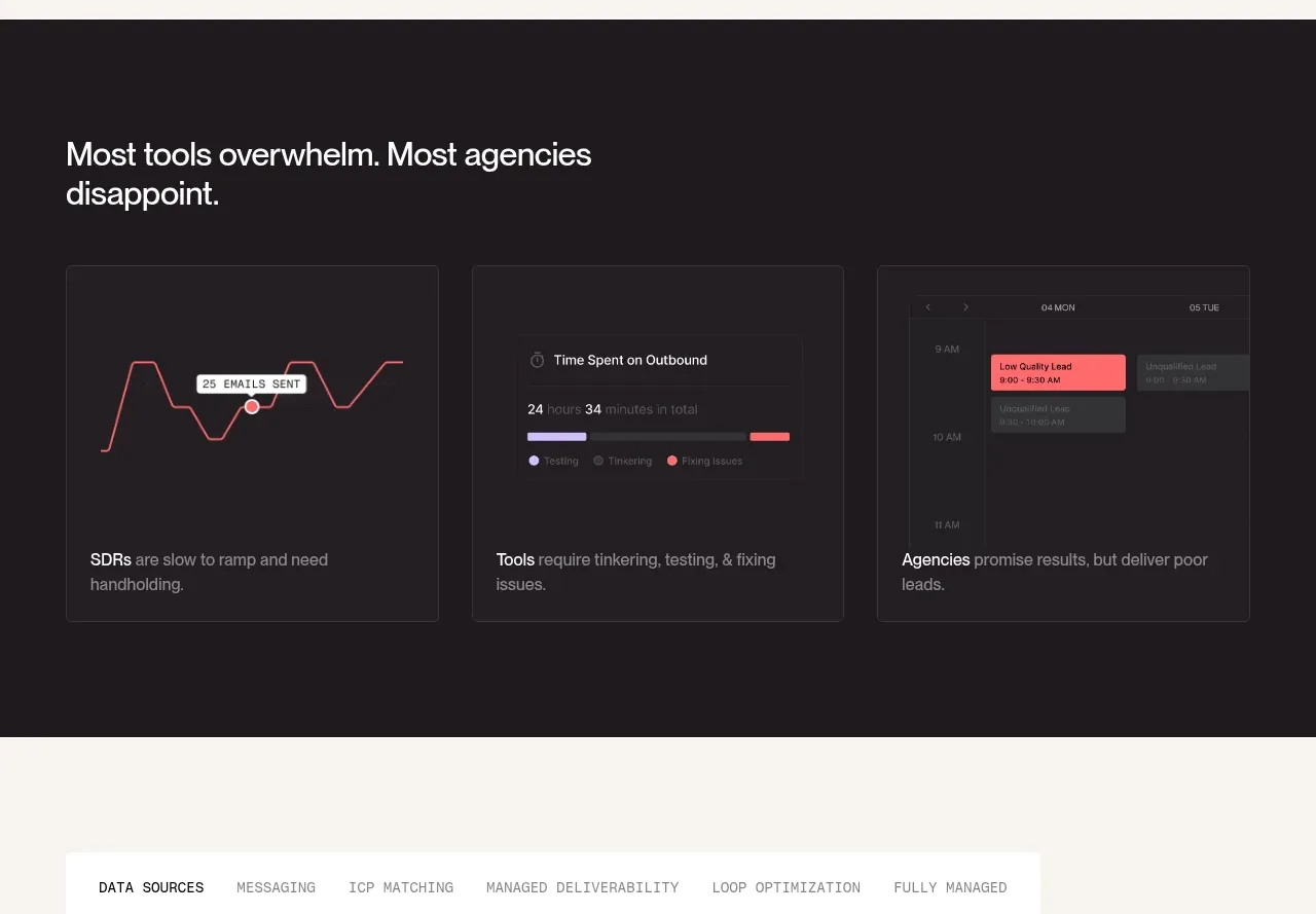 Why alternatives disappoint
throxy · Feature grid
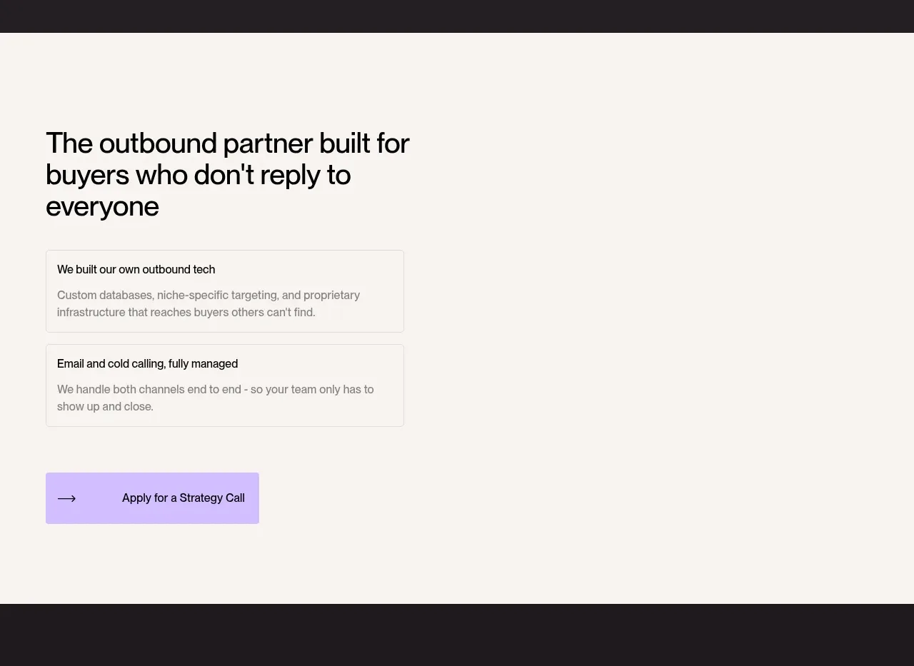 Outbound partner benefits
throxy · Feature grid
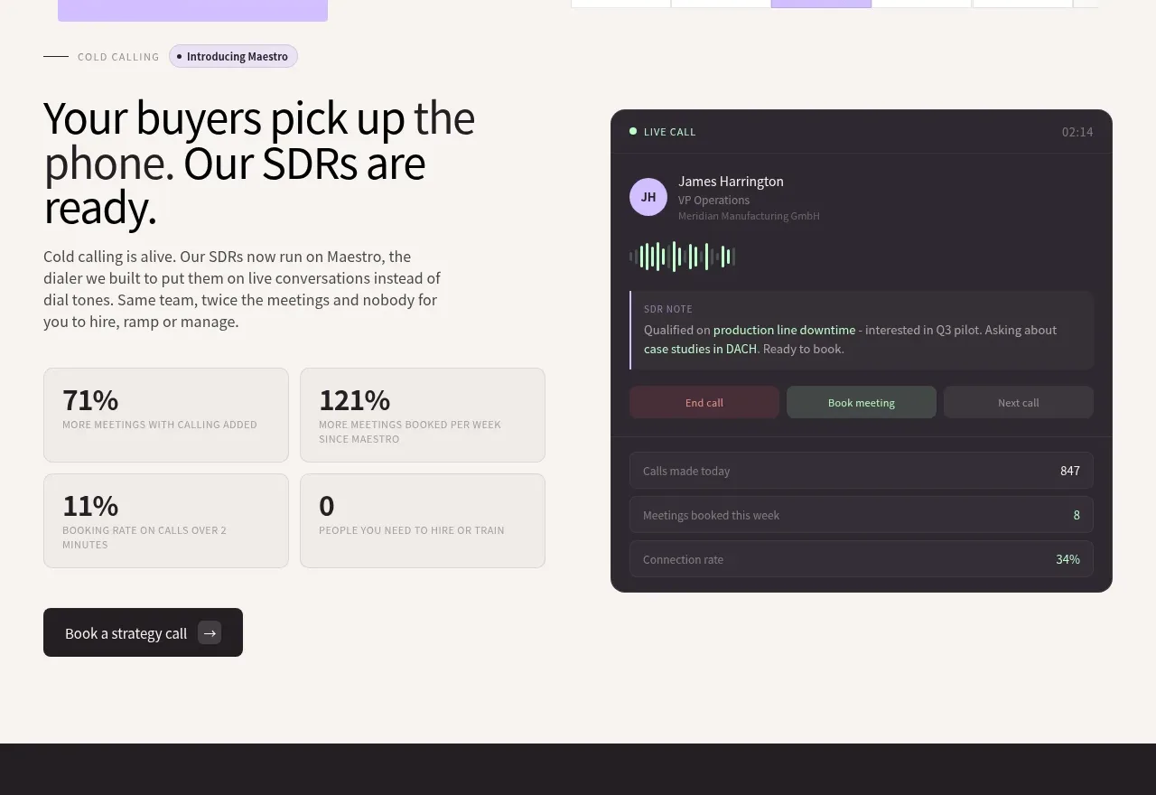 Cold-calling performance section
throxy · Feature grid
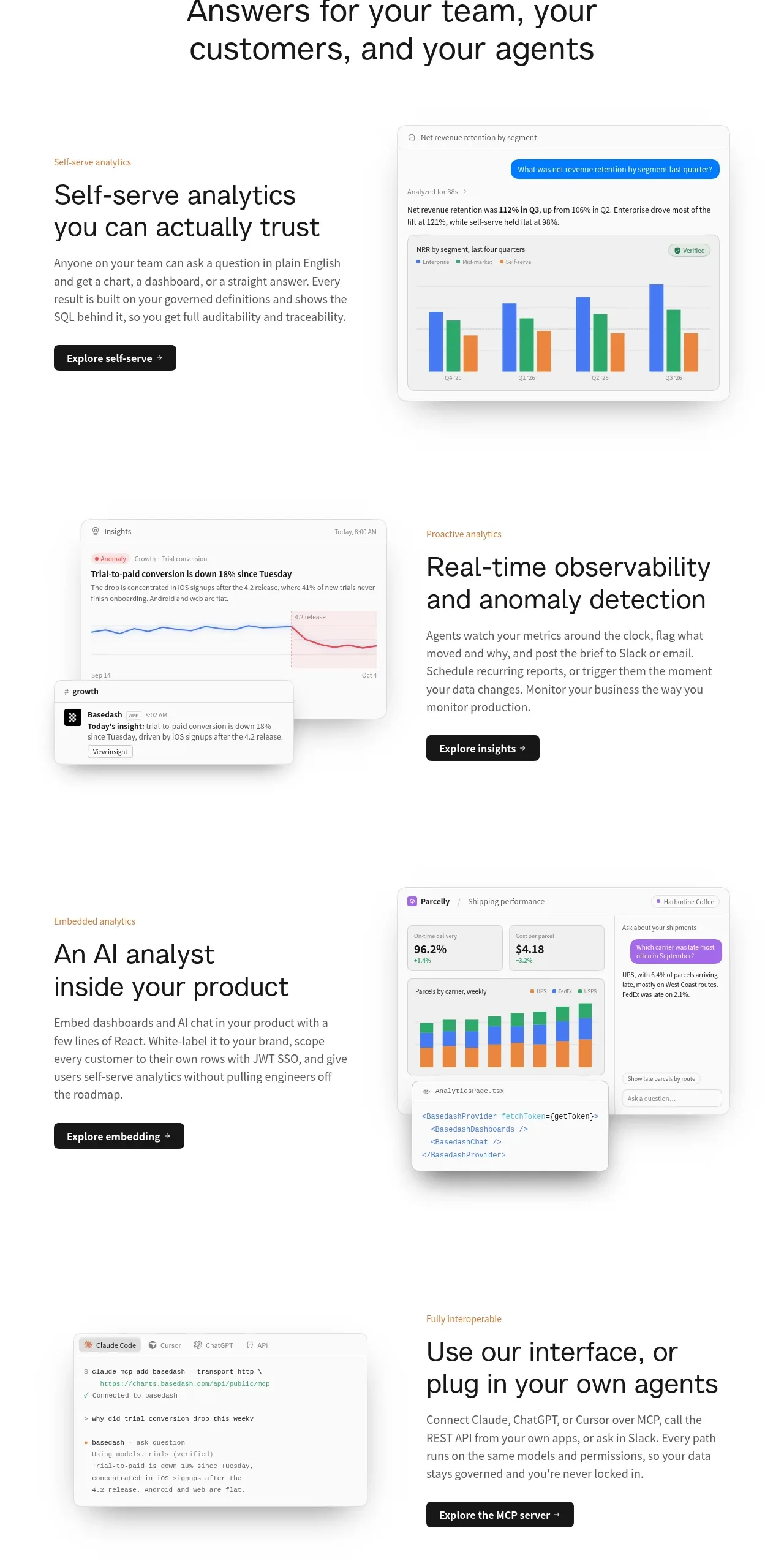
 Analytics capability showcase
Basedash View-only members · Feature grid