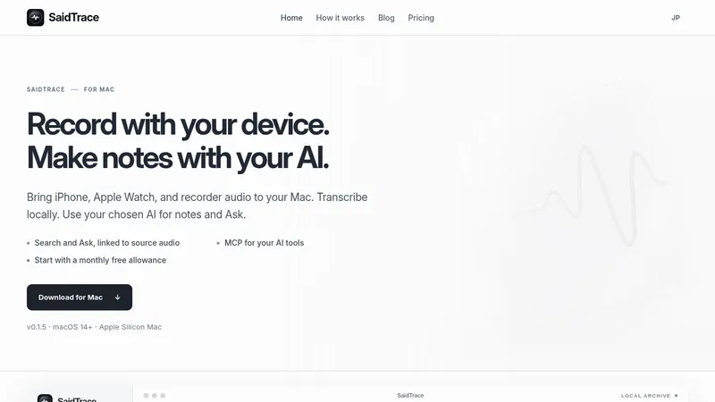
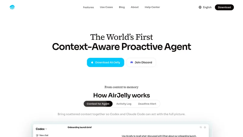
kage
loquime.com

Design analysis
A spacious off-white landing page pairs oversized black sans-serif headlines with italic editorial serif phrases, creating a recurring contrast between direct utility and expressive voice. The hero starts sparse, then expands into a dense collage of app mockups; later sections alternate between large typographic statements, pale product demonstrations, saturated feature cards, a blue meeting panel, privacy content, pricing, FAQ, and a branded footer, while floating colorful capsule mascots keep the long page playful.
Prompt preview
## Reference images

Study these alongside the description below: hierarchy, rhythm, spacing, colour. Build for the product you are asked about, using this design language.

- Full page: https://kage-design-assets.t3.tigrisfiles.io/screenshots/loqui/a3dfb9eb-3572-4db1-a73a-a6d0266fe180-1793080985787-full.webp
- Above the fold: https://kage-design-assets.t3.tigrisfiles.io/screenshots/loqui/a3dfb9eb-3572-4db1-a73a-a6d0266fe180-1793080982266.webp
- Design on Kage: https://kage.design/designs/loqui-landing-page

## Before you start
Ask the user what they are building, who it is for, and which brand assets they already have, including product name, colours, typography, logo, and illustration or UI assets. Wait for their answers before designing. Apply everything below to their product rather than copying the reference.

## Page structure
- **Top navigation:** Use a compact, centered header on an off-white canvas, with a small brand mark at left, a short row of text links in the middle, and sign-in plus a filled primary button at right.
- **Hero announcement and headline:** Place a small announcement badge above a very large centered headline. Combine a heavy black sans-serif phrase with a contrasting italic serif phrase on the next line.
- **Hero supporting copy and actions:** Add a short centered explanation followed by two pill buttons, using a saturated primary action and a quiet secondary action.
- **Product-in-context collage:** Introduce the product with a small uppercase section label and a thin divider, then build a three-column collage of realistic app panels. Mix email, chat, notes, code, meeting, and messaging surfaces with one bright purple transcription card and one blue card; use varied heights, soft borders, and rounded corners.
- **Cross-app statement:** Follow with a centered headline that again mixes bold sans-serif and italic serif, then a short explanatory paragraph.
- **App compatibility typography:** Show supported app names as an oversized staggered typographic composition. Pair each name with a small app tile and a tiny uppercase tone label, then finish with an italic serif line and rows of compact app chips.
- **Editing demonstration:** Use a two-column section with a left text explanation and legend, and a right pale gray rounded demo panel showing rough spoken text transformed into a clean result with highlighted corrections.
- **Tone adaptation diagram:** Center a statement about different tones, add brief copy, and show a wide pale panel containing three example sentences connected by a dotted routing line to chat, email, and document labels and a central voice control.
- **Progressive improvement feature grid:** Add a left-aligned headline and a five-card grid. Use one wide lime card for vocabulary learning, a pale language card, and three smaller cyan, yellow, and pink cards for commands, seals/signatures, and hands-free interaction. Put lightweight UI snippets inside the cards.
- **Multi-speaker meeting section:** Break the neutral rhythm with a large saturated blue rounded panel. Place a mixed sans/italic headline and supporting copy above a white meeting transcript mockup with speaker tracks, decisions, actions, risks, and questions; finish with four concise capability columns.
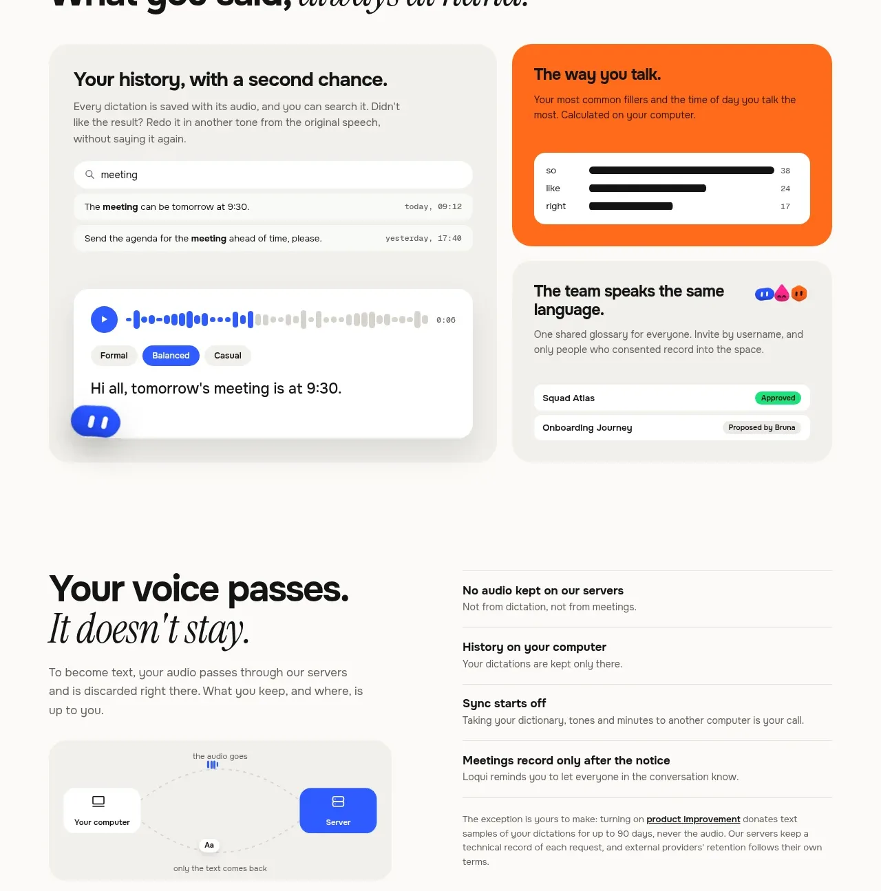
- **History and shared language:** Return to the off-white canvas with a mixed-style heading and a two-column arrangement: a large pale history/audio card on the left, plus orange and light cards on the right for speaking patterns and team vocabulary.
- **Privacy and data section:** Use a calm two-column layout with a large statement and a small computer/server diagram on the left, and a vertically separated list of privacy promises on the right.
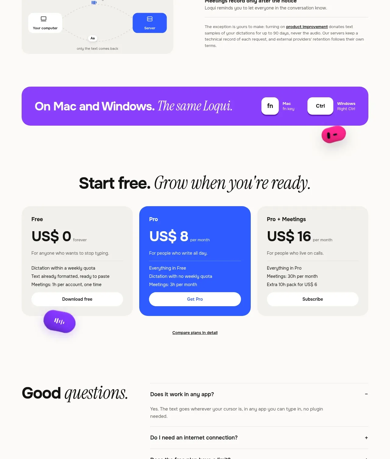
- **Platform banner:** Add a full-width purple gradient or purple rounded banner with a mixed-style headline and small Mac/Windows shortcut keycaps aligned on the right.
- **Pricing:** Center a large heading, then show three equal rounded pricing cards. Keep the middle plan saturated blue with white type while the other plans stay pale gray; include price, short audience description, feature list, and pill CTA in each, followed by a comparison link.
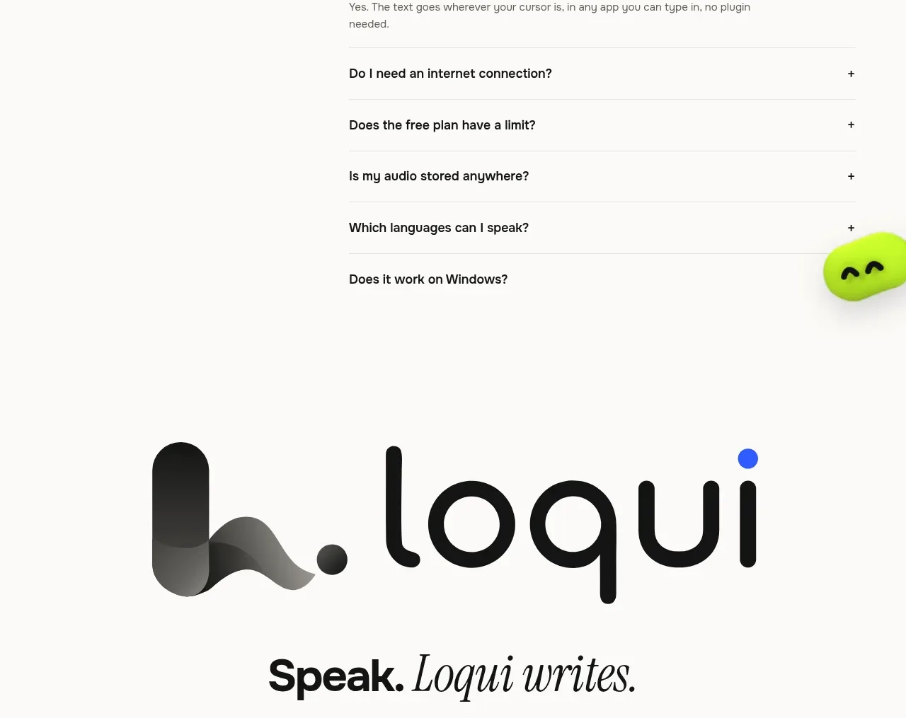
- **FAQ:** Create a sparse two-column section with a large heading on the left and a ruled accordion list on the right. Keep the first answer open and the remaining questions collapsed with plus or minus indicators.
- **Closing brand CTA:** Use a large centered brand mark or abstract product symbol, a final mixed-style statement, and the same two download actions from the hero.
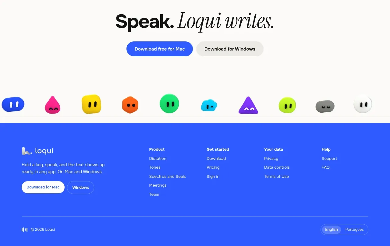
- **Mascot strip and footer:** Place a row of small colorful character shapes above a saturated blue footer. Include a compact brand lockup, short product description, download buttons, grouped navigation columns, a divider, copyright, and language controls.

## Design language
- Build hierarchy through extreme scale contrast: use oversized black sans-serif display headings, compact neutral body copy, tiny uppercase monospace-like labels, and occasional italic serif phrases for warmth and emphasis.
- Keep the page airy at the top and between major sections, then increase density inside demos, compatibility lists, feature grids, pricing, and FAQ. Alternate centered statements with left-aligned explanatory layouts so the long page changes rhythm without losing cohesion.
- Use a warm off-white background around `#f7f6f3` rather than stark white, near-black text around `#111111`, pale UI surfaces around `#eeece8`, and saturated accents such as blue `#3158f5`, purple `#8337ed`, lime `#c8ff18`, cyan `#16c6e8`, yellow `#ffd51a`, orange `#ff6b16`, and pink `#f72585`.
- Pair a broad geometric or grotesk sans-serif for headings and interface text with a high-contrast italic serif for selected phrases. Make display type tight and bold, body copy small and relaxed, and labels visibly tracked and uppercase.
- Treat panels as soft, tactile cards: use large corner radii, very thin low-contrast borders, restrained gray shadows, and almost no heavy outlines. Use white inset cards inside colored feature panels and pale gray containers around demonstrations.
- Let color signal feature context rather than decorate every surface: reserve saturated fills for primary actions, highlighted product behaviors, the meeting panel, one pricing tier, and small mascot objects. Keep most page space neutral.
- Use pill-shaped buttons, compact keycaps, app chips, small status labels, dotted connectors, waveform-like marks, and miniature realistic product interfaces to make abstract capabilities tangible.
- Keep interaction behavior quiet and direct: buttons should have subtle lift or color transitions, FAQ rows should expand in place, cards can reveal small hover elevation, and floating mascot capsules may drift gently without blocking content. Respect reduced-motion preferences.
- Maintain a wide centered content grid with generous vertical spacing, but allow selected mockups and mascots to break the grid slightly for energy. On smaller screens, stack columns, preserve the heading contrast, and keep controls comfortably tappable.

## Never
- Do not use the reference product's logo, wordmark, name, copy, mascot characters, exact app collage, illustrations, icon set, or branded UI content.
- Do not reproduce the reference's exact headlines, pricing, feature wording, screenshots, or visual identity. Create new content, assets, and examples for the user's product.
- Never present the result as Loqui or imply affiliation with it.
Components from this page
All components
 Minimal product navigation
Loqui · Navigation
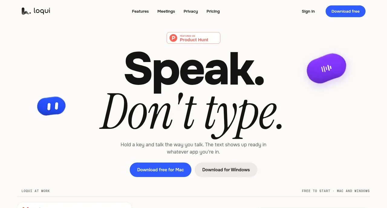 Speak, don’t type hero
Loqui · Hero
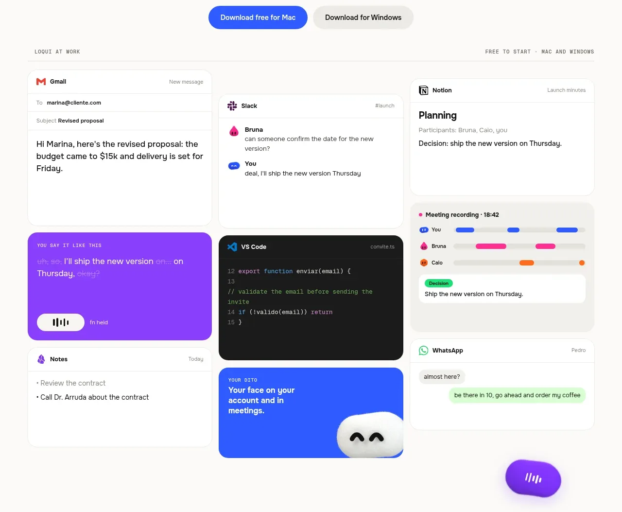 Loqui at work collage
Loqui · Feature grid
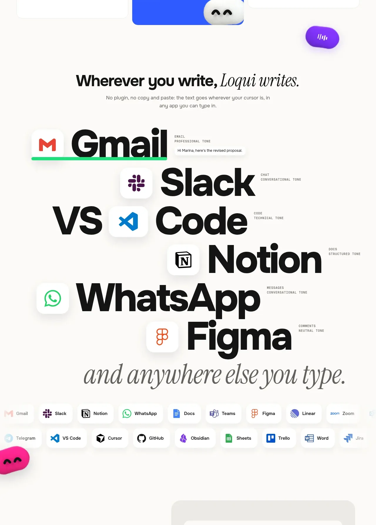 Works wherever you write
Loqui · Feature grid
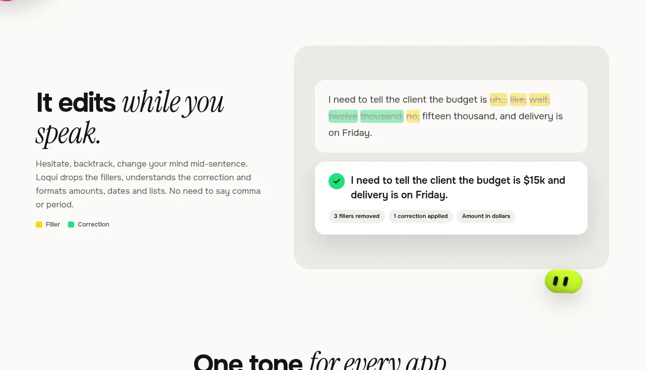 Edits while you speak
Loqui · Feature grid
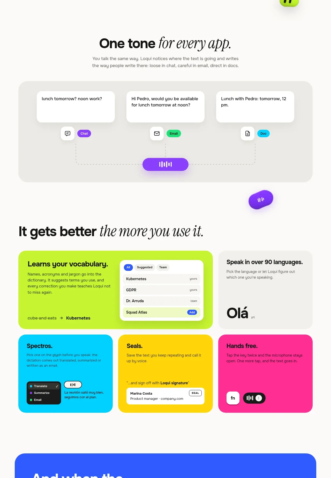 Tone and adaptive writing
Loqui · Feature grid
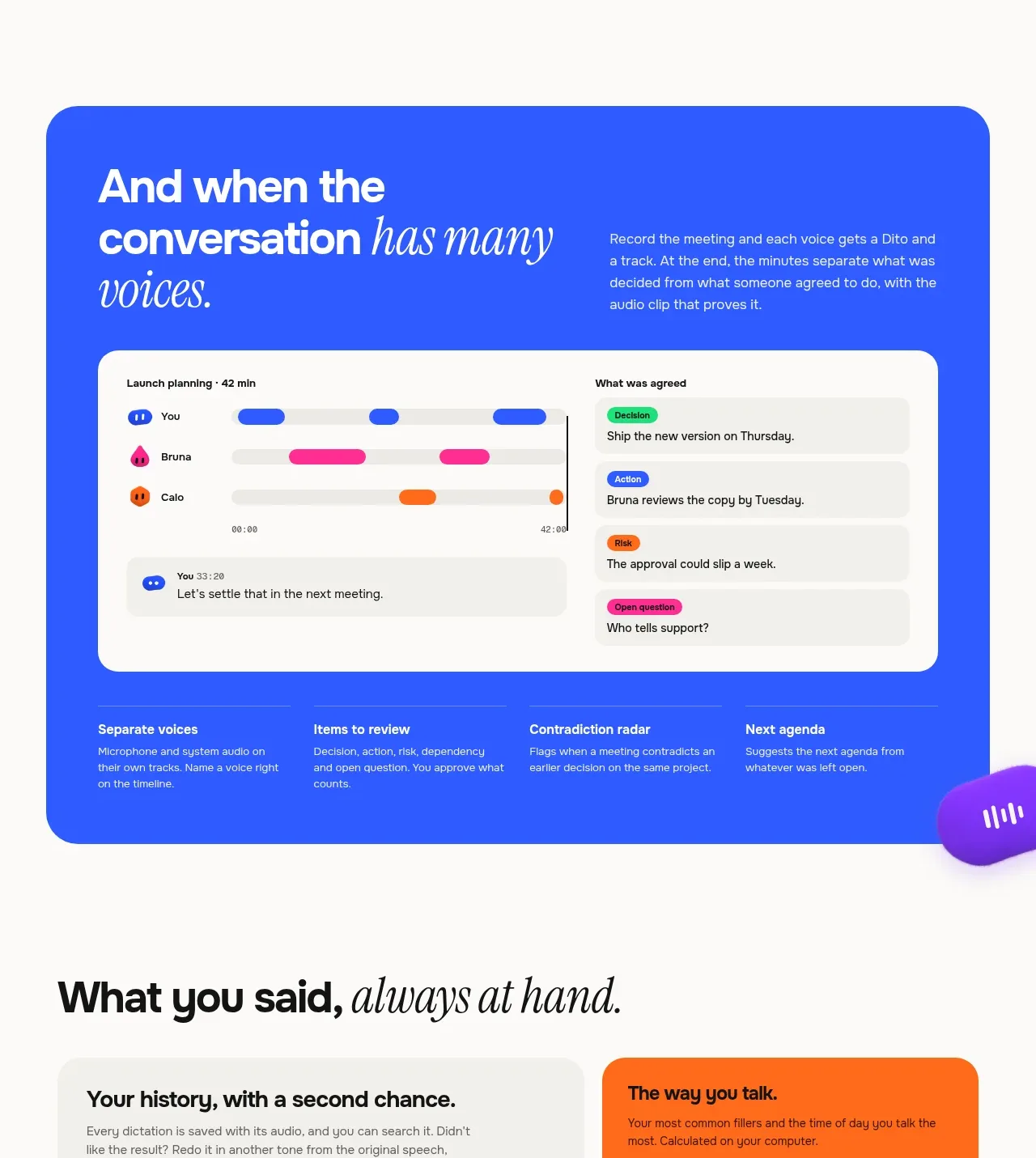 Many voices, one meeting view
Loqui · Feature grid
 Memory and shared context
Loqui · Feature grid
 Privacy and local processing
Loqui · Feature grid
 Three-tier pricing plans
Loqui · Pricing table
 Frequently asked questions
Loqui · FAQ