 kage
loquime.com
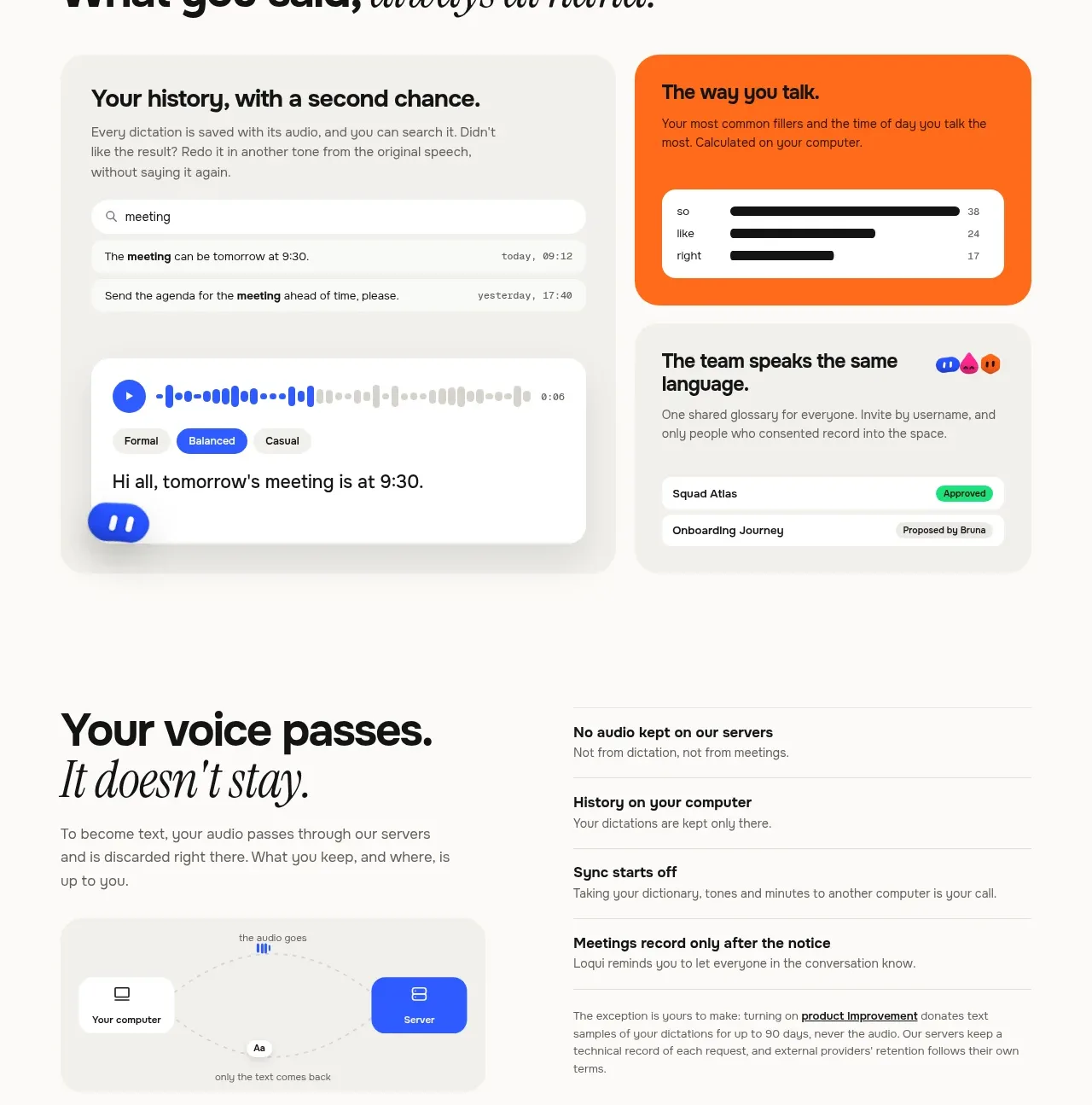
Design analysis
The section combines a large searchable history/audio card with smaller cards for tone and shared language. It communicates that the product preserves useful context, not merely raw output.
Prompt preview
## Reference images

Study these alongside the description below: hierarchy, rhythm, spacing, colour. Build for the product you are asked about, using this design language.

- Component: https://kage-design-assets.t3.tigrisfiles.io/components/loqui/a3dfb9eb-3572-4db1-a73a-a6d0266fe180-1793081142-7.webp
- Full page it was cut from: https://kage-design-assets.t3.tigrisfiles.io/screenshots/loqui/a3dfb9eb-3572-4db1-a73a-a6d0266fe180-1793080985787-full.webp
- Component on Kage: https://kage.design/component/loqui-feature-grid-6

## Before you start
Ask what information the user's product remembers, how people retrieve it, and how teams benefit from shared context. Use those answers to shape the cards.

Build a memory-focused feature grid with a large left card showing search, an audio waveform, and a generated text result, plus two stacked right cards showing personalization and team vocabulary. Introduce the grid with a concise editorial heading.

Design rules:
- Use a neutral palette: #eeece8 card backgrounds, white inner surfaces, #111111 text, and #6f6c67 metadata.
- Let the main card occupy roughly 60% width and the two secondary cards occupy 40%, with 18–24px gaps.
- Use 20–28px radii, soft shadows, and clear inner padding.
- Include a prominent search field, play control, waveform, and transcript state in the main card.
- Use a warm orange accent around #ff741c for one supporting card and keep the other mostly neutral.
- Make history rows and status chips readable at a glance; add hover/focus states to searchable items.
- Stack the layout on mobile with the main card first.

Never:
- Never use logos, product names, copy, illustrations, or imagery from the reference.
- Never copy the exact search query, transcript, colours, or card titles.
More components
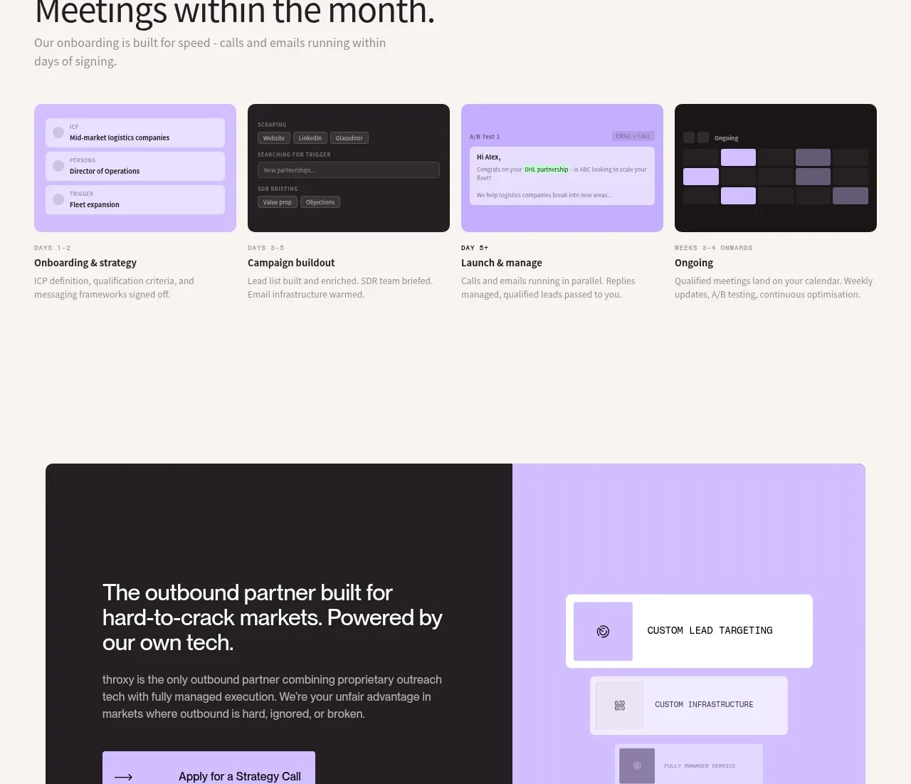
 Rapid onboarding timeline
throxy · Feature grid
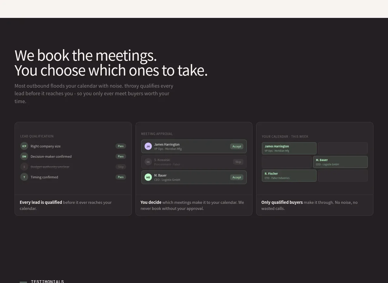 Qualification workflow cards
throxy · Feature grid
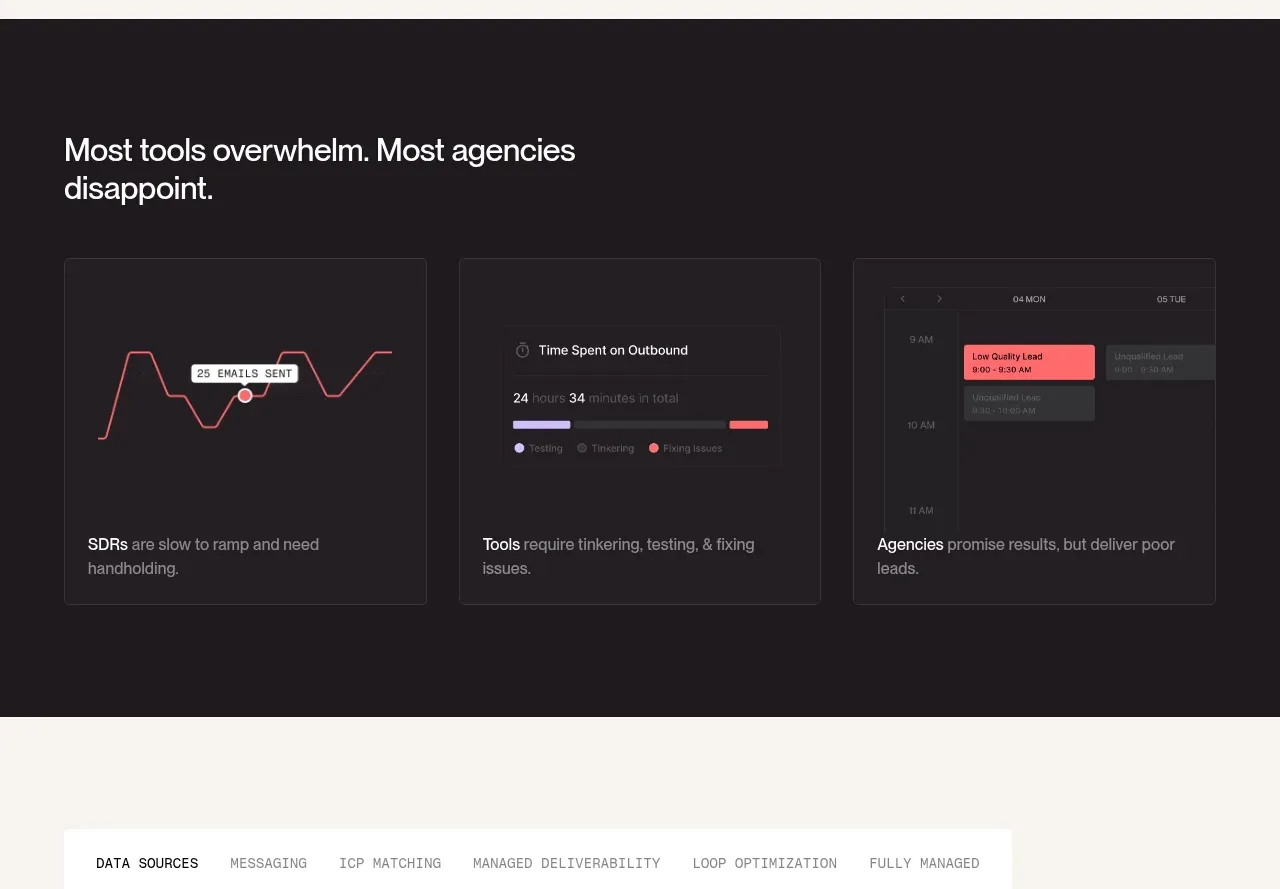 Why alternatives disappoint
throxy · Feature grid
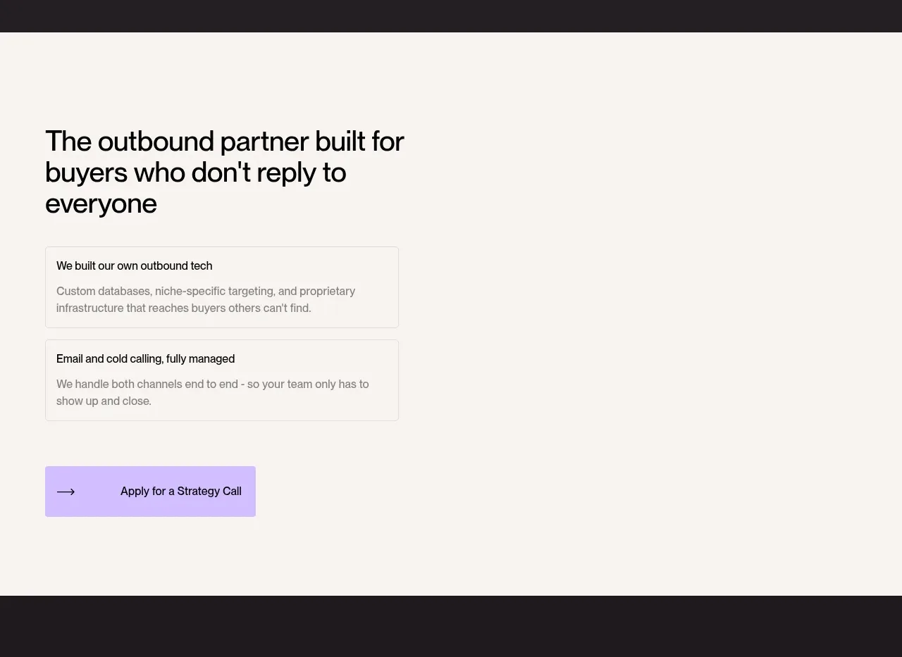 Outbound partner benefits
throxy · Feature grid
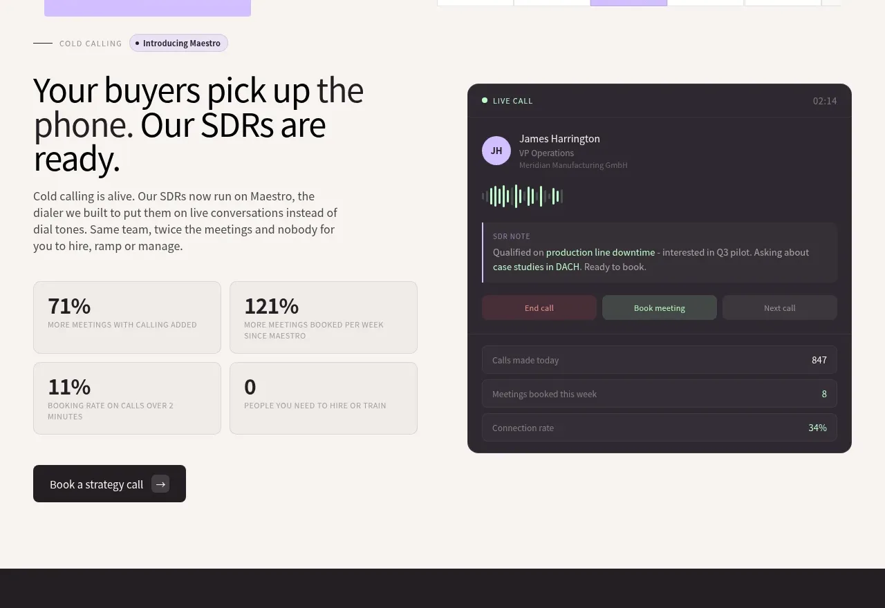 Cold-calling performance section
throxy · Feature grid
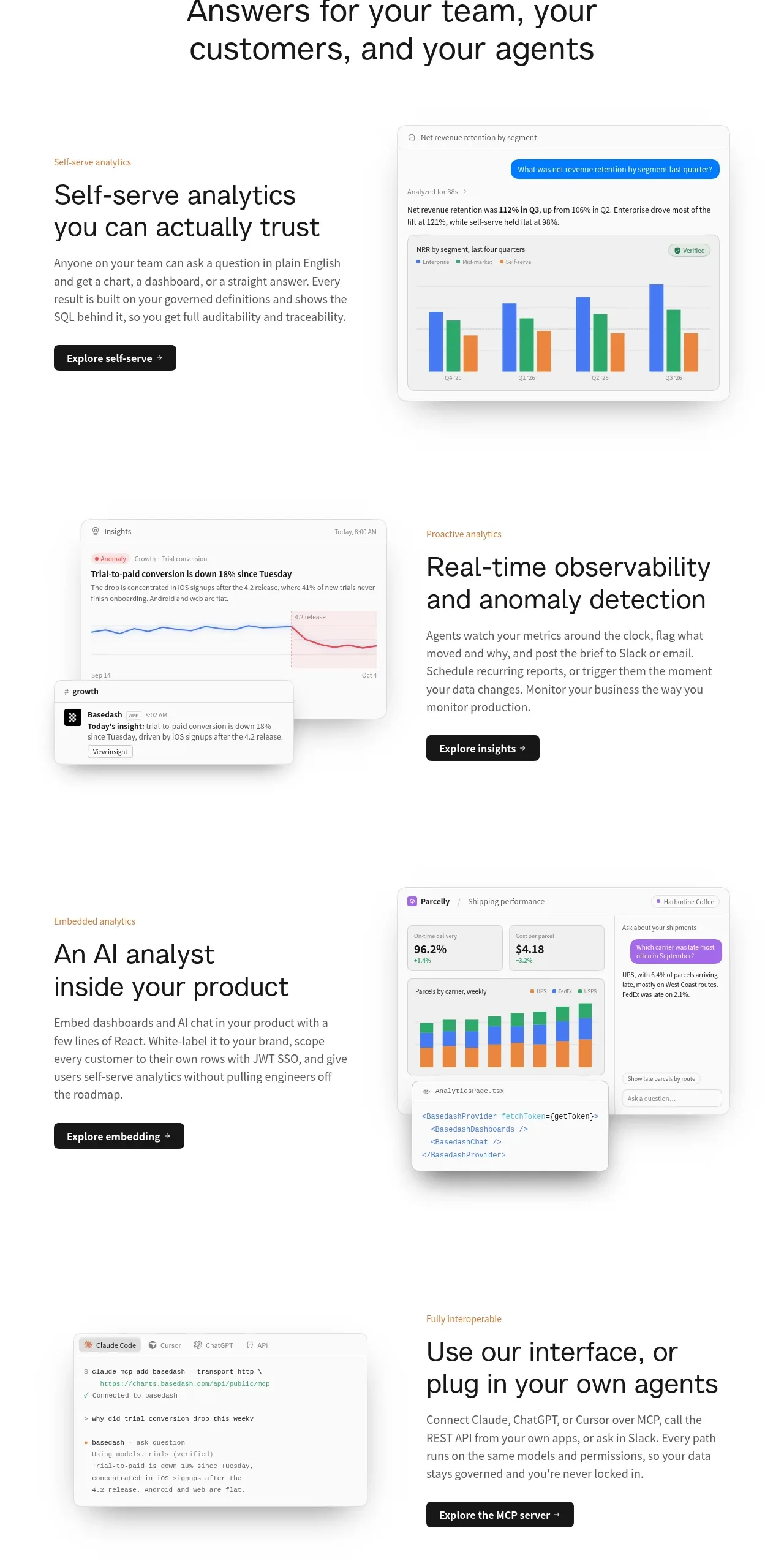
 Analytics capability showcase
Basedash View-only members · Feature grid