 kage
loquime.com
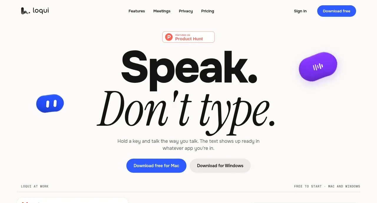
Design analysis
The hero uses an extreme typographic contrast between a heavy sans-serif headline and an italic editorial phrase, supported by a short explanation and two platform CTAs. Floating colour accents add motion without competing with the message.
Prompt preview
## Reference images

Study these alongside the description below: hierarchy, rhythm, spacing, colour. Build for the product you are asked about, using this design language.

- Component: https://kage-design-assets.t3.tigrisfiles.io/components/loqui/a3dfb9eb-3572-4db1-a73a-a6d0266fe180-1793081139-1.webp
- Full page it was cut from: https://kage-design-assets.t3.tigrisfiles.io/screenshots/loqui/a3dfb9eb-3572-4db1-a73a-a6d0266fe180-1793080985787-full.webp
- Component on Kage: https://kage.design/component/loqui-hero

## Before you start
Ask what the user's product does, what its clearest one-line promise is, and which actions matter most. Then create a hero around those answers using the principles below.

Build a spacious landing-page hero for a product that helps people work faster. Make the headline the dominant visual: combine a very large bold grotesk/sans-serif phrase with a contrasting italic serif phrase beneath or beside it. Add a small credibility eyebrow above, a two-line supporting paragraph, and two platform-specific CTAs below.

Design rules:
- Center the hero in a generous vertical stack, with the first content directly below the nav.
- Use near-black #111111 on a warm white #fbfaf8 background.
- Make the primary CTA saturated blue around #3158f5 with white text; make the secondary CTA soft grey #f0efec with dark text.
- Use a bold display size around 88–120px on desktop, a 42–64px mobile size, and an italic serif accent with a noticeably lighter texture.
- Keep copy width around 430–520px for the paragraph and use relaxed line-height around 1.4.
- Place one or two small abstract accent forms near the headline edges in blue or violet, with soft shadows and large rounded shapes.
- Add hover lift and focus states to buttons; stack CTAs on narrow screens.

Never:
- Never use logos, product names, copy, illustrations, or imagery from the reference.
- Never copy the exact headline, floating shapes, typography treatment, or platform labels.
More components
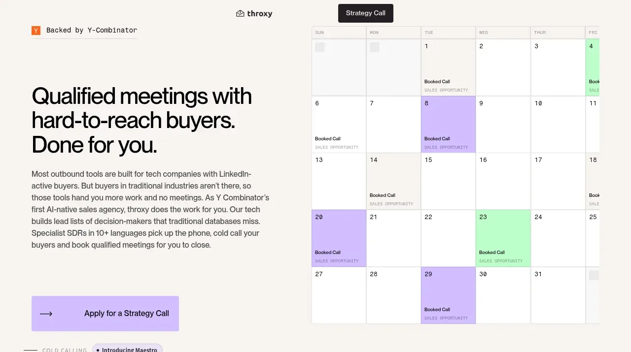
 Buyer-focused hero with calendar visual
throxy · Hero
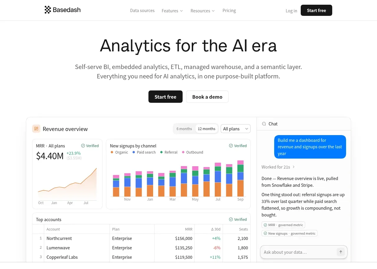
 Analytics product hero
Basedash View-only members · Hero
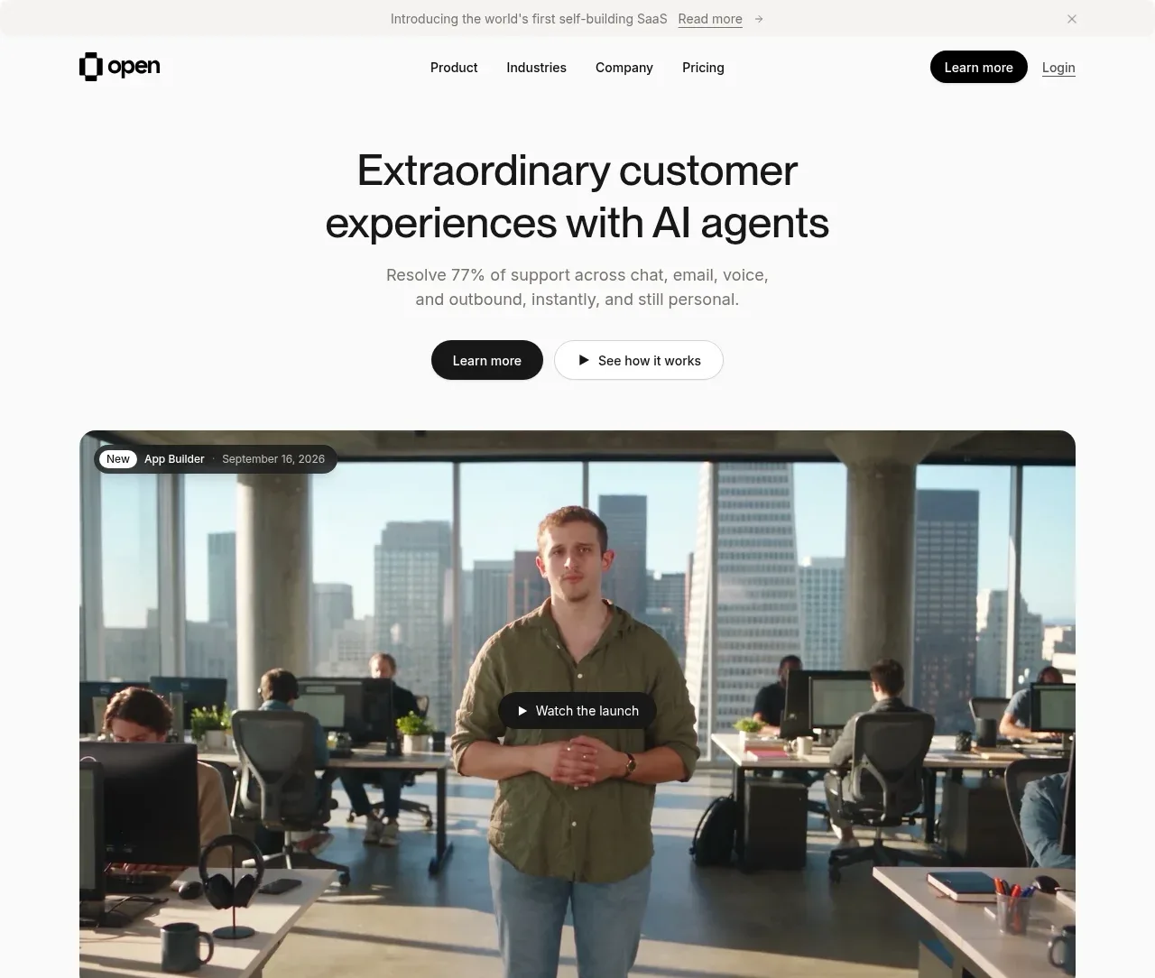
 AI customer experience hero
Open For sales · Hero
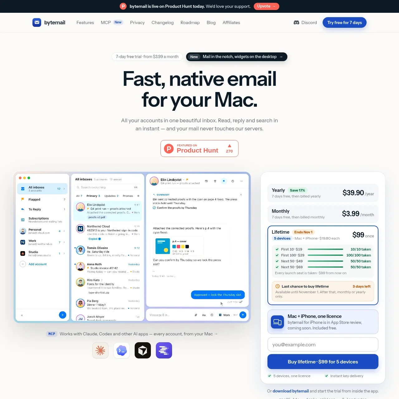
 Mac email product hero
bytemail · Hero
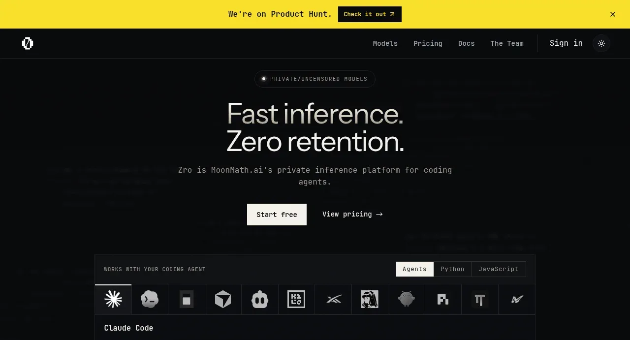
 Private inference hero
Zro: Uncensored Security Models · Hero
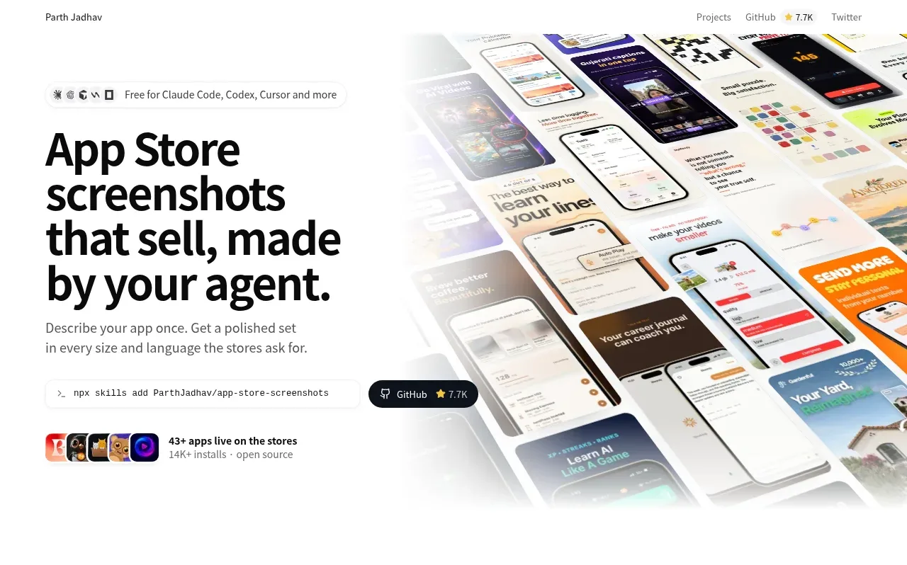
 Product hero with screenshot collage
App Store Screenshots · Hero