 kage
kage
lovable.dev
Design analysis
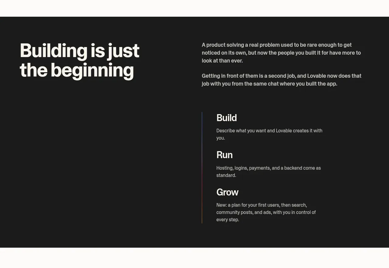
A dark contrast band reframes the product as a three-stage operating system. A large statement sits beside short explanatory copy and a vertically connected Build, Run, Grow sequence.
Prompt preview
## Reference images

Study these alongside the description below: hierarchy, rhythm, spacing, colour. Build for the product you are asked about, using this design language.

- Component: https://kage-design-assets.t3.tigrisfiles.io/components/lovable-growth-tools/9452fb95-0338-4269-a5da-8889e8804cc9-1792216982-2.webp
- Full page it was cut from: https://kage-design-assets.t3.tigrisfiles.io/screenshots/lovable-growth-tools/9452fb95-0338-4269-a5da-8889e8804cc9-1792216920277-full.webp
- Component on Kage: https://kage.design/component/lovable-growth-tools-feature-grid

## Before you start
Ask what the user's product and brand are, then apply these principles to that product rather than reproducing the reference.

Build a full-width dark section (#1b1b1b) with a two-column desktop layout: a large light heading on the left and explanatory copy plus three vertically stacked stages on the right. Connect the stages with a thin vertical line or progress rail, and use short labels with one-sentence descriptions. Keep the composition editorial, with a 56–72px section padding, muted gray body text, off-white headings, and restrained accent color on the rail. On small screens stack the columns and preserve the sequence. Avoid dense cards; the contrast and vertical rhythm should do the work.

Never: use logos, product names, copy, illustrations, or imagery from the reference.
More components

 Data-to-action engine
Salience · Feature grid
Data-to-action engine
Salience · Feature grid
 Actionable alert workflow
Salience · Feature grid
Actionable alert workflow
Salience · Feature grid
 Trust proof and core outcomes
Salience · Feature grid
Trust proof and core outcomes
Salience · Feature grid
 Three-step implementation flow
Salience · Feature grid
Three-step implementation flow
Salience · Feature grid
 What analytics misses
Salience · Feature grid
What analytics misses
Salience · Feature grid

 Workflow features and capabilities
CrewTower Mod for Claude Code · Feature grid
Workflow features and capabilities
CrewTower Mod for Claude Code · Feature grid