kage
kage
lullme.app
Design analysis
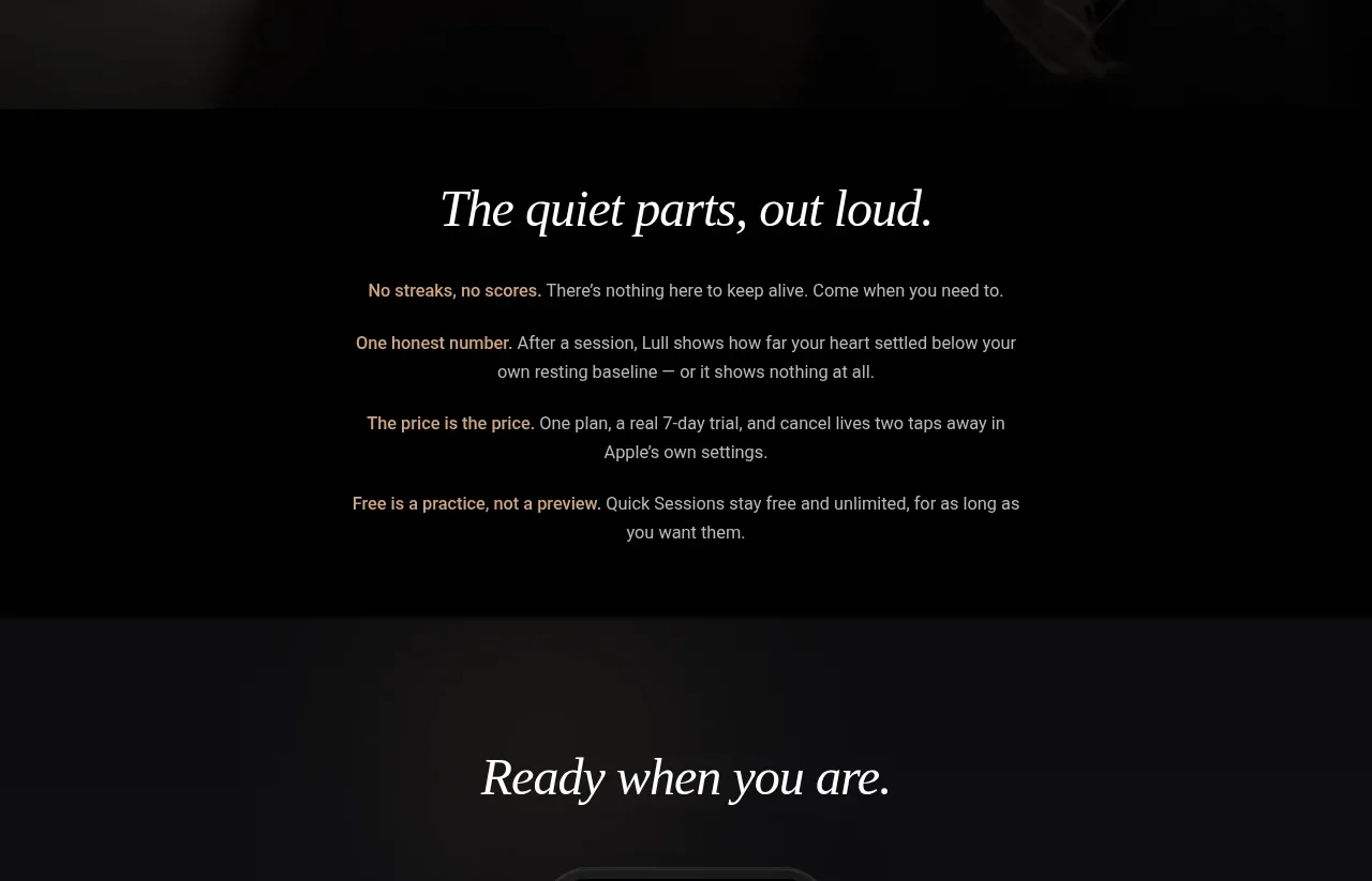
A quiet text-led section builds trust by explaining the product's philosophy in several short paragraphs rather than adding another visual feature.
Prompt preview
## Reference images

Study these alongside the description below: hierarchy, rhythm, spacing, colour. Build for the product you are asked about, using this design language.

- Component: https://kage-design-assets.t3.tigrisfiles.io/components/lull/1eb36b3c-9a0d-499b-8ae4-8916c2d1f7b6-1789884098-7.webp
- Full page it was cut from: https://kage-design-assets.t3.tigrisfiles.io/screenshots/lull/1eb36b3c-9a0d-499b-8ae4-8916c2d1f7b6-1789884066726-full.webp
- Component on Kage: https://kage.design/component/lull-card

## Before you start
Ask what the user's product refuses to do, what it believes, and how it handles pricing or privacy. Express those principles in a calm, honest text section.

Build a spacious, text-led trust section on a solid near-black background. Center a short italic serif heading, then set three or four brief paragraphs in a narrow readable column. Each paragraph should communicate one principle—such as simplicity, transparency, privacy, or a realistic promise—without marketing exaggeration. Use generous line spacing and clear paragraph separation. Keep the section visually restrained; the power should come from specificity and honesty. If there is a key policy link, style it as a subtle underlined text action rather than a loud button.

Use background #050505, heading #eee9e1, body #b1aba3, links #d4cec5, max text width 500–580px, 72–110px vertical padding, 16px body size, 1.7 line-height, and understated hover underlines. Ensure contrast and allow text to reflow naturally on mobile.

### Never
- Never copy the reference copy, product name, logo, or imagery.
- Never make unverifiable promises or hide important pricing conditions.
- Never use a dense wall of legal text in place of clear principles.