 kage
kage
lullme.app
Design analysis
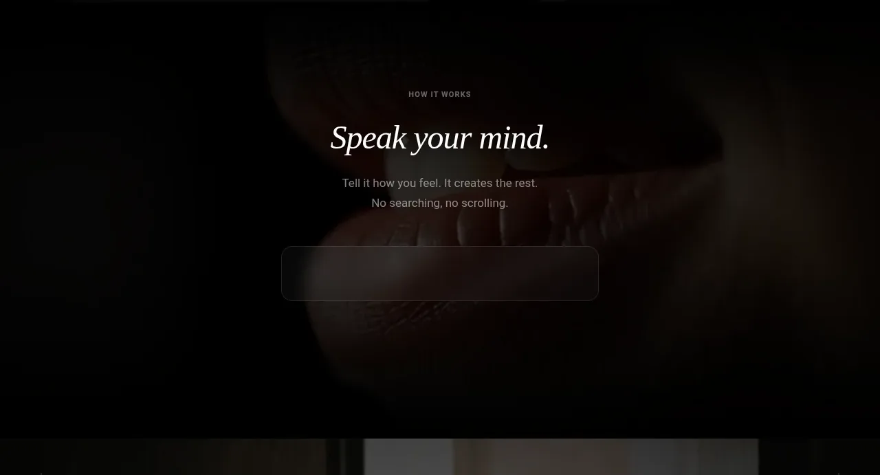
A focused how-it-works band reduces the product to one emotionally direct instruction, a short explanation, and a quiet translucent interaction surface over a background image.
Prompt preview
## Reference images

Study these alongside the description below: hierarchy, rhythm, spacing, colour. Build for the product you are asked about, using this design language.

- Component: https://kage-design-assets.t3.tigrisfiles.io/components/lull/1eb36b3c-9a0d-499b-8ae4-8916c2d1f7b6-1789884096-2.webp
- Full page it was cut from: https://kage-design-assets.t3.tigrisfiles.io/screenshots/lull/1eb36b3c-9a0d-499b-8ae4-8916c2d1f7b6-1789884066726-full.webp
- Component on Kage: https://kage.design/component/lull-feature-grid

## Before you start
Ask what the user's core product flow is and what first action should feel effortless. Translate that flow into a focused explanatory section for their brand.

Create a full-width, image-backed how-it-works section with a dark overlay and one centered content stack. Start with a tiny uppercase eyebrow, then a short italic serif heading, followed by one or two lines explaining the interaction in plain language. Below it, show a single understated translucent control or preview that hints at the product experience without becoming a dense dashboard. Use generous vertical padding and keep the content optically centered. If the product has a natural first step, make the preview interactive with a subtle focus, hover, or input state.

Use a near-black photographic overlay, warm white heading, subdued gray body, frosted surface rgba(255,255,255,.08), 1px low-contrast border, 16–20px radius, and soft shadow. Use an eyebrow around 9–11px with letter spacing; heading around 34–44px; body 13–15px. Maintain a narrow 520px content measure and at least 72px spacing between major elements.

### Never
- Never copy the reference wording, imagery, logo, product name, or exact UI.
- Never turn this into a multi-step tutorial with excessive controls.
- Never use bright gradients that break the quiet mood.
More components

 AI-powered helpdesk feature section
intercom.com · Feature grid
AI-powered helpdesk feature section
intercom.com · Feature grid
 Integrations and ecosystem section
intercom.com · Feature grid
Integrations and ecosystem section
intercom.com · Feature grid
 AI agent capabilities section
intercom.com · Feature grid
AI agent capabilities section
intercom.com · Feature grid
 Unified support experience overview
intercom.com · Feature grid
Unified support experience overview
intercom.com · Feature grid

 Core invoicing capabilities
sendinvo.com · Feature grid
Core invoicing capabilities
sendinvo.com · Feature grid
 Audience and trade types
sendinvo.com · Feature grid
Audience and trade types
sendinvo.com · Feature grid