 kage
kage
mailwell.app
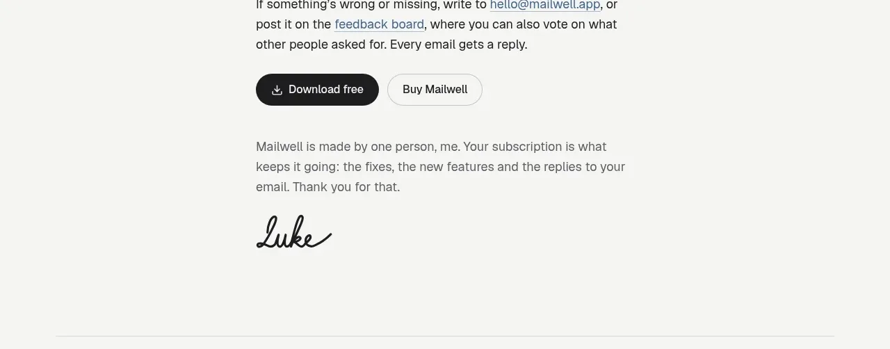
Design analysis
The conversion section restates the low-friction trial and gives users two clear paths: start free or purchase. Supporting contact and feedback text reduces uncertainty before the final action row.
Prompt preview
## Reference images

Study these alongside the description below: hierarchy, rhythm, spacing, colour. Build for the product you are asked about, using this design language.

- Component: https://kage-design-assets.t3.tigrisfiles.io/components/mailwell/88191a7a-ee36-4079-ad0c-b8c821ee63e0-1791525983-6.webp
- Full page it was cut from: https://kage-design-assets.t3.tigrisfiles.io/screenshots/mailwell/88191a7a-ee36-4079-ad0c-b8c821ee63e0-1791525844093-full.webp
- Component on Kage: https://kage.design/component/mailwell-cta

## Before you start
Ask what the user's primary conversion is, what reassurance removes hesitation, and what secondary support path should be offered. Apply the structure to that product.

Build a narrow centered CTA section around 380–440px wide. Start with a 22–26px bold heading, then explain the trial, pricing, or activation terms in one or two short paragraphs. Add a secondary support paragraph with an email, documentation, or feedback link styled as an understated underline or darker text. End with two pill buttons: a black primary action with white text and a white/off-white secondary action with a #d0d0d0 border. Use 15–16px body copy, generous 56–72px vertical padding, and 24–32px between content groups. Keep the CTA direct and human rather than sales-heavy.

Never use logos, product names, copy, illustrations, or imagery from the reference.
More components
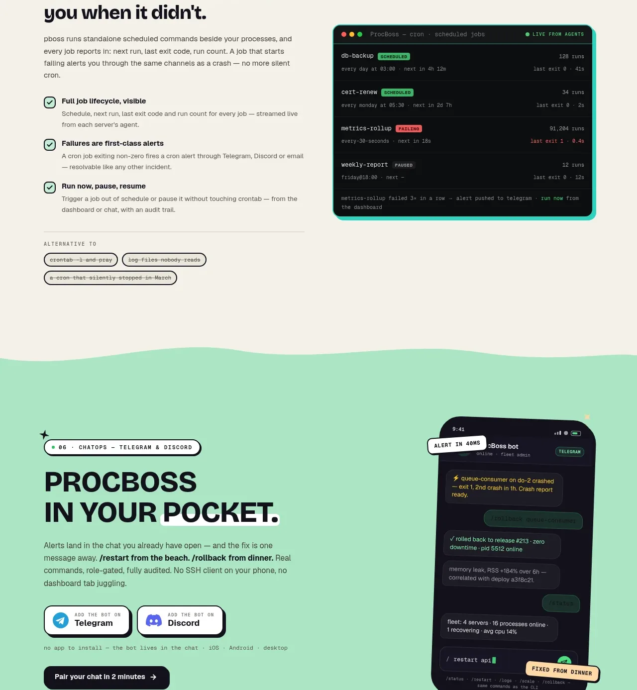
 Pocket alerts call to action
ProcBoss · Call to action
Pocket alerts call to action
ProcBoss · Call to action
 Dark final conversion band
ProcBoss · Call to action
Dark final conversion band
ProcBoss · Call to action
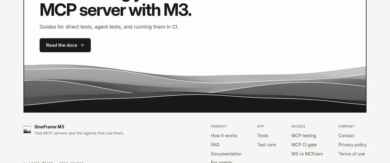
 Documentation call to action
SineFrame M3 · Call to action
Documentation call to action
SineFrame M3 · Call to action
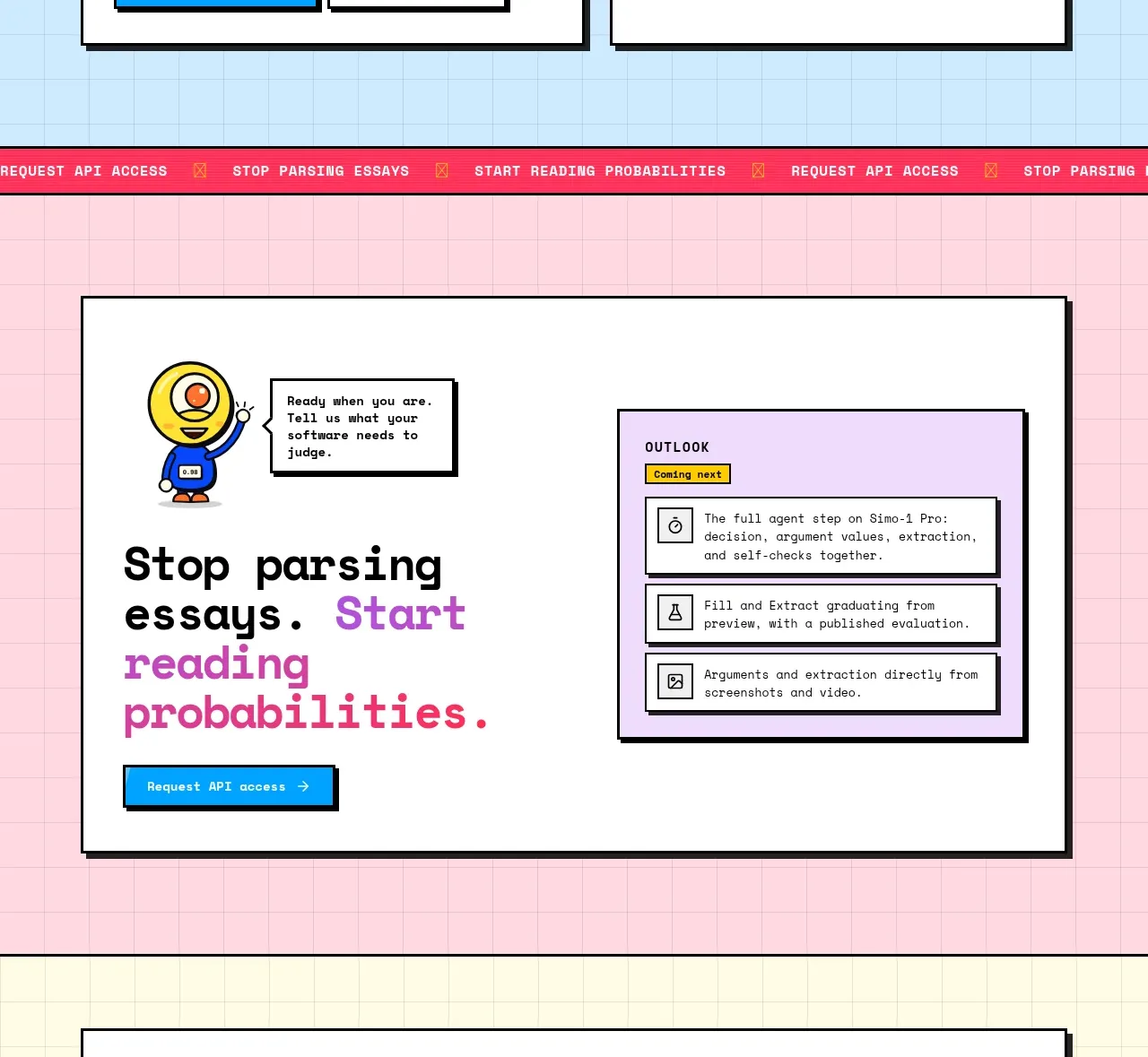
 Conversion call to action
Simo · Call to action
Conversion call to action
Simo · Call to action
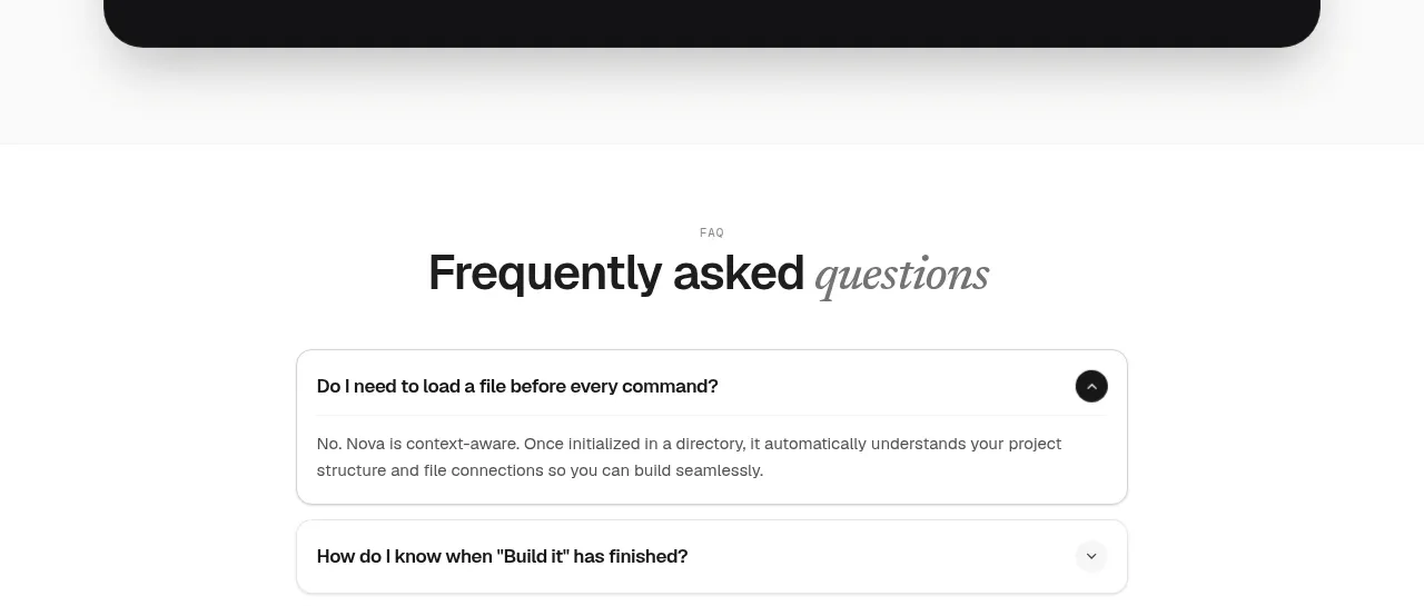
 Install command CTA
NOVA CLI v1.0 · Call to action
Install command CTA
NOVA CLI v1.0 · Call to action

 Manifesto statement
Hark · Call to action
Manifesto statement
Hark · Call to action