kage
kage
Design analysis
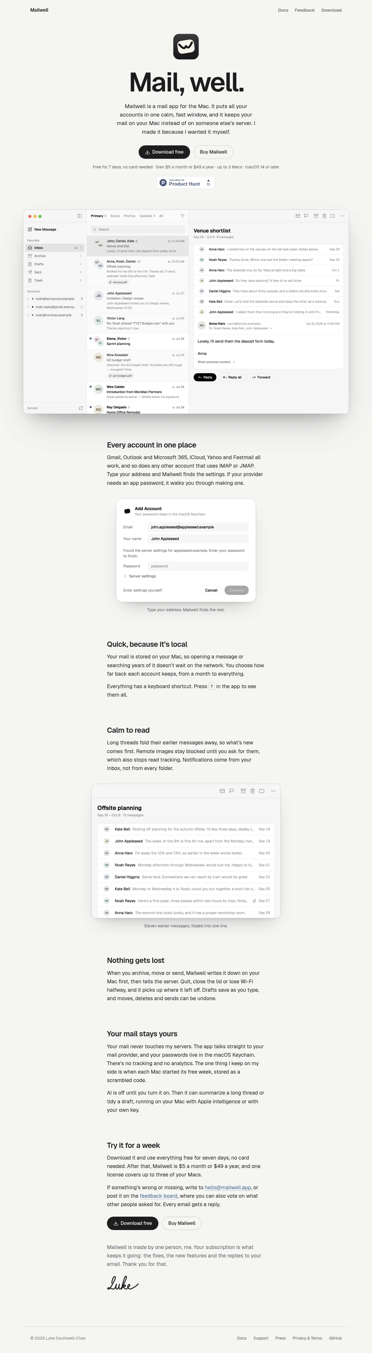
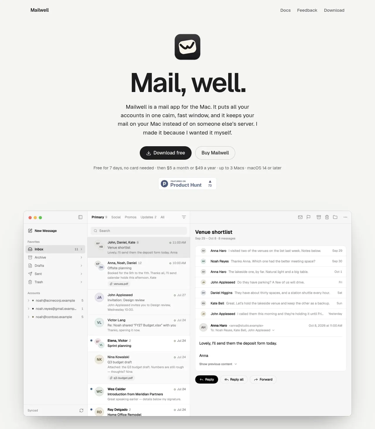
A restrained product landing page for a native Mac mail client. The hero is a compact dark band — short headline, one-line positioning, and a single large app screenshot rendered as the visual proof, framed like a real macOS window. Below the hero the page flips to a light background and settles into a steady product-tour rhythm: alternating rows of text and interface screenshots, each row isolating one capability (multi-account, protocols, keyboard/shortcuts, privacy) with tight paragraph copy rather than marketing fluff. Density stays low and spacing generous throughout, with the interface screenshots doing most of the persuasion; typography is a single neutral sans with strong size contrast between section headings and body. The page closes with a dark footer that visually bookends the dark hero.
Prompt preview
## Reference images

Study these alongside the description below: hierarchy, rhythm, spacing, colour. Build for the product you are asked about, using this design language.

- Full page: https://kage-design-assets.t3.tigrisfiles.io/screenshots/mailwell/88191a7a-ee36-4079-ad0c-b8c821ee63e0-1791525844093-full.webp
- Above the fold: https://kage-design-assets.t3.tigrisfiles.io/screenshots/mailwell/88191a7a-ee36-4079-ad0c-b8c821ee63e0-1791525842226.webp
- Design on Kage: https://kage.design/designs/mailwell-landing-page

## Before you start
Ask the user what they are building, who it is for, and what brand assets they already have (product name, logo, brand colours, typefaces, any real screenshots of their product). Wait for the answers before writing anything. Everything below is applied to *their* product, not to the reference.

## Page structure
1. **Sticky top nav** — slim bar: wordmark left, 4–5 anchor links centre/right, one accent CTA button right ("Download" / equivalent). Minimal border-bottom, no mega-menu.
2. **Dark hero (full viewport)** — centred stack: small eyebrow or version tag, one strong headline (the product category + key differentiator), one supporting line naming supported integrations/protocols, one primary CTA and one secondary text link. Below the copy, a single large screenshot of the real app, styled as an authentic macOS window with subtle rounded corners and a soft shadow, slightly overflowing the dark band so it bridges into the next section.
3. **Light product-tour rows** — 3–5 alternating two-column rows (text left / screenshot right, then flipped). Each row: small section label or heading, one short paragraph of concrete copy about one specific capability, and a real interface screenshot or cropped UI detail. Generous vertical padding (~120px) between rows.
4. **Feature grid** — a 3-up row of compact feature blocks: small inline icon or monochrome glyph, bold one-line title, two lines of body. Same width grid as the rows above, tighter vertical rhythm.
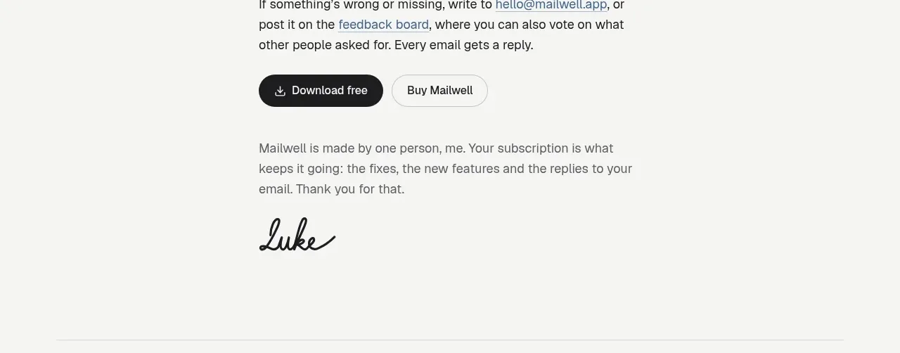
5. **Closing statement band** — a centred single-sentence value restatement plus one repeated CTA button, on a subtly tinted background to break the white rhythm.
6. **Dark footer** — bookends the hero: 4-column link list (Product, Resources, Company, Legal) in small muted type, wordmark and copyright line at the bottom.

## Design language
- **Two-tone architecture**: one dark band at top (hero) and one at bottom (footer), everything between is a single light surface. Use near-black `#0E0F12` for the dark bands, off-white `#FAFAF9`/`#FFFFFF` for the body, `#6B7280` for secondary text.
- **Accents are scarce**: one accent colour reserved for the primary CTA and links only; keep the palette otherwise monochrome so real product screenshots carry the colour.
- **Type**: one neutral grotesque sans (Inter/Söhne-like). Hero headline ~56–64px, section headings ~32–36px, feature titles ~18px semibold, body 16–17px with 1.6 line-height. Contrast of scale does the hierarchy — no weight tricks or display fonts.
- **Hero framing**: the screenshot is treated as evidence, not decoration — real window chrome, subtle 12–16px radius, layered soft shadow (large blur, low opacity), never a flat rectangle.
- **Rhythm**: hero is dense and centred; tour rows are airy with big gaps; the feature grid tightens up again; closing band and footer compress back down. Alternate the left/right placement of screenshots so the eye zigzags down the page.
- **Borders & shadows**: hairline `1px solid #E5E7EB` dividers between light sections; shadows only on screenshots and buttons; radius consistent at 8–12px.
- **Interaction**: nav links and CTAs get simple colour/underline transitions (~150ms); screenshots are static images, no decorative animation required.

## Never
Do not reuse the reference product's name, wordmark, logo, tagline, marketing copy, screenshots or icon set. Build the page around the user's own product, brand assets and real UI captures; never present the result as Mailwell or imply any affiliation.
Components from this page
All components
 Minimal product navigation
Mailwell · Navigation
Minimal product navigation
Mailwell · Navigation
 Product promise with app preview
Mailwell · Hero
Product promise with app preview
Mailwell · Hero
 Unified account setup
Mailwell · Feature grid
Unified account setup
Mailwell · Feature grid
 Fast local workflow and calm reading
Mailwell · Feature grid
Fast local workflow and calm reading
Mailwell · Feature grid
 Reliable, recoverable actions
Mailwell · Feature grid
Reliable, recoverable actions
Mailwell · Feature grid
 Privacy and optional intelligence
Mailwell · Feature grid
Privacy and optional intelligence
Mailwell · Feature grid
 Trial and purchase call to action
Mailwell · Call to action
Trial and purchase call to action
Mailwell · Call to action
 Founder note and utility footer
Mailwell · Footer
Founder note and utility footer
Mailwell · Footer