 kage
kage
mailwell.app

Design analysis
A focused feature band explains broad account compatibility in a narrow reading column and supports it with a centered settings dialog visual. The text-first structure makes the benefit clear before showing the interface detail.
Prompt preview
## Reference images

Study these alongside the description below: hierarchy, rhythm, spacing, colour. Build for the product you are asked about, using this design language.

- Component: https://kage-design-assets.t3.tigrisfiles.io/components/mailwell/88191a7a-ee36-4079-ad0c-b8c821ee63e0-1791525982-2.webp
- Full page it was cut from: https://kage-design-assets.t3.tigrisfiles.io/screenshots/mailwell/88191a7a-ee36-4079-ad0c-b8c821ee63e0-1791525844093-full.webp
- Component on Kage: https://kage.design/component/mailwell-feature-grid

## Before you start
Ask what integrations or setup workflow the user's product needs and what user benefit should lead the section. Apply the principles to that product.

Build a single feature section on the same warm off-white background. Use a centered, narrow content column around 380–440px wide. Start with a 22–26px bold heading, followed by two or three short paragraphs in 15–16px text with a relaxed line height. Place a realistic but simplified product setup/settings panel below the copy, centered and clearly separated by whitespace. The panel should use a white surface, 1px #d8d8d8 border, 12–16px radius, subtle shadow, compact labels, muted helper text, and one obvious disabled or secondary action. Add a small centered caption beneath it. Keep vertical rhythm generous: roughly 56–72px section padding and 28–40px between text, visual, and caption.

Never use logos, product names, copy, illustrations, or imagery from the reference.
More components

 Reliable, recoverable actions
Mailwell · Feature grid
Reliable, recoverable actions
Mailwell · Feature grid
 Privacy and optional intelligence
Mailwell · Feature grid
Privacy and optional intelligence
Mailwell · Feature grid
 Fast local workflow and calm reading
Mailwell · Feature grid
Fast local workflow and calm reading
Mailwell · Feature grid

 Cloud layer workflows
ProcBoss · Feature grid
Cloud layer workflows
ProcBoss · Feature grid
 Operational blind spots
ProcBoss · Feature grid
Operational blind spots
ProcBoss · Feature grid
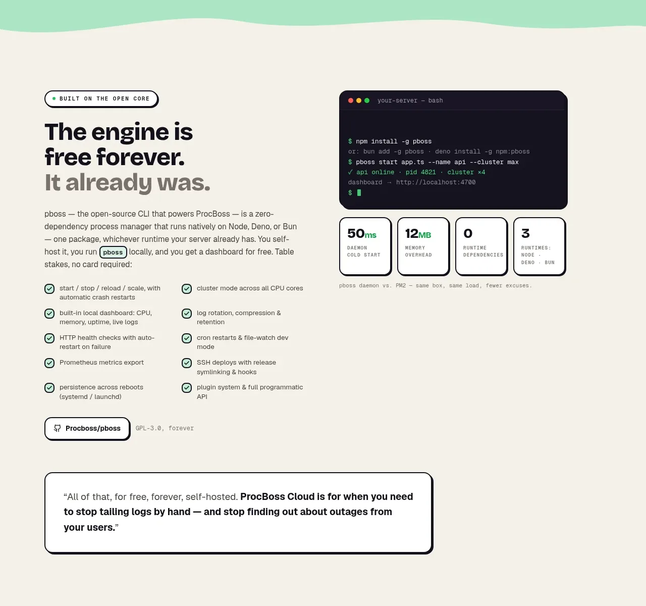 Free forever foundation
ProcBoss · Feature grid
Free forever foundation
ProcBoss · Feature grid