 kage
kage
mailwell.app

Design analysis
A compact text-only feature band communicates that important actions are durable and reversible. Its restrained width and generous whitespace make the claim feel trustworthy.
Prompt preview
## Reference images

Study these alongside the description below: hierarchy, rhythm, spacing, colour. Build for the product you are asked about, using this design language.

- Component: https://kage-design-assets.t3.tigrisfiles.io/components/mailwell/88191a7a-ee36-4079-ad0c-b8c821ee63e0-1791525982-4.webp
- Full page it was cut from: https://kage-design-assets.t3.tigrisfiles.io/screenshots/mailwell/88191a7a-ee36-4079-ad0c-b8c821ee63e0-1791525844093-full.webp
- Component on Kage: https://kage.design/component/mailwell-feature-grid-3

## Before you start
Ask what reliability, persistence, privacy, or recovery promise the user's product makes. Apply the same editorial clarity to that promise.

Build a text-only feature block in a centered column about 380–440px wide. Use a 22–26px semibold heading and a paragraph of 3–5 lines beneath it. Keep the background warm off-white, text near-black #181818, and secondary text around #333. Use 15–16px body type with 1.55 line height, 56–72px top and bottom padding, and 24–30px between heading and paragraph. Do not add cards or decorative graphics; the absence of visual noise should reinforce confidence. If an inline product concept needs emphasis, use weight rather than color.

Never use logos, product names, copy, illustrations, or imagery from the reference.
More components

 Unified account setup
Mailwell · Feature grid
Unified account setup
Mailwell · Feature grid
 Privacy and optional intelligence
Mailwell · Feature grid
Privacy and optional intelligence
Mailwell · Feature grid
 Fast local workflow and calm reading
Mailwell · Feature grid
Fast local workflow and calm reading
Mailwell · Feature grid

 Cloud layer workflows
ProcBoss · Feature grid
Cloud layer workflows
ProcBoss · Feature grid
 Operational blind spots
ProcBoss · Feature grid
Operational blind spots
ProcBoss · Feature grid
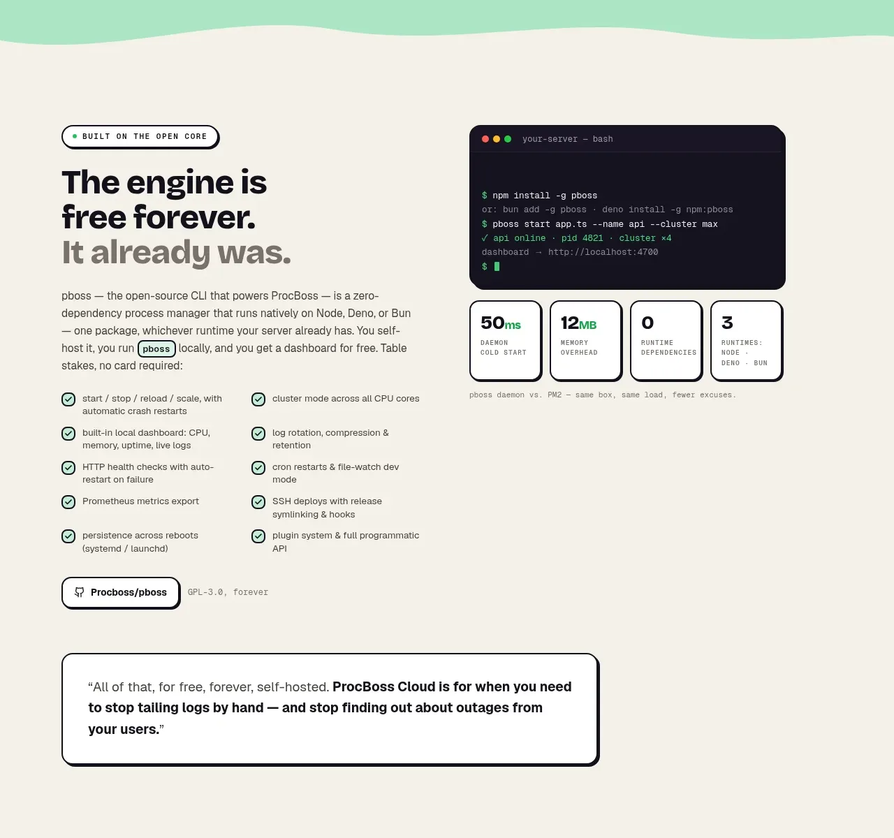 Free forever foundation
ProcBoss · Feature grid
Free forever foundation
ProcBoss · Feature grid