 kage
kage
mailwell.app

Design analysis
This section combines a privacy-first explanation with a clearly optional intelligence capability. The content is split into two paragraphs while maintaining one narrow, readable column and a low-pressure tone.
Prompt preview
## Reference images

Study these alongside the description below: hierarchy, rhythm, spacing, colour. Build for the product you are asked about, using this design language.

- Component: https://kage-design-assets.t3.tigrisfiles.io/components/mailwell/88191a7a-ee36-4079-ad0c-b8c821ee63e0-1791525982-5.webp
- Full page it was cut from: https://kage-design-assets.t3.tigrisfiles.io/screenshots/mailwell/88191a7a-ee36-4079-ad0c-b8c821ee63e0-1791525844093-full.webp
- Component on Kage: https://kage.design/component/mailwell-feature-grid-4

## Before you start
Ask what data boundaries, privacy commitments, and optional automation features matter to the user's product. Apply the principles below without making unsupported claims.

Create a narrow editorial feature section, approximately 380–440px wide, with a strong 22–26px heading and two separated paragraphs. Explain the trust boundary first, then describe any automation or AI as opt-in and user-controlled. Use a warm off-white background, near-black headings, #303030 body text, and muted gray supporting details. Maintain 15–16px body type, 1.55–1.7 line height, and 28–36px between paragraphs. Keep the section visually quiet: no gradients, no oversized illustration, and no dense UI. Let the copy and spacing do the persuasive work.

Never use logos, product names, copy, illustrations, or imagery from the reference.
More components

 Reliable, recoverable actions
Mailwell · Feature grid
Reliable, recoverable actions
Mailwell · Feature grid
 Fast local workflow and calm reading
Mailwell · Feature grid
Fast local workflow and calm reading
Mailwell · Feature grid
 Unified account setup
Mailwell · Feature grid
Unified account setup
Mailwell · Feature grid

 Cloud layer workflows
ProcBoss · Feature grid
Cloud layer workflows
ProcBoss · Feature grid
 Operational blind spots
ProcBoss · Feature grid
Operational blind spots
ProcBoss · Feature grid
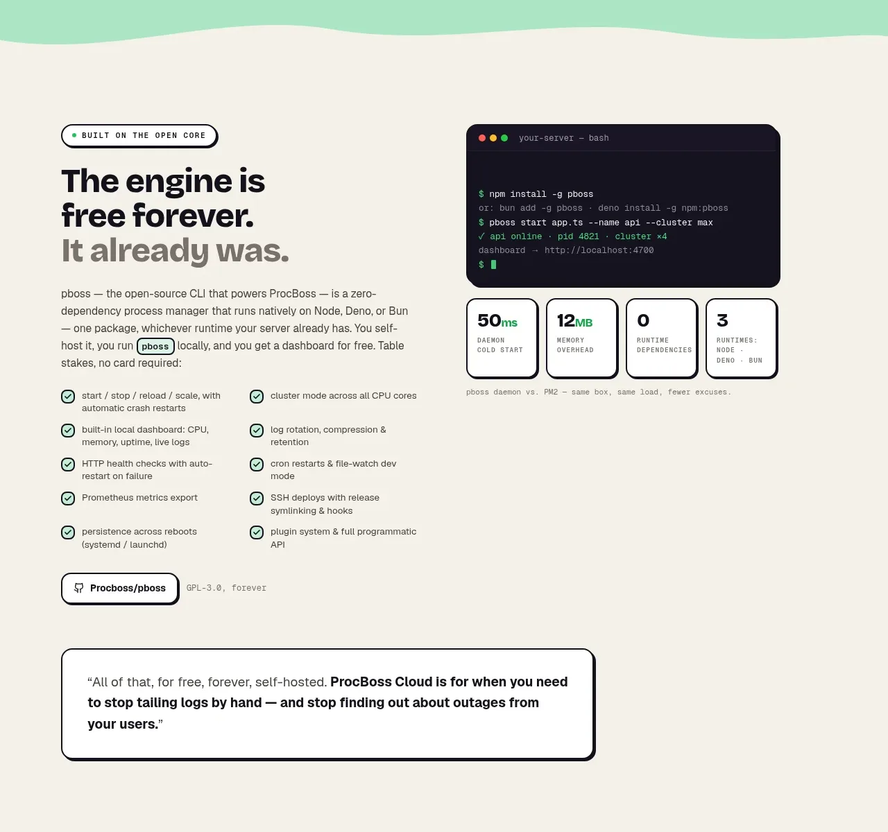 Free forever foundation
ProcBoss · Feature grid
Free forever foundation
ProcBoss · Feature grid