kage
kage
mailwell.app
Design analysis
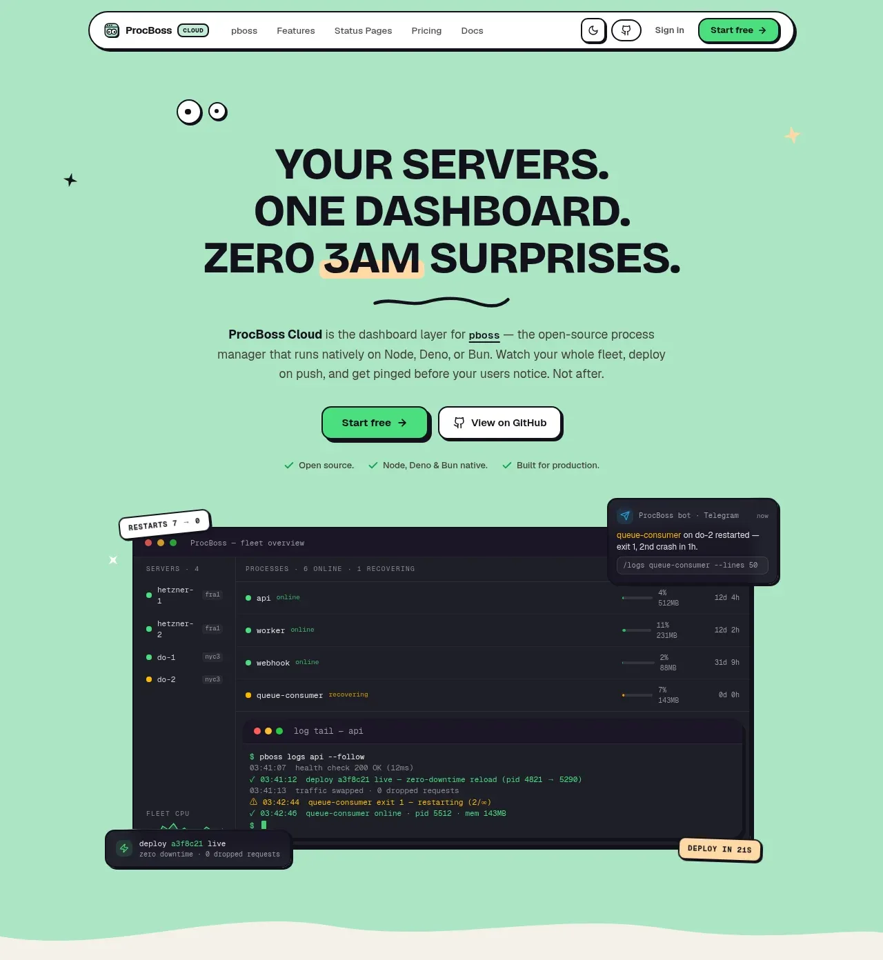
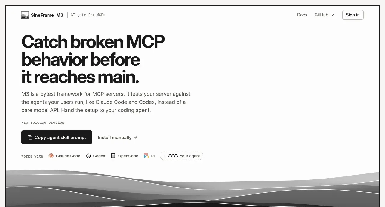
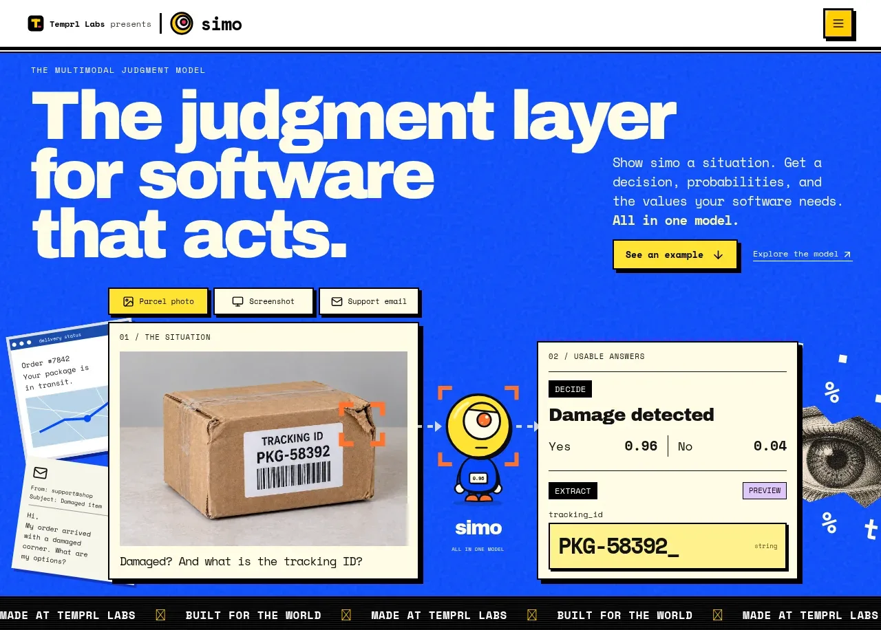
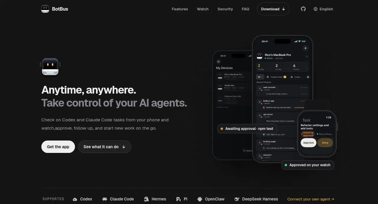
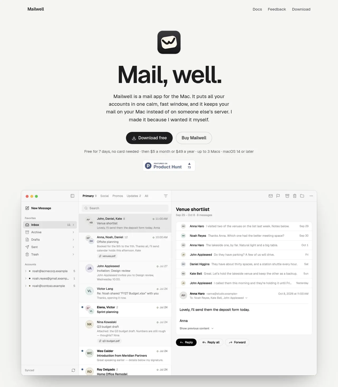
The hero uses a bold, centered promise, concise explanatory copy, paired primary and secondary actions, a small trial note, and a large realistic product screenshot that demonstrates the product immediately.
Prompt preview
## Reference images

Study these alongside the description below: hierarchy, rhythm, spacing, colour. Build for the product you are asked about, using this design language.

- Component: https://kage-design-assets.t3.tigrisfiles.io/components/mailwell/88191a7a-ee36-4079-ad0c-b8c821ee63e0-1791525981-1.webp
- Full page it was cut from: https://kage-design-assets.t3.tigrisfiles.io/screenshots/mailwell/88191a7a-ee36-4079-ad0c-b8c821ee63e0-1791525844093-full.webp
- Component on Kage: https://kage.design/component/mailwell-hero

## Before you start
Ask what the user's product does, what makes it distinct, and which action matters most. Apply the principles below to that product and its brand.

Create a centered hero beneath the navigation on a warm off-white canvas. Stack a small rounded app/product icon, an oversized black headline, a narrow paragraph with a comfortable 1.55 line height, and two pill-shaped actions. Make the primary action black with white text and the secondary action white/off-white with a thin gray border. Add a very small muted trial or reassurance line beneath the buttons, then a compact credibility badge if the product has one. Finish the hero with a large, centered product UI preview extending nearly edge to edge but retaining generous side margins; give it a subtle gray border, 10–14px radius, and soft shadow. Use a responsive layout so the preview remains legible and crops gracefully on narrow screens. The headline should be approximately 58–72px desktop and the supporting copy approximately 16px.

Never use logos, product names, copy, illustrations, or imagery from the reference.