kage
kage
mailyte.com
Design analysis
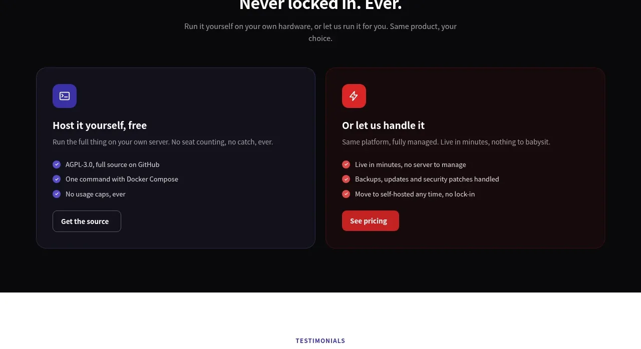
A dark section frames an open-source message above two contrasting cards, helping visitors choose between self-hosting and managed service.
Prompt preview
## Reference images

Study these alongside the description below: hierarchy, rhythm, spacing, colour. Build for the product you are asked about, using this design language.

- Component: https://kage-design-assets.t3.tigrisfiles.io/components/mailyte/142780af-add7-4be9-ae30-6edb3206e4e0-1789538515-8.webp
- Full page it was cut from: https://kage-design-assets.t3.tigrisfiles.io/screenshots/mailyte/142780af-add7-4be9-ae30-6edb3206e4e0-1789538442487-full.webp
- Component on Kage: https://kage.design/component/mailyte-card

## Before you start
Ask what the user's product, audience, and brand are, then apply the principles below to that product rather than reproducing the reference.

Design a dark comparison section with a centered eyebrow, heading, and short supporting paragraph, followed by two equal cards. Each card should have a colored icon tile, a clear option title, short description, three checkmarked benefits, and one CTA. Differentiate the options with cool indigo/blue and warm red accents while keeping both cards equally legible. Use background #09090c, card surfaces #14131b and #1d0d10, thin borders #2a2931, 18px radii, 32px internal padding, #f3f1f6 headings, and #aaa7b0 body text. On mobile stack cards; make the comparison scannable and avoid implying one option is universally superior.

Never: use logos, product names, copy, illustrations, or imagery from the reference.