 kage
kage
mailyte.com
Design analysis
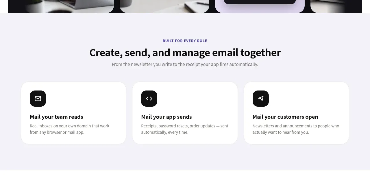
A pale section introduces the product through three equal cards, each mapping a distinct role in the workflow to a concise benefit.
Prompt preview
## Reference images

Study these alongside the description below: hierarchy, rhythm, spacing, colour. Build for the product you are asked about, using this design language.

- Component: https://kage-design-assets.t3.tigrisfiles.io/components/mailyte/142780af-add7-4be9-ae30-6edb3206e4e0-1789538513-2.webp
- Full page it was cut from: https://kage-design-assets.t3.tigrisfiles.io/screenshots/mailyte/142780af-add7-4be9-ae30-6edb3206e4e0-1789538442487-full.webp
- Component on Kage: https://kage.design/component/mailyte-feature-grid

## Before you start
Ask what the user's product, audience, and brand are, then apply the principles below to that product rather than reproducing the reference.

Build a light feature-introduction section with a centered eyebrow, strong heading, and one-line supporting copy. Below it place three equal-width cards in a responsive grid, each with a black or brand-colored icon tile, a concise benefit headline, and two lines of explanatory copy. Use a very pale lavender-gray background (#f5f4fb), dark text (#16151b), muted copy (#777681), white cards, 16–20px card radius, a subtle #e9e8ee border, and a soft shadow only on hover. Keep the grid inside a 800px–1100px max-width container with 16px gaps and 48–72px vertical padding. Cards should equalize in height and become one column on mobile; add a small lift and border-color transition on hover.

Never: use logos, product names, copy, illustrations, or imagery from the reference.
More components

 Authentication product capabilities
tiun. · Feature grid
Authentication product capabilities
tiun. · Feature grid
 Customer data and user management
tiun. · Feature grid
Customer data and user management
tiun. · Feature grid
 Problem and unified solution narrative
tiun. · Feature grid
Problem and unified solution narrative
tiun. · Feature grid
 Integration and agent workflow
tiun. · Feature grid
Integration and agent workflow
tiun. · Feature grid
 Billing and checkout capabilities
tiun. · Feature grid
Billing and checkout capabilities
tiun. · Feature grid

 Receiving money channels
Payflip · Feature grid
Receiving money channels
Payflip · Feature grid