 kage
kage
mailyte.com
Design analysis
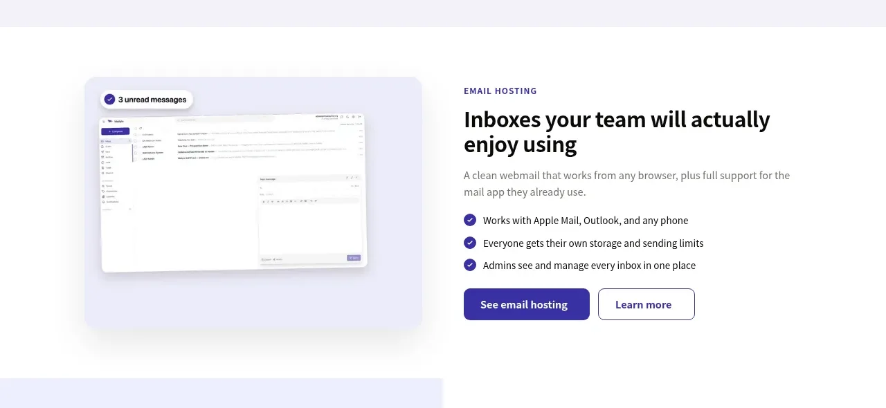
A two-column feature band pairs a product screenshot area with a text block containing benefits, checklist bullets, and dual actions.
Prompt preview
## Reference images

Study these alongside the description below: hierarchy, rhythm, spacing, colour. Build for the product you are asked about, using this design language.

- Component: https://kage-design-assets.t3.tigrisfiles.io/components/mailyte/142780af-add7-4be9-ae30-6edb3206e4e0-1789538513-3.webp
- Full page it was cut from: https://kage-design-assets.t3.tigrisfiles.io/screenshots/mailyte/142780af-add7-4be9-ae30-6edb3206e4e0-1789538442487-full.webp
- Component on Kage: https://kage.design/component/mailyte-feature-grid-2

## Before you start
Ask what the user's product, audience, and brand are, then apply the principles below to that product rather than reproducing the reference.

Create a two-column product feature section for a core capability. Put a large rounded product UI mockup or user-provided screenshot on one side inside a softly tinted visual frame, and on the other side use a small uppercase eyebrow, 32–40px heading, concise paragraph, three checkmark benefits, and primary/secondary buttons. Alternate the image side on later feature sections to create visual rhythm. Use a white background, #4a3bb0 accent text/icons, #77747d body text, 20px visual radius, 8px buttons, and 80–120px vertical padding. Align the text vertically around the visual center; on mobile stack the visual before the copy and preserve readable spacing.

Never: use logos, product names, copy, illustrations, or imagery from the reference.
More components

 Authentication product capabilities
tiun. · Feature grid
Authentication product capabilities
tiun. · Feature grid
 Customer data and user management
tiun. · Feature grid
Customer data and user management
tiun. · Feature grid
 Problem and unified solution narrative
tiun. · Feature grid
Problem and unified solution narrative
tiun. · Feature grid
 Integration and agent workflow
tiun. · Feature grid
Integration and agent workflow
tiun. · Feature grid
 Billing and checkout capabilities
tiun. · Feature grid
Billing and checkout capabilities
tiun. · Feature grid

 Receiving money channels
Payflip · Feature grid
Receiving money channels
Payflip · Feature grid