 kage
kage
mailyte.com
Design analysis
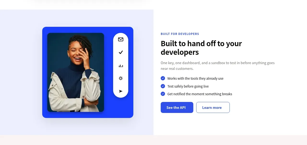
The second split feature targets developers with a bold visual card, clear value proposition, checklist, and API-oriented CTA.
Prompt preview
## Reference images

Study these alongside the description below: hierarchy, rhythm, spacing, colour. Build for the product you are asked about, using this design language.

- Component: https://kage-design-assets.t3.tigrisfiles.io/components/mailyte/142780af-add7-4be9-ae30-6edb3206e4e0-1789538514-4.webp
- Full page it was cut from: https://kage-design-assets.t3.tigrisfiles.io/screenshots/mailyte/142780af-add7-4be9-ae30-6edb3206e4e0-1789538442487-full.webp
- Component on Kage: https://kage.design/component/mailyte-feature-grid-3

## Before you start
Ask what the user's product, audience, and brand are, then apply the principles below to that product rather than reproducing the reference.

Build a developer-oriented split feature with the image/mockup on the left and copy on the right. Use a tinted lavender visual canvas containing a bold, framed interface or abstract product screenshot; do not make the visual decorative without communicating product use. The copy should include an eyebrow, 32–40px heading, short explanation, three concise checked benefits, and a filled technical CTA plus an outlined learn-more action. Use #f6f6ff or a similarly soft canvas, #17151d headings, #6f6c76 body text, cobalt blue (#3155e8) for buttons and checks, 18–24px radii, and 80–120px section padding. Ensure the layout reverses cleanly on mobile and all actions have focus states.

Never: use logos, product names, copy, illustrations, or imagery from the reference.
More components

 Authentication product capabilities
tiun. · Feature grid
Authentication product capabilities
tiun. · Feature grid
 Customer data and user management
tiun. · Feature grid
Customer data and user management
tiun. · Feature grid
 Problem and unified solution narrative
tiun. · Feature grid
Problem and unified solution narrative
tiun. · Feature grid
 Integration and agent workflow
tiun. · Feature grid
Integration and agent workflow
tiun. · Feature grid
 Billing and checkout capabilities
tiun. · Feature grid
Billing and checkout capabilities
tiun. · Feature grid

 Receiving money channels
Payflip · Feature grid
Receiving money channels
Payflip · Feature grid