 kage
kage
mailyte.com
Design analysis
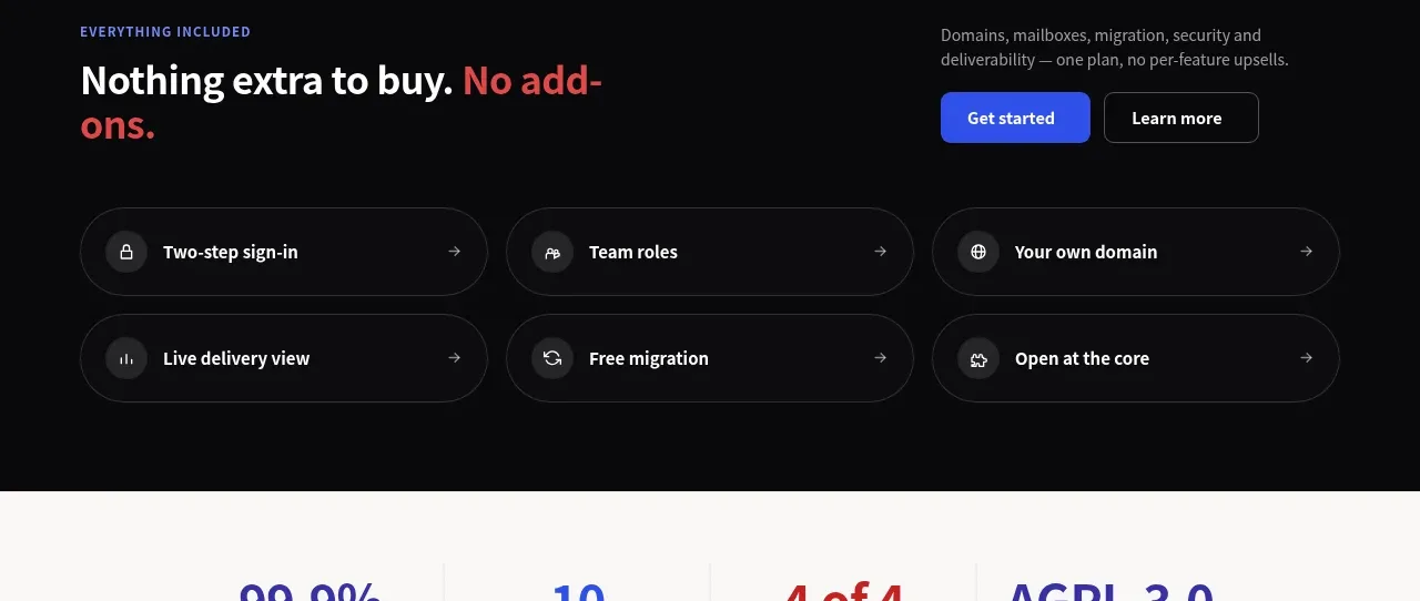
A dark reassurance block combines a bold value statement and CTAs with six compact capability pills arranged in two rows.
Prompt preview
## Reference images

Study these alongside the description below: hierarchy, rhythm, spacing, colour. Build for the product you are asked about, using this design language.

- Component: https://kage-design-assets.t3.tigrisfiles.io/components/mailyte/142780af-add7-4be9-ae30-6edb3206e4e0-1789538515-6.webp
- Full page it was cut from: https://kage-design-assets.t3.tigrisfiles.io/screenshots/mailyte/142780af-add7-4be9-ae30-6edb3206e4e0-1789538442487-full.webp
- Component on Kage: https://kage.design/component/mailyte-feature-grid-4

## Before you start
Ask what the user's product, audience, and brand are, then apply the principles below to that product rather than reproducing the reference.

Create a dark “everything included” section using #09090c or near-black. The top row should have a left-aligned eyebrow and large headline, with a short explanation and two actions aligned to the right on desktop. Below, show six compact capability rows in a three-column grid, each as a pill-like bordered surface with an icon, concise label, and trailing arrow. Use #f4f2f7 headings, #a3a0aa supporting text, subtle #292830 borders, 18–28px pill radii, and a restrained indigo/red accent system. Keep 64–88px vertical padding, 16px grid gaps, and make pills keyboard-focusable with hover border and background changes. Stack the intro and use two columns or one column on smaller screens.

Never: use logos, product names, copy, illustrations, or imagery from the reference.
More components

 Authentication product capabilities
tiun. · Feature grid
Authentication product capabilities
tiun. · Feature grid
 Customer data and user management
tiun. · Feature grid
Customer data and user management
tiun. · Feature grid
 Problem and unified solution narrative
tiun. · Feature grid
Problem and unified solution narrative
tiun. · Feature grid
 Integration and agent workflow
tiun. · Feature grid
Integration and agent workflow
tiun. · Feature grid
 Billing and checkout capabilities
tiun. · Feature grid
Billing and checkout capabilities
tiun. · Feature grid

 Receiving money channels
Payflip · Feature grid
Receiving money channels
Payflip · Feature grid