kage
kage
mailyte.com

Design analysis
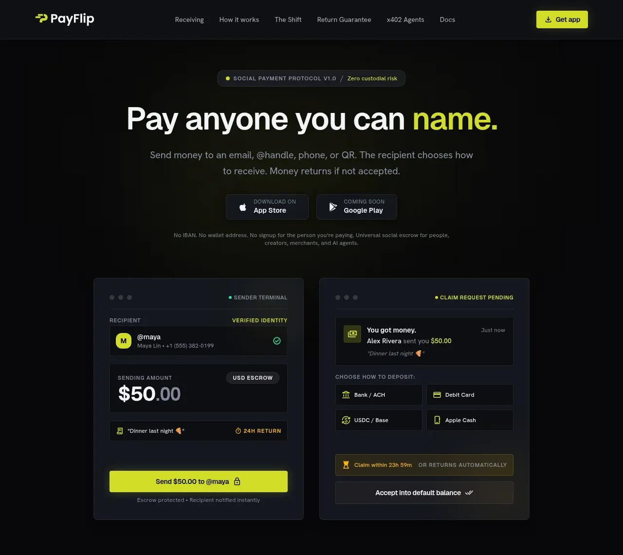
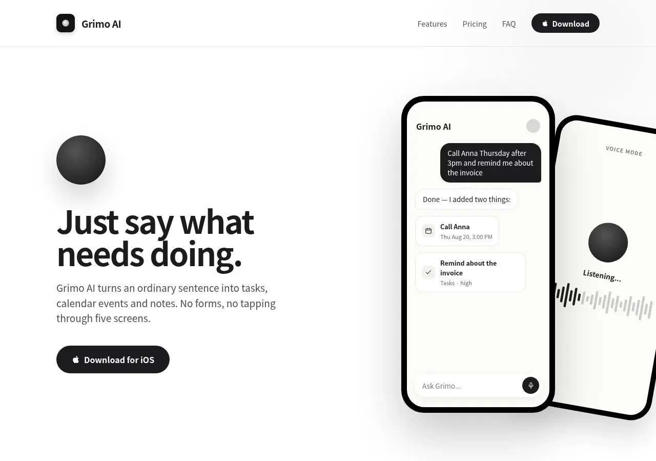
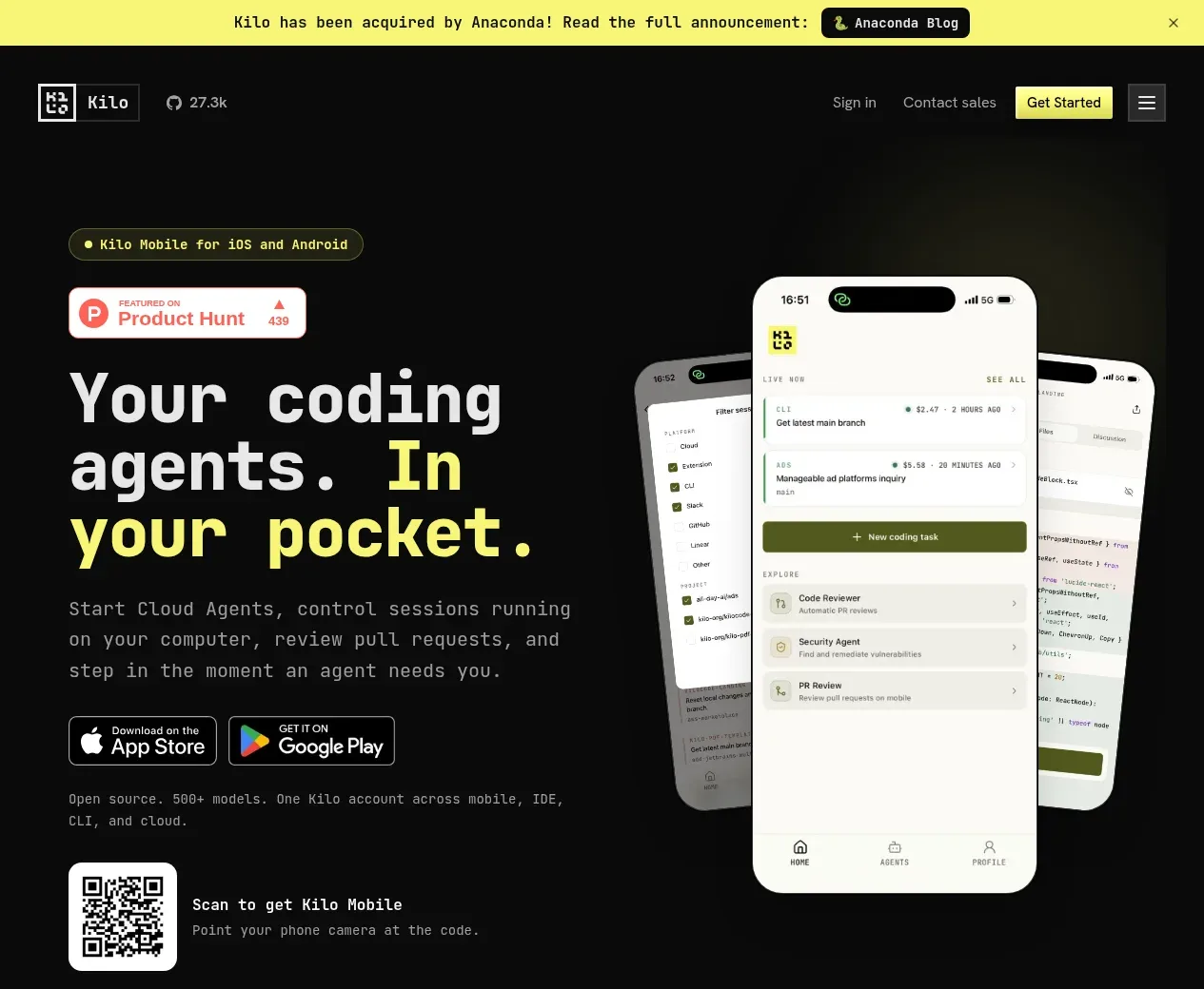
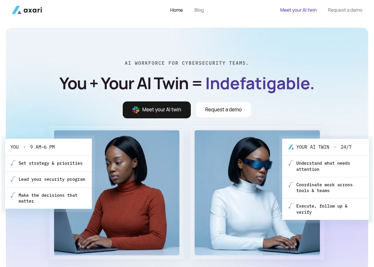
The dark hero pairs a large, expressive headline with two CTAs, reassurance copy, customer proof, and a wide visual collage that gives the product emotional and functional context.
Prompt preview
## Reference images

Study these alongside the description below: hierarchy, rhythm, spacing, colour. Build for the product you are asked about, using this design language.

- Component: https://kage-design-assets.t3.tigrisfiles.io/components/mailyte/142780af-add7-4be9-ae30-6edb3206e4e0-1789538513-1.webp
- Full page it was cut from: https://kage-design-assets.t3.tigrisfiles.io/screenshots/mailyte/142780af-add7-4be9-ae30-6edb3206e4e0-1789538442487-full.webp
- Component on Kage: https://kage.design/component/mailyte-hero

## Before you start
Ask what the user's product, audience, and brand are, then apply the principles below to that product rather than reproducing the reference.

Create a dark, high-impact SaaS hero directly below the navigation. Use a near-black panel (#121116) with generous top padding, a centered max-width text column, a 64–76px responsive headline, short muted supporting copy, and two adjacent CTAs: a filled brand button and a bordered secondary action. Add a small reassurance line below the buttons, then a compact “trusted by” label and a horizontal row of placeholder customer names or abstract marks. End the hero with a full-width, edge-to-edge collage of 3–4 rounded visual panels, varying widths slightly to create rhythm; keep the collage clipped within the hero and use 16–22px radii. Use white headline text, #a8a5b0 body text, electric blue and violet accents (#3155e8, #4b35a8), 8px button radii, and 24–32px section gaps. On small screens stack the CTAs and allow the collage to horizontally crop without causing page overflow.

Never: use logos, product names, copy, illustrations, or imagery from the reference.