kage
kage
mailyte.com
Design analysis
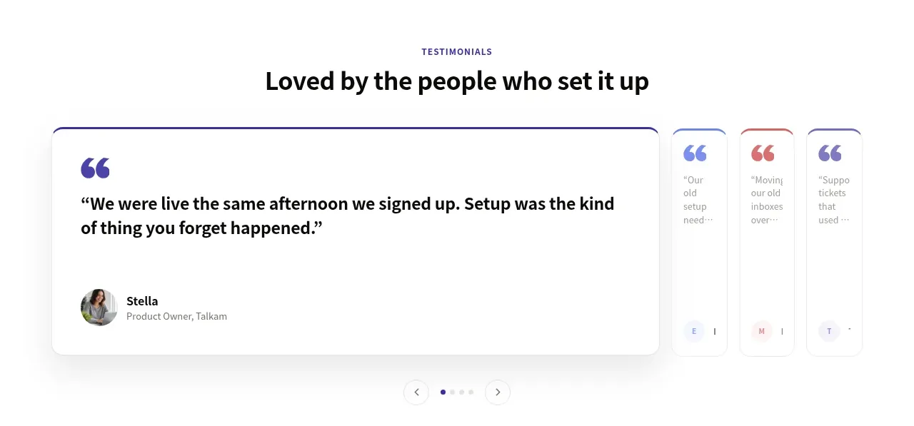
A testimonial section uses one dominant quote card, smaller neighboring previews, and pagination to create a polished carousel without overwhelming the page.
Prompt preview
## Reference images

Study these alongside the description below: hierarchy, rhythm, spacing, colour. Build for the product you are asked about, using this design language.

- Component: https://kage-design-assets.t3.tigrisfiles.io/components/mailyte/142780af-add7-4be9-ae30-6edb3206e4e0-1789538516-9.webp
- Full page it was cut from: https://kage-design-assets.t3.tigrisfiles.io/screenshots/mailyte/142780af-add7-4be9-ae30-6edb3206e4e0-1789538442487-full.webp
- Component on Kage: https://kage.design/component/mailyte-testimonials

## Before you start
Ask what the user's product, audience, and brand are, then apply the principles below to that product rather than reproducing the reference.

Build a testimonial carousel section with a centered eyebrow and heading, then a wide content area featuring one large active quote card and two partially visible neighboring cards or previews. The active card should contain an oversized quotation mark, a 1–2 sentence quote, avatar placeholder, person name, and role/company field. Use a white background, subtle #e8e7ed borders, a top accent line in the brand color, 16px radius, soft shadow, dark #16151b quote text, and muted metadata. Add previous/next controls and dot pagination below; support swipe, keyboard controls, pause-on-hover, and reduced motion. On mobile show one card at a time and preserve generous 64–96px section padding.

Never: use logos, product names, copy, illustrations, or imagery from the reference.