 kage
kage
make0.ai

Design analysis
This section presents one portable memory layer beside a lightweight connection diagram linking multiple AI tools.
Prompt preview
## Reference images

Study these alongside the description below: hierarchy, rhythm, spacing, colour. Build for the product you are asked about, using this design language.

- Component: https://kage-design-assets.t3.tigrisfiles.io/components/make0-brain/19c81372-003a-4a5c-a9ad-89626e51177c-1792044274-2.webp
- Full page it was cut from: https://kage-design-assets.t3.tigrisfiles.io/screenshots/make0-brain/19c81372-003a-4a5c-a9ad-89626e51177c-1792044170316-full.webp
- Component on Kage: https://kage.design/component/make0-brain-feature-grid-2

## Before you start
Ask what the user's product and brand are, then apply these principles to that product rather than reproducing the reference.

Build a compact feature band with an uppercase eyebrow, a large two-line heading, and a concise paragraph on the left. On the right, show an abstract integration diagram: one central rounded card connected by thin pale lines to several small stacked app cards. Keep the diagram decorative but understandable, with soft shadows and lots of empty space. Use a warm white background, black typography, muted gray body text, orange-red accent details around `#f4512a`, 12–16px radii, and a thin divider at the bottom. Align the text and diagram to one grid and stack them vertically on mobile.

Never: use logos, product names, copy, illustrations, or imagery from the reference.
More components

 Research and automation capabilities
AdAnt 2.0 · Feature grid
Research and automation capabilities
AdAnt 2.0 · Feature grid
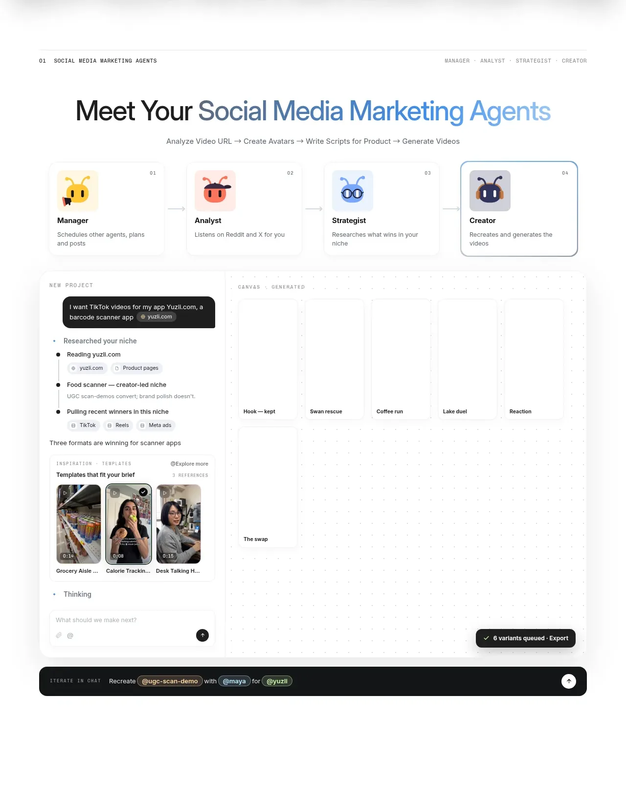 Agent team workspace
AdAnt 2.0 · Feature grid
Agent team workspace
AdAnt 2.0 · Feature grid

 Audience and use cases
AirJelly · Feature grid
Audience and use cases
AirJelly · Feature grid
 Real work handled showcase
AirJelly · Feature grid
Real work handled showcase
AirJelly · Feature grid
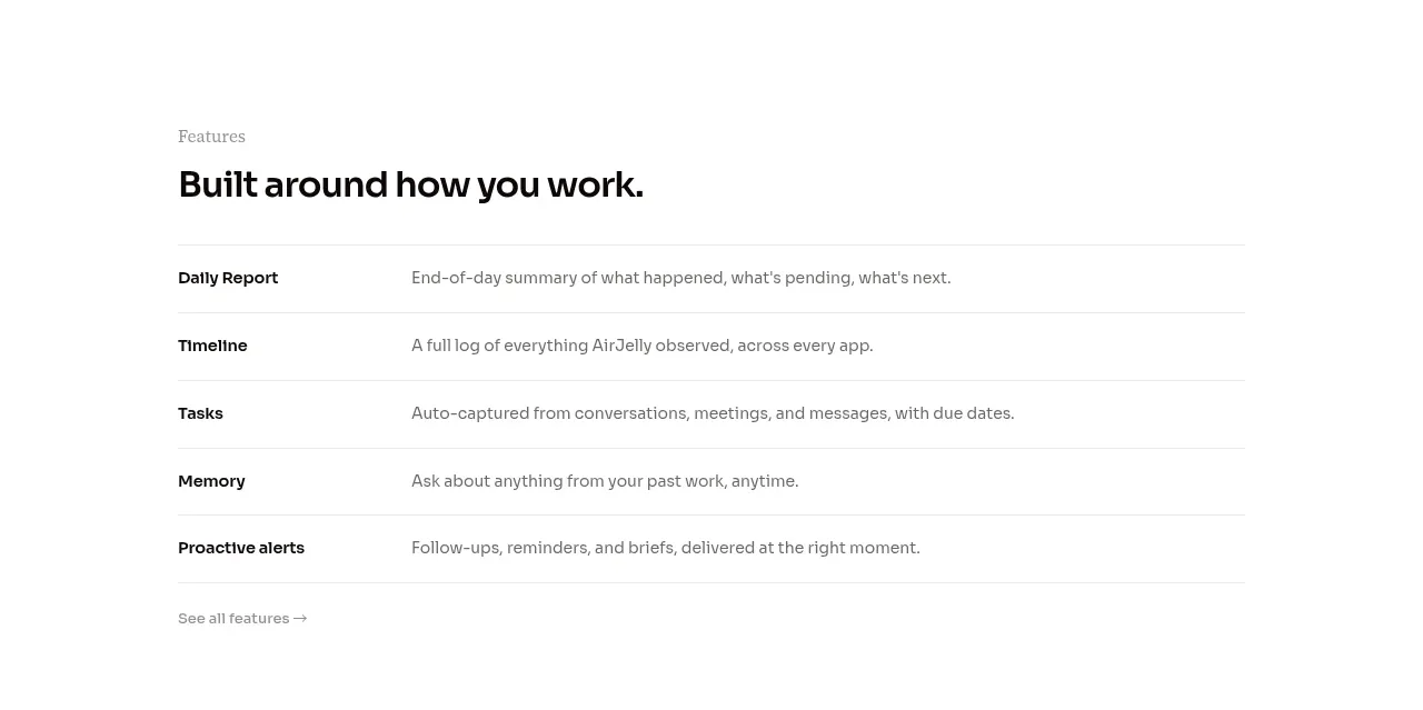 Feature capabilities list
AirJelly · Feature grid
Feature capabilities list
AirJelly · Feature grid
 How the product works demo
AirJelly · Feature grid
How the product works demo
AirJelly · Feature grid