 kage
kage
make0.ai

Design analysis
A setup-focused section pairs an approachable promise with a visual source-to-brain flow made from small connected cards.
Prompt preview
## Reference images

Study these alongside the description below: hierarchy, rhythm, spacing, colour. Build for the product you are asked about, using this design language.

- Component: https://kage-design-assets.t3.tigrisfiles.io/components/make0-brain/19c81372-003a-4a5c-a9ad-89626e51177c-1792044275-3.webp
- Full page it was cut from: https://kage-design-assets.t3.tigrisfiles.io/screenshots/make0-brain/19c81372-003a-4a5c-a9ad-89626e51177c-1792044170316-full.webp
- Component on Kage: https://kage.design/component/make0-brain-feature-grid-3

## Before you start
Ask what the user's product and brand are, then apply these principles to that product rather than reproducing the reference.

Create a “get started” feature section with a small uppercase label, a bold two-line heading, and a short paragraph on the left. On the right, design a simple flow visualization: several compact source cards arranged in a loose grid feed through subtle connector lines into one larger destination card. Use off-white and white surfaces, light gray borders, tiny metadata labels, and one orange accent to show the destination or active state. Keep the visual airy rather than technical, with 72–96px section padding, 40–48px heading size, 12px card radii, and graceful stacking on mobile.

Never: use logos, product names, copy, illustrations, or imagery from the reference.
More components

 Research and automation capabilities
AdAnt 2.0 · Feature grid
Research and automation capabilities
AdAnt 2.0 · Feature grid
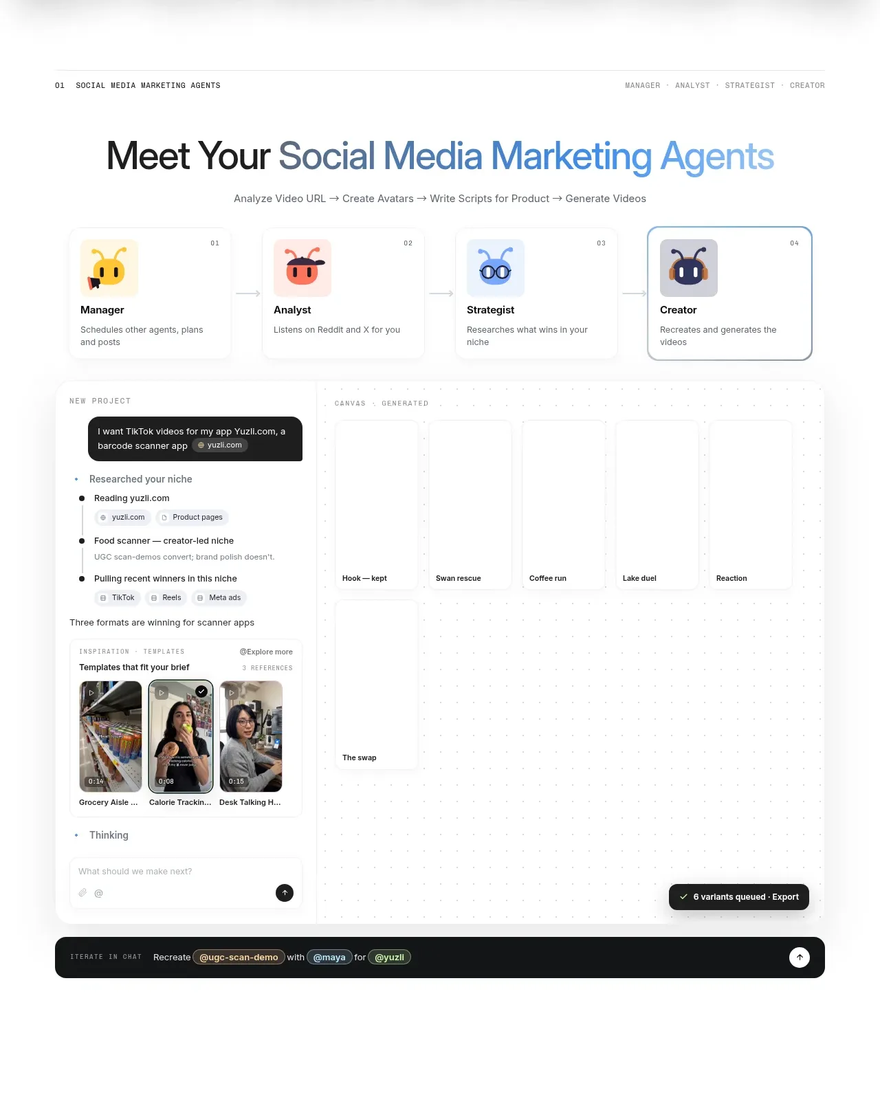 Agent team workspace
AdAnt 2.0 · Feature grid
Agent team workspace
AdAnt 2.0 · Feature grid

 Audience and use cases
AirJelly · Feature grid
Audience and use cases
AirJelly · Feature grid
 Real work handled showcase
AirJelly · Feature grid
Real work handled showcase
AirJelly · Feature grid
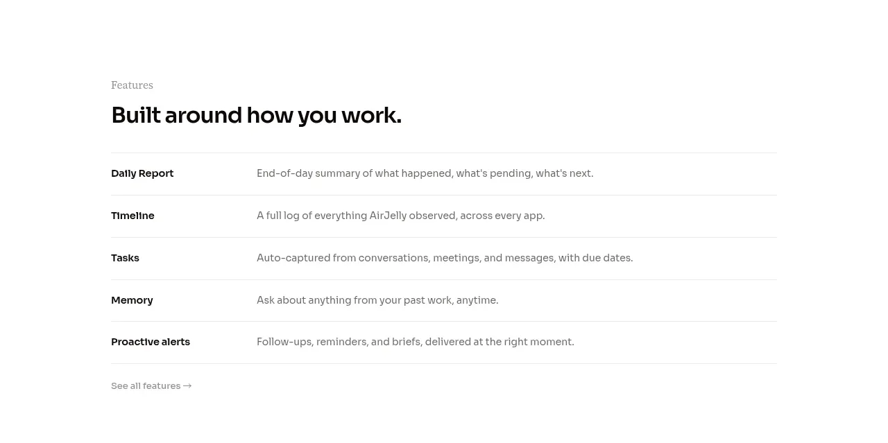 Feature capabilities list
AirJelly · Feature grid
Feature capabilities list
AirJelly · Feature grid
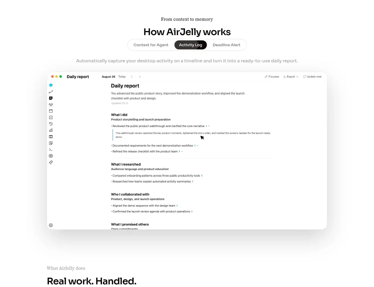 How the product works demo
AirJelly · Feature grid
How the product works demo
AirJelly · Feature grid