 kage
kage
marqly.com
Design analysis
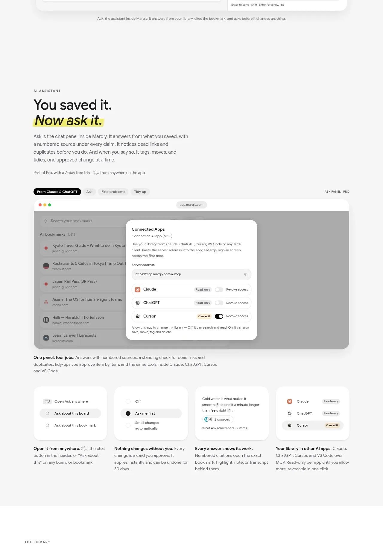
This section introduces the AI assistant through a text-led heading, a large connected-app interface demo, and four concise capability cards underneath.
Prompt preview
## Reference images

Study these alongside the description below: hierarchy, rhythm, spacing, colour. Build for the product you are asked about, using this design language.

- Component: https://kage-design-assets.t3.tigrisfiles.io/components/marqly-6-0/c854bda3-2558-4a76-a0fe-ed0b4296df4d-1789452130-2.webp
- Full page it was cut from: https://kage-design-assets.t3.tigrisfiles.io/screenshots/marqly-6-0/c854bda3-2558-4a76-a0fe-ed0b4296df4d-1789452075868-full.webp
- Component on Kage: https://kage.design/component/marqly-6-0-feature-grid

## Before you start
Ask what the user's product is, who it serves, and what its brand personality should be. Apply the principles below to that product rather than copying the reference.

Build a feature section for an AI assistant. Start with a left-aligned eyebrow, bold two-line heading with a highlighted phrase, and a short paragraph. Follow it with a large browser/app mockup showing integrations or permissions in a centered modal, then a four-column row of compact explanatory cards. Use an airy off-white background #f7f7f6, near-black #151619 typography, and a restrained accent yellow #f5ed4d for emphasis. Set the heading around 34–42px with tight line-height, body text at 14px, and card labels around 13px. Use 16–20px card radius, faint #e5e5e3 borders, white surfaces, soft 0 12px 32px rgba(20,20,20,.08) shadows, and 48–64px section padding. Make cards equal height, keep the mockup wider than the text column, and add a responsive two-column/mobile stack. Visible controls may include tabs, permission pills, toggles, and primary/secondary buttons, but keep interactions functional.

Never: use the reference logo, product name, copy, illustrations, imagery, or brand assets.







