 kage
kage
marqly.com
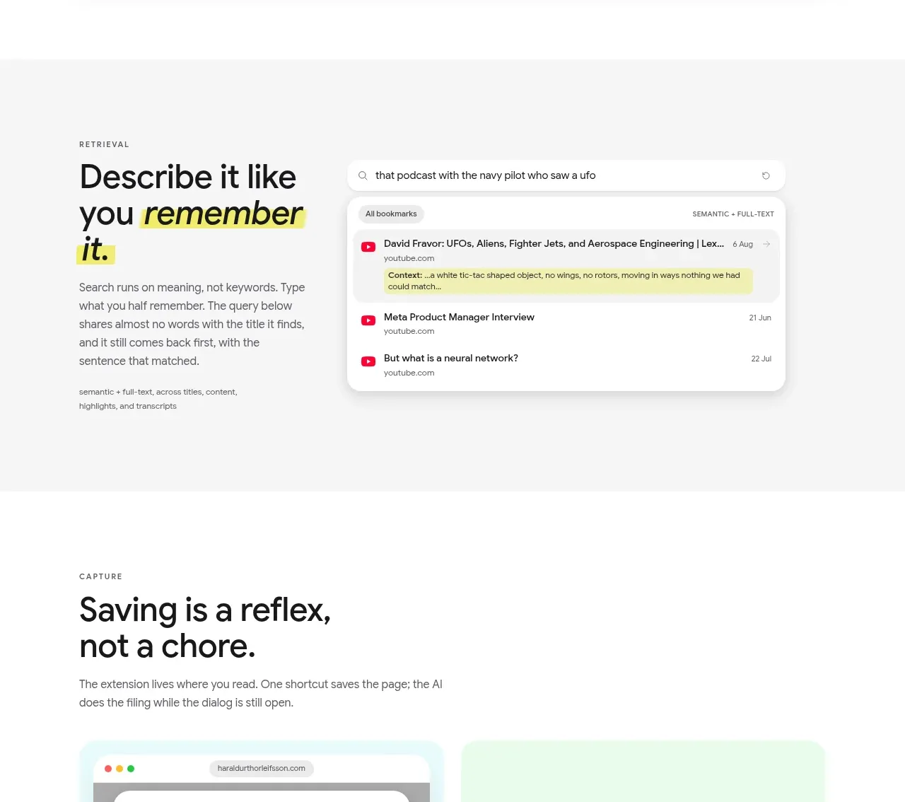
Design analysis
A split feature band contrasts a clear benefit statement on the left with a focused semantic-search interface on the right.
Prompt preview
## Reference images

Study these alongside the description below: hierarchy, rhythm, spacing, colour. Build for the product you are asked about, using this design language.

- Component: https://kage-design-assets.t3.tigrisfiles.io/components/marqly-6-0/c854bda3-2558-4a76-a0fe-ed0b4296df4d-1789452132-4.webp
- Full page it was cut from: https://kage-design-assets.t3.tigrisfiles.io/screenshots/marqly-6-0/c854bda3-2558-4a76-a0fe-ed0b4296df4d-1789452075868-full.webp
- Component on Kage: https://kage.design/component/marqly-6-0-feature-grid-2

## Before you start
Ask what the user's product is, who it serves, and what its brand personality should be. Apply the principles below to that product rather than copying the reference.

Build a split feature section explaining natural-language or semantic search. Align an eyebrow, 36–44px heading, body copy, and a small supporting metadata line in a left column; place a wide search-results panel in a right column. The panel should include a search field, a semantic/full-text indicator, result rows, highlighted matching text, source labels, and timestamps. Use a warm off-white background #f5f5f3, white panel #ffffff, near-black #171717, muted #747474, and a restrained pink/red accent #e94b72 for selected results. Use 20px panel radius, subtle border #e5e5e3, soft shadow, 64–96px vertical padding, and generous column gap. On mobile, stack the panel beneath the copy. Add hover states to result rows and a clear focus state for the search field.

Never: use the reference logo, product name, copy, illustrations, imagery, or brand assets.







