 kage
kage
marqly.com
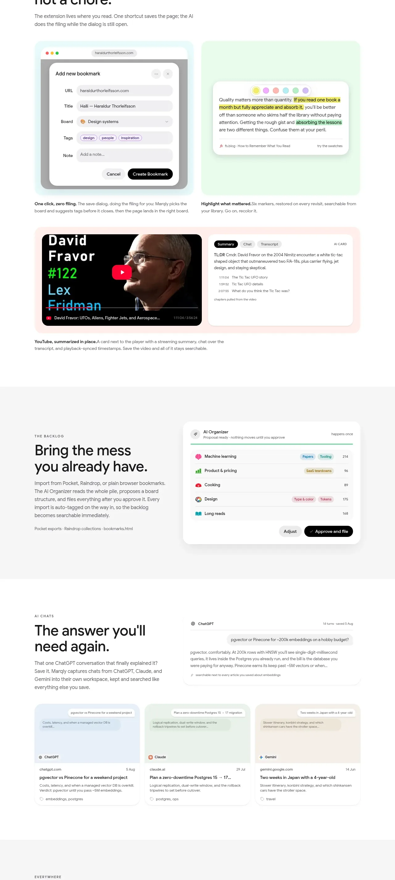
Design analysis
Three related workflows are presented as visual feature pairs: quick saving, highlighted reading, and summarized video/content with AI assistance.
Prompt preview
## Reference images

Study these alongside the description below: hierarchy, rhythm, spacing, colour. Build for the product you are asked about, using this design language.

- Component: https://kage-design-assets.t3.tigrisfiles.io/components/marqly-6-0/c854bda3-2558-4a76-a0fe-ed0b4296df4d-1789452132-5.webp
- Full page it was cut from: https://kage-design-assets.t3.tigrisfiles.io/screenshots/marqly-6-0/c854bda3-2558-4a76-a0fe-ed0b4296df4d-1789452075868-full.webp
- Component on Kage: https://kage.design/component/marqly-6-0-feature-grid-3

## Before you start
Ask what the user's product is, who it serves, and what its brand personality should be. Apply the principles below to that product rather than copying the reference.

Create a three-part workflow feature section with generous white space. Each row should contain a strong benefit heading and short explanation alongside a pair of polished product panels or media cards. Demonstrate: fast capture through a bookmark form, reading/highlighting through a highlighted excerpt, and media summarization through a video card beside an AI summary panel. Alternate image/text alignment between rows to create rhythm. Use a white or very pale gray background, 38–46px headings, 14px body text, dark charcoal #171719, pastel mint #e4faed, pale cyan #e7f8fb, soft blush #fff0f2, and yellow #f3eb52 highlights. Give visual panels 18–22px corners, light borders, and diffuse shadows. Include realistic but invented UI controls such as URL fields, dropdowns, tags, play buttons, transcript tabs, and summary chips. On mobile, stack each pair and preserve clear reading order.

Never: use the reference logo, product name, copy, illustrations, imagery, or brand assets.







