 kage
kage
marqly.com
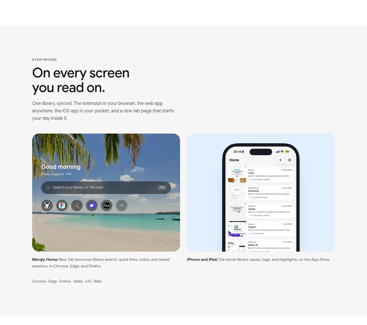
Design analysis
This muted feature band addresses messy existing collections and pairs reassuring copy with an approval-oriented organization interface.
Prompt preview
## Reference images

Study these alongside the description below: hierarchy, rhythm, spacing, colour. Build for the product you are asked about, using this design language.

- Component: https://kage-design-assets.t3.tigrisfiles.io/components/marqly-6-0/c854bda3-2558-4a76-a0fe-ed0b4296df4d-1789452133-6.webp
- Full page it was cut from: https://kage-design-assets.t3.tigrisfiles.io/screenshots/marqly-6-0/c854bda3-2558-4a76-a0fe-ed0b4296df4d-1789452075868-full.webp
- Component on Kage: https://kage.design/component/marqly-6-0-feature-grid-4

## Before you start
Ask what the user's product is, who it serves, and what its brand personality should be. Apply the principles below to that product rather than copying the reference.

Design a two-column feature band about organizing an existing backlog. Put a concise eyebrow, bold 38–44px heading, explanatory paragraph, and small supporting line on the left. On the right, show a rounded organization panel with categories, item counts, AI-suggested tags, and clear Reject/Approve or Adjust actions. Use a pale gray background #f5f5f4, white panel #ffffff, dark text #171719, muted gray #777a7d, mint/teal status colour #bfe9d4, and a small pink accent #e75682. Use 18–22px corners, subtle borders, soft shadows, 64–88px vertical spacing, and align everything to a consistent max-width. Make approval controls keyboard accessible and provide hover/focus feedback.

Never: use the reference logo, product name, copy, illustrations, imagery, or brand assets.







