kage
kage
marqly.com
Design analysis
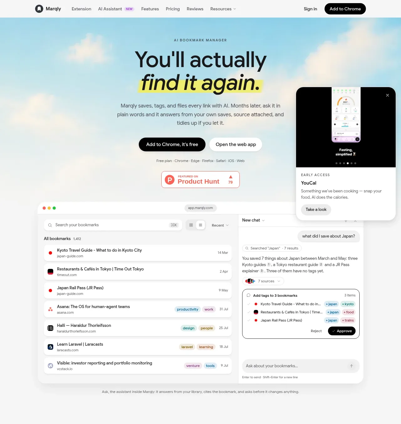
The hero pairs a bold, lightly highlighted headline and short explanation with two CTAs, a browser mockup, and a floating mobile/product card to make the product immediately tangible.
Prompt preview
## Reference images

Study these alongside the description below: hierarchy, rhythm, spacing, colour. Build for the product you are asked about, using this design language.

- Component: https://kage-design-assets.t3.tigrisfiles.io/components/marqly-6-0/c854bda3-2558-4a76-a0fe-ed0b4296df4d-1789452130-1.webp
- Full page it was cut from: https://kage-design-assets.t3.tigrisfiles.io/screenshots/marqly-6-0/c854bda3-2558-4a76-a0fe-ed0b4296df4d-1789452075868-full.webp
- Component on Kage: https://kage.design/component/marqly-6-0-hero

## Before you start
Ask what the user's product is, who it serves, and what its brand personality should be. Apply the principles below to that product rather than copying the reference.

Create a spacious SaaS hero directly below the navigation. Center a small uppercase eyebrow, a large two-line headline with one phrase highlighted in a soft yellow marker-like background, a concise supporting paragraph, and two compact pill CTAs. Place a large polished desktop product mockup in the lower half, with a secondary floating mobile or contextual card overlapping the upper-right edge. Use a very pale sky/cream atmospheric background with approximate colours #dff5fb, #fffdf8, and #f4f6f5; keep the text near-black #121416. Use a geometric sans-serif, 44–58px desktop headline with tight line-height around 0.95, 14px body copy, and 12px eyebrow lettering. Keep content within a max-width of 1100px, use generous vertical padding, soft shadows, 18–24px rounded corners, and subtle glassy white surfaces. The primary CTA should be dark, the secondary CTA white with a light border. Ensure the visual is responsive and stacks cleanly on narrow screens.

Never: use the reference logo, product name, copy, illustrations, imagery, or brand assets.