kage
kage
marqly.com
Design analysis
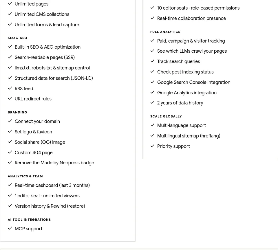
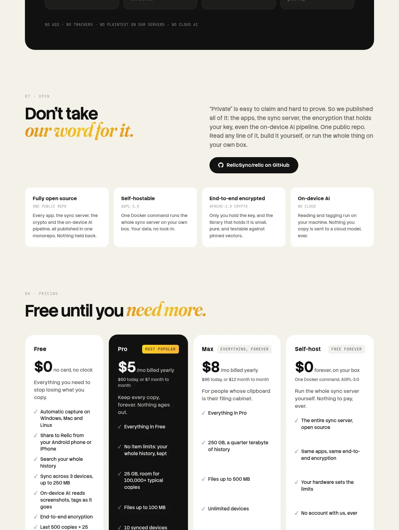
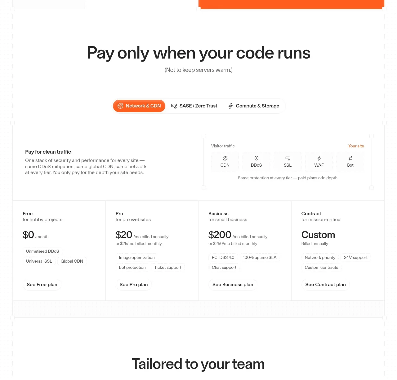
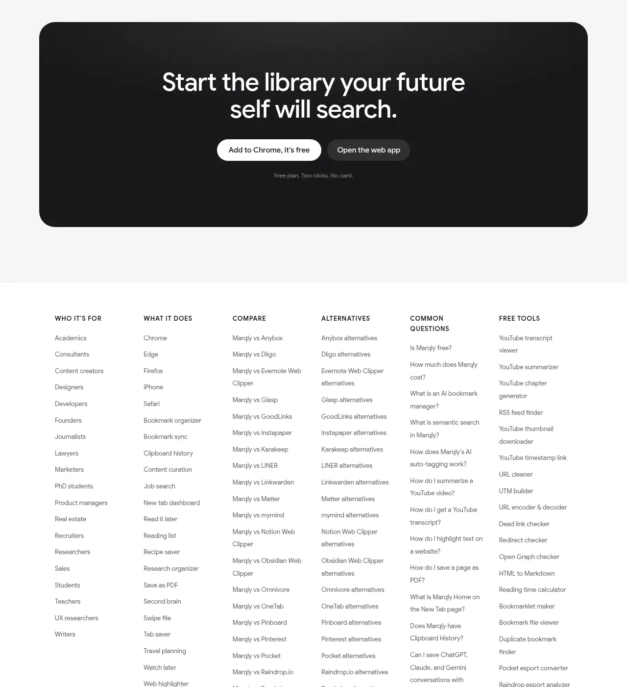
A clear two-tier pricing block uses strong contrast between free and paid plans, a billing toggle, detailed feature lists, and prominent plan buttons.
Prompt preview
## Reference images

Study these alongside the description below: hierarchy, rhythm, spacing, colour. Build for the product you are asked about, using this design language.

- Component: https://kage-design-assets.t3.tigrisfiles.io/components/marqly-6-0/c854bda3-2558-4a76-a0fe-ed0b4296df4d-1789452135-10.webp
- Full page it was cut from: https://kage-design-assets.t3.tigrisfiles.io/screenshots/marqly-6-0/c854bda3-2558-4a76-a0fe-ed0b4296df4d-1789452075868-full.webp
- Component on Kage: https://kage.design/component/marqly-6-0-pricing-table

## Before you start
Ask what the user's product is, who it serves, and what its brand personality should be. Apply the principles below to that product rather than copying the reference.

Create a two-tier pricing section with an eyebrow, large headline, and annual/monthly segmented toggle. Use equal-width plan cards: a light free plan and a near-black premium plan with a small coloured savings badge. Include plan name, price, billing qualifier, a dense but scannable checklist of benefits, optional footnote, and a full-width CTA. Use background #f5f5f3, free card #ffffff, premium card #18181a, text #171719 on light and #ffffff on dark, muted text #777/#b7b7b7, and an accent purple/pink badge #a847f5 or #ed6b9b. Use 18–22px corners, faint borders on the light card, 28–32px padding, and rounded buttons. Make the billing toggle actually update displayed prices and clearly identify the recommended plan. Stack cards on mobile.

Never: use the reference logo, product name, copy, illustrations, imagery, or brand assets.