kage
kage
masterclass.com

Design analysis
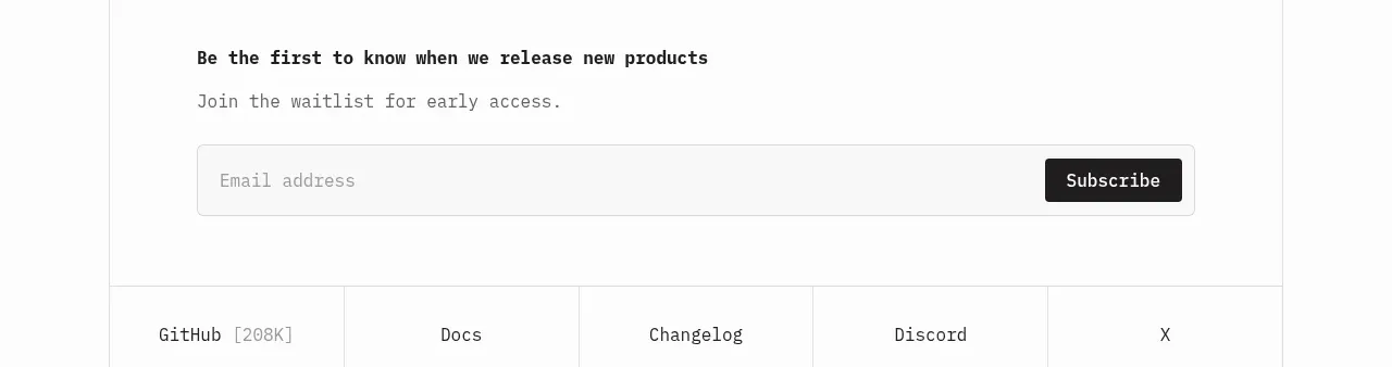
A low-friction email capture strip promises sample content, pairing a short explanation with a single email field, consent checkbox, and submit button.
Prompt preview
## Reference images

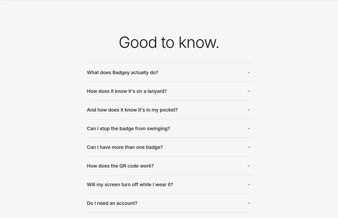
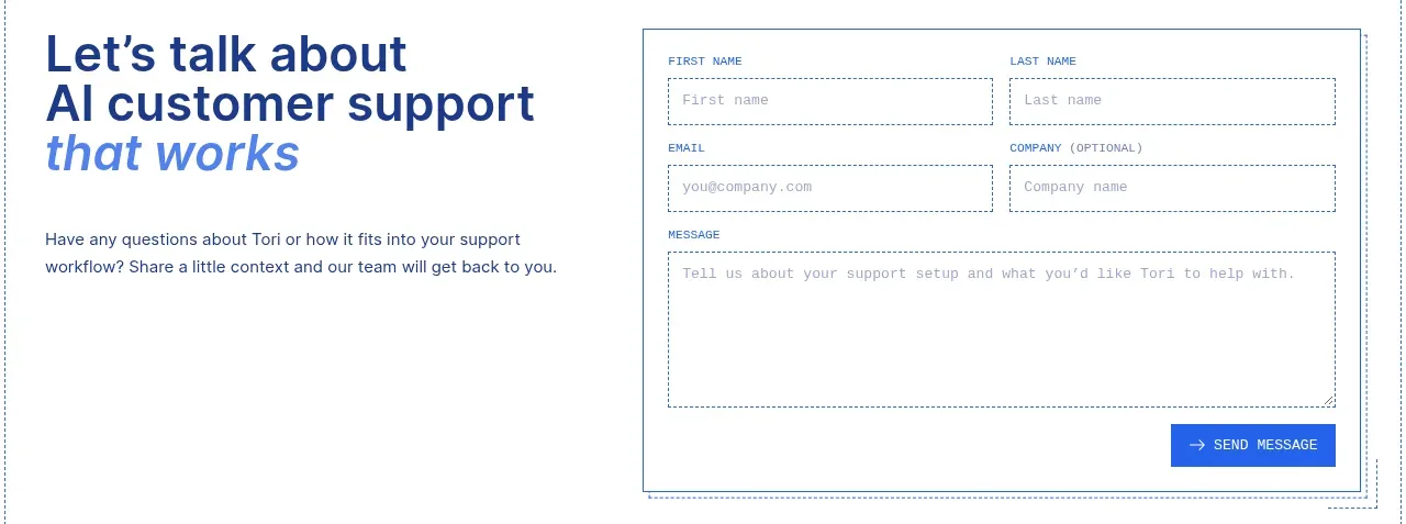
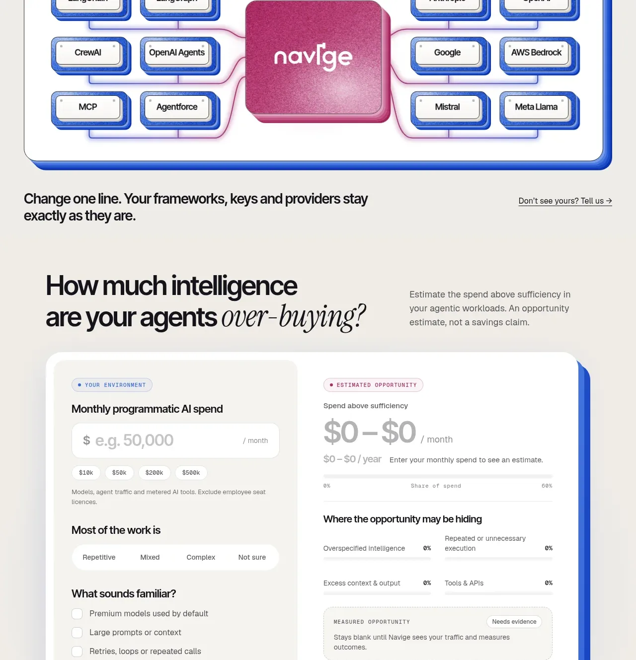
Study these alongside the description below: hierarchy, rhythm, spacing, colour. Build for the product you are asked about, using this design language.

- Component: https://kage-design-assets.t3.tigrisfiles.io/components/masterclass-com/5ec25cd5-decc-406e-8087-269a3e7b0a10-1789146212-9.webp
- Full page it was cut from: https://kage-design-assets.t3.tigrisfiles.io/screenshots/masterclass-com/5ec25cd5-decc-406e-8087-269a3e7b0a10-1789146173702-full.webp
- Component on Kage: https://kage.design/component/masterclass-form

## Before you start
Ask what the user's product, audience, email offer, and brand are, then adapt this signup pattern.

Create a compact dark email signup band with explanatory text on the left and a form on the right. Include a visible label, wide email input, submit button, consent checkbox, and a small legal note with links. Use black #050505, charcoal #202327 input surfaces, white labels, #9b9b9b legal copy, and an outlined or accent-filled submit action. Align the input and button on one row at desktop, with the checkbox and legal copy beneath; stack everything at narrow widths. Use 8px field/button radii, 44px controls, clear invalid and success states, and never rely on placeholder text as the only label.

Never: use logos, product names, copy, illustrations, or imagery from the reference.