 kage
kage
mastra.ai

Design analysis
A compact, horizontal process navigator pairs clearly separated workflow stages with a single active state and a contextual explanation beneath it. The restrained dark treatment, dotted connectors, and icon-led labels make a complex multi-step flow feel legible without competing with the surrounding product experience.
Prompt preview
## Reference images

Study these alongside the description below: hierarchy, rhythm, spacing, colour. Build for the product you are asked about, using this design language.

- Component: https://kage-design-assets.t3.tigrisfiles.io/components/mastra-factory/e98dc23c-cafd-4086-ae60-932f10b41f0f-1789106664-3.webp
- Full page it was cut from: https://kage-design-assets.t3.tigrisfiles.io/screenshots/mastra-factory/e98dc23c-cafd-4086-ae60-932f10b41f0f-1789106606408-full.webp
- Component on Kage: https://kage.design/component/mastra-factory-tabs

## Before you start
Ask what the user's product does, who it is for, and what its brand personality, colours, and typography are. Then apply the principles below to create an original version of this workflow-tabs section for that product—not a visual copy of the reference.

## Build a workflow stage-tabs section
Create a dark, contained section that explains a sequential product workflow through horizontally arranged tabs. It should feel like a calm operational dashboard: sparse, technical, and highly legible, with one clearly active stage and a short contextual message below the navigation.

### Layout and alignment
- Place the component inside a wide rounded container with generous horizontal padding and substantial vertical breathing room.
- Keep the content on a readable inner grid rather than stretching every element to the full container width.
- Add a small row of three abstract integration/status glyphs above the tabs, aligned with the workflow start. Use simple iconography appropriate to the user's product; do not use recognizable third-party marks.
- Arrange 5–7 stages in one horizontal sequence on desktop. Each stage is a compact pill or subtly bordered tab with an icon followed by a short uppercase label.
- Connect neighbouring stages with thin dotted or segmented rules, visually passing between the tab controls without overpowering them.
- Place the active-stage explanation below the sequence, aligned to the same left edge as the first tab. Keep it narrow—roughly 18–26 characters per line on desktop—so it reads like a concise operational status note.
- On smaller screens, allow the tab row to scroll horizontally or transform it into a vertically connected stepper. Preserve the order, active state, and explanatory text.

### Typography hierarchy
- Use a compact uppercase label style for stage names: monospaced or strongly technical sans-serif, approximately 12–14px, with moderate letter spacing.
- Make inactive labels muted and the active label brighter, while keeping all labels visually consistent in weight.
- Set the supporting message in a monospaced or condensed technical style, approximately 13–15px with increased line height and noticeable tracking. Use sentence case or uppercase based on the user's brand, but maintain a concise, system-like tone.
- Avoid oversized marketing headlines; this component is about orientation and progress.

### Colour and visual language
- Use a near-black page or section background around `#050505` and a slightly lighter panel around `#111111`.
- Use subtle borders around `#252525` to define the container and tabs without creating a card-heavy appearance.
- Set inactive text and icons around `#707070`–`#858585`; use off-white around `#E8E8E8` for active and high-priority content.
- Give the active tab one restrained brand accent—approximately a luminous blue such as `#5CC8FF`, or an equivalent accent from the user's brand. Use it for the active icon, a small indicator, or a soft highlight rather than flooding the entire control.
- Keep connectors dim, around `#292929`, and ensure contrast remains accessible for text and controls.

### Borders, radius, and spacing
- Use a large outer radius around 26–32px for the containing panel.
- Use smaller tab radii around 10–14px, with a faint fill or border on inactive states and a slightly brighter fill on the active state.
- Use 8px spacing between icon and label, 20–28px internal tab padding, and 24–40px gaps between stage groups depending on available width.
- Give the icon row 24–32px of separation from the tabs and the explanatory text 28–36px of separation from the tab rail.
- Keep borders one pixel and low contrast; the sense of structure should come from alignment, spacing, and the active state.

### Interaction and accessibility
- Make every stage a real button or accessible tab with `role="tablist"`, `role="tab"`, and associated tab panels when the content changes.
- Clicking or using arrow keys should change the active stage and update the explanation below. Support Home/End navigation and visible keyboard focus.
- Add a restrained hover state: brighten the label and border slightly, without shifting layout.
- Animate the active transition subtly—around 150–250ms—with no dramatic movement. A small accent glow or fill change is enough.
- Mark the selected state with `aria-selected` and a clear visual treatment. Do not rely on colour alone; use contrast, fill, border, or an indicator as well.
- On mobile, ensure horizontal scrolling has no awkward clipped controls and that touch targets are at least 44px high.

### Content behaviour
- Keep each explanation to one concise sentence or two short lines. The copy should describe what the selected stage does in the user's product.
- Maintain a stable component height where possible to prevent layout jumping when stages change.
- Use original labels, icons, and status language that fit the user's product and brand.

## Never
- Never copy the reference's product name, labels, supporting copy, or exact workflow terminology.
- Never use logos, recognizable third-party brand marks, or integration icons from the reference.
- Never reuse the reference's exact icon designs, layout measurements, colour values as a rigid palette, or pixel arrangement.
- Never include illustrations, screenshots, or imagery from the reference.
- Never make the tabs decorative only; they must communicate and control a real workflow state.
- Never sacrifice keyboard access, responsive behaviour, or readable contrast for visual similarity.
More components

 Directory filters and sorting
The Brains · Tabs & steps
Directory filters and sorting
The Brains · Tabs & steps

 Enterprise use cases
bestproxy.com · Tabs & steps
Enterprise use cases
bestproxy.com · Tabs & steps
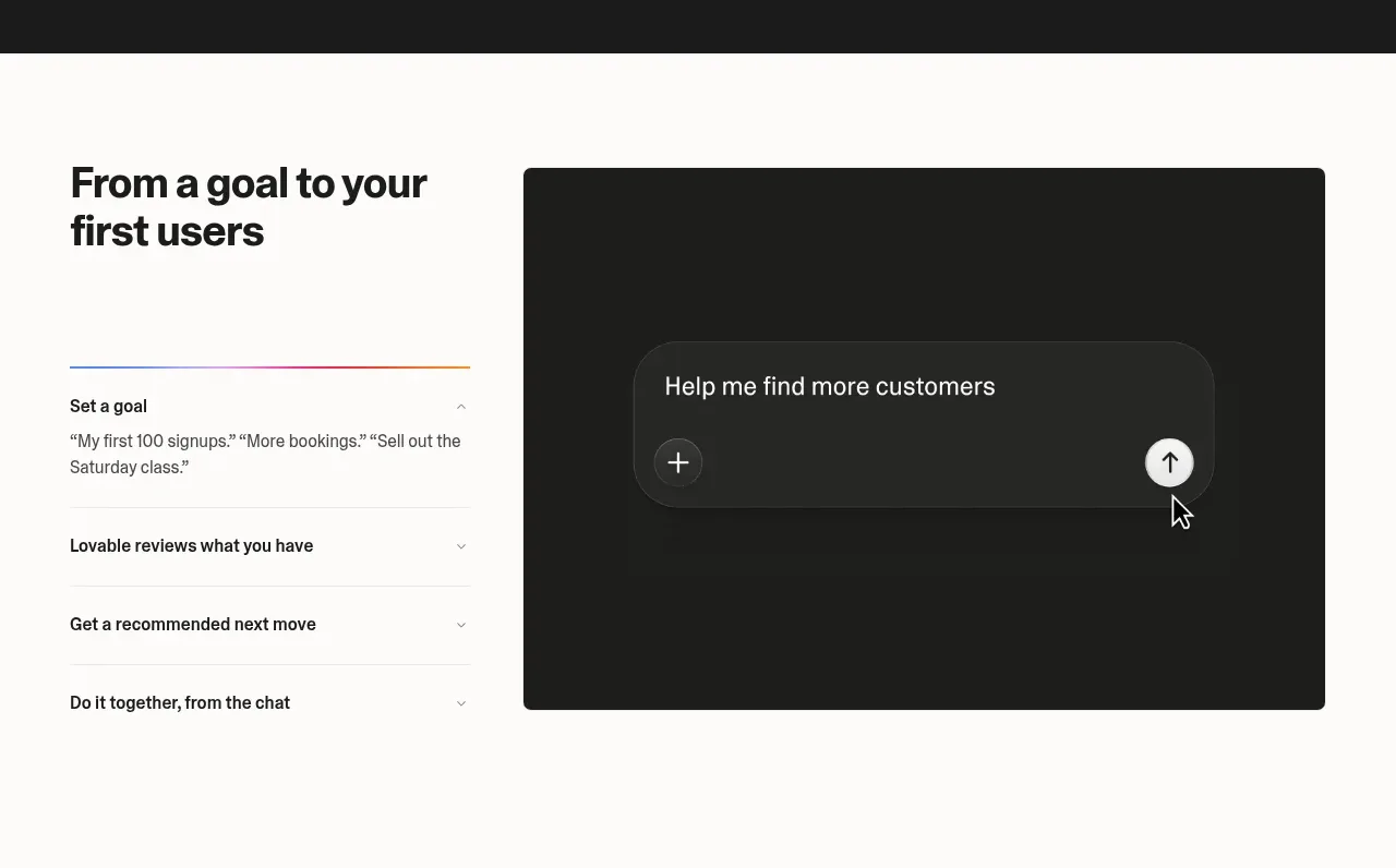
 Goal-to-first-users assistant
Lovable Growth Tools · Tabs & steps
Goal-to-first-users assistant
Lovable Growth Tools · Tabs & steps
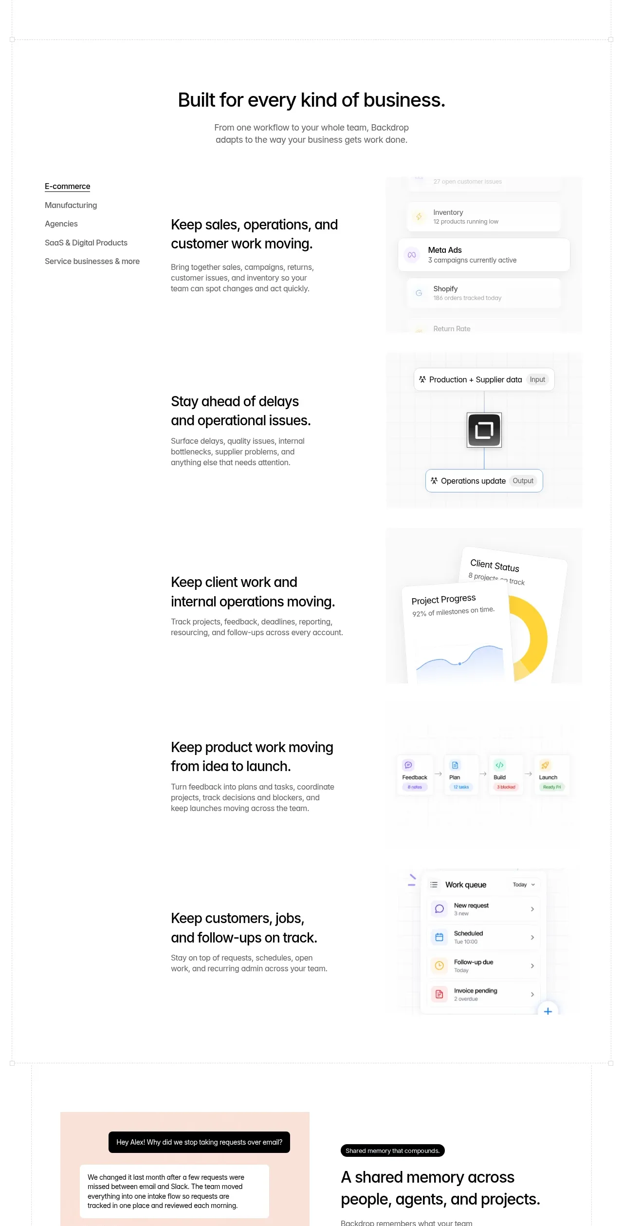
 Business use cases tabs
Backdrop · Tabs & steps
Business use cases tabs
Backdrop · Tabs & steps
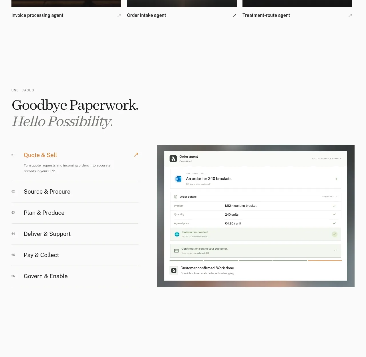
 Workflow stages with product preview
Lleverage · Tabs & steps
Workflow stages with product preview
Lleverage · Tabs & steps
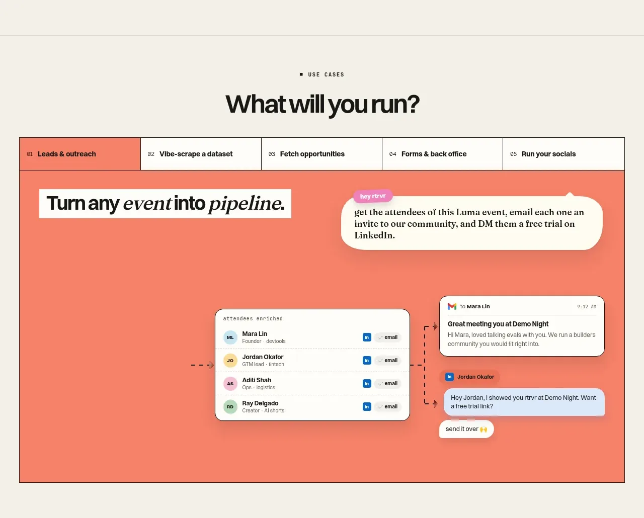
 Use-case selector and interactive showcase
Retriever AI · Tabs & steps
Use-case selector and interactive showcase
Retriever AI · Tabs & steps