 kage
kage
maybloc.com
Design analysis
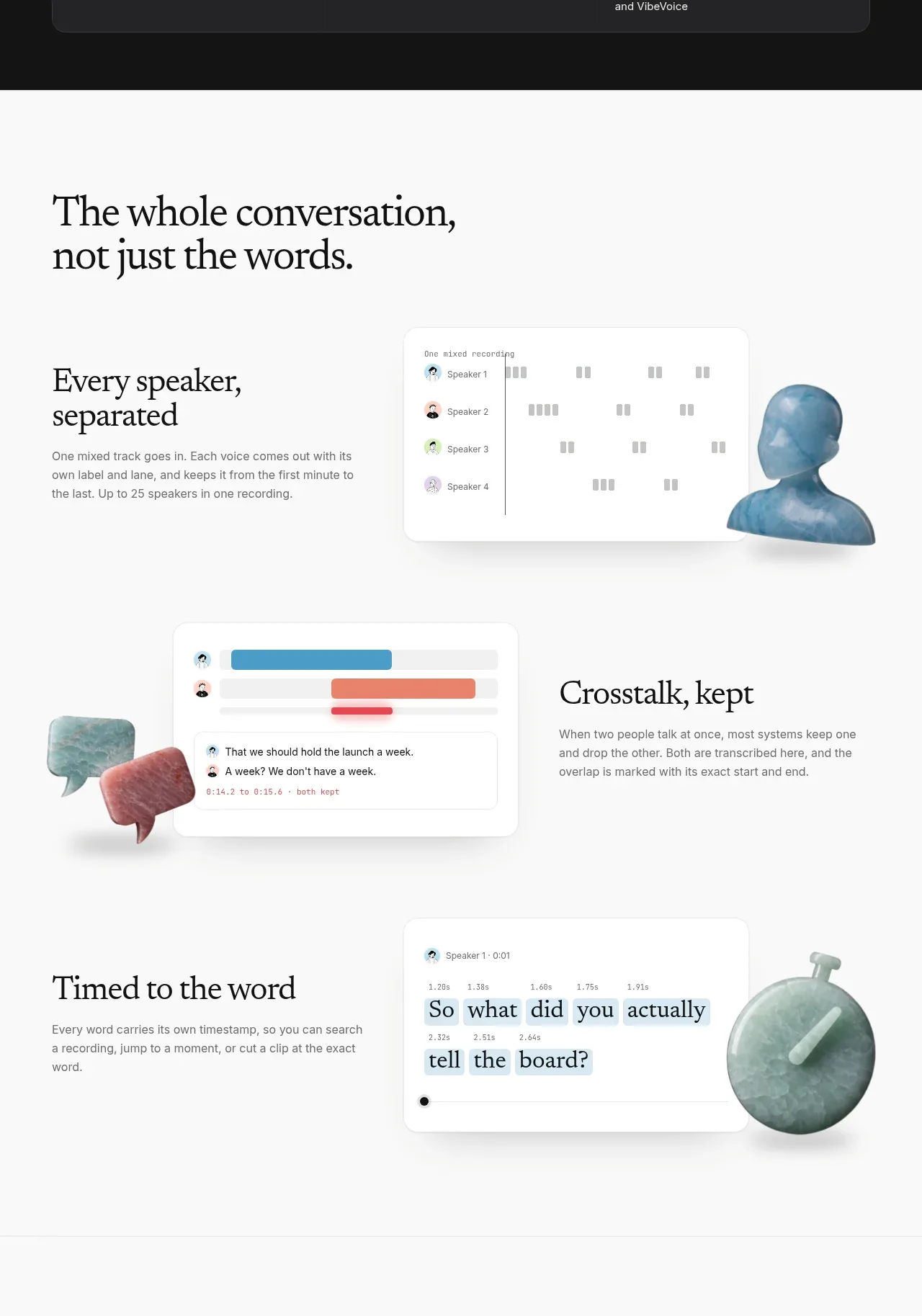
A large section headline introduces three alternating feature rows, each pairing a focused explanation with a product-style visual and tactile object.
Prompt preview
## Reference images

Study these alongside the description below: hierarchy, rhythm, spacing, colour. Build for the product you are asked about, using this design language.

- Component: https://kage-design-assets.t3.tigrisfiles.io/components/maybloc/1877ee03-3cf3-49f7-b006-226ca2ea42de-1792217041-3.webp
- Full page it was cut from: https://kage-design-assets.t3.tigrisfiles.io/screenshots/maybloc/1877ee03-3cf3-49f7-b006-226ca2ea42de-1792216974687-full.webp
- Component on Kage: https://kage.design/component/maybloc-feature-grid

## Before you start
Ask what the user's product is, who it serves, and what brand voice and visual identity it should use. Apply the principles below to that product rather than reproducing the reference.

Create a long feature section with a large serif heading at the top and three alternating two-column rows. Each row should have a short serif feature title, a compact sans-serif explanation, and a custom interface visual on the opposite side. Alternate image/text alignment to create rhythm. Keep a calm near-white #fafafa canvas, #111111 headings, #707070 body copy, subtle #e5e5e5 rules, and 20–24px vertical row gaps with large section padding. Interface mockups should be rounded white cards with restrained borders and soft shadows; decorative 3D objects may overlap the cards but must support the concept and remain original. Include useful details such as speaker labels, timing, overlap highlighting, or search states where relevant. Stack each row on mobile and preserve a logical reading order.

Never: use the reference's logo, product name, copy, illustrations, imagery, or exact mockup content.
More components

 Data-to-action engine
Salience · Feature grid
Data-to-action engine
Salience · Feature grid
 Actionable alert workflow
Salience · Feature grid
Actionable alert workflow
Salience · Feature grid
 Trust proof and core outcomes
Salience · Feature grid
Trust proof and core outcomes
Salience · Feature grid
 Three-step implementation flow
Salience · Feature grid
Three-step implementation flow
Salience · Feature grid
 What analytics misses
Salience · Feature grid
What analytics misses
Salience · Feature grid

 Workflow features and capabilities
CrewTower Mod for Claude Code · Feature grid
Workflow features and capabilities
CrewTower Mod for Claude Code · Feature grid