 kage
kage
maybloc.com
Design analysis
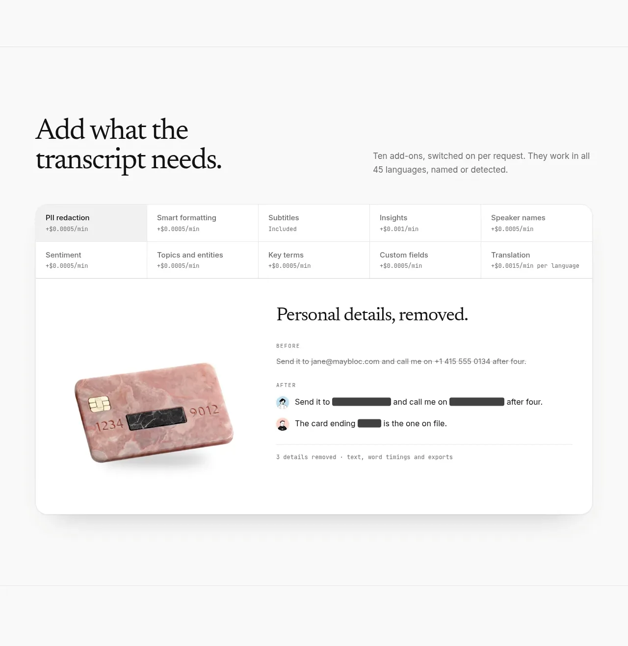
This section combines a concise add-on matrix with a large privacy/redaction example, making extensibility and sensitive-data handling feel concrete.
Prompt preview
## Reference images

Study these alongside the description below: hierarchy, rhythm, spacing, colour. Build for the product you are asked about, using this design language.

- Component: https://kage-design-assets.t3.tigrisfiles.io/components/maybloc/1877ee03-3cf3-49f7-b006-226ca2ea42de-1792217042-5.webp
- Full page it was cut from: https://kage-design-assets.t3.tigrisfiles.io/screenshots/maybloc/1877ee03-3cf3-49f7-b006-226ca2ea42de-1792216974687-full.webp
- Component on Kage: https://kage.design/component/maybloc-feature-grid-2

## Before you start
Ask what the user's product is, who it serves, and what brand voice and visual identity it should use. Apply the principles below to that product rather than reproducing the reference.

Design an extensibility section with a two-column heading row: an editorial serif title on the left and a concise explanation on the right. Add a bordered, rounded grid of optional capabilities beneath it, using compact cells, small labels, and understated pricing or availability metadata. Follow with a larger white privacy example card: show a before/after transformation of sensitive content, with clear labels and visually redacted spans, plus a small explanatory footer line. Use #fafafa page background, white cards, #e4e4e4 borders, 14–18px radius, #111111 headings, and #737373 metadata. Keep the interaction model obvious: add-ons can be toggled or selected, and redaction can have a reveal-on-demand control with accessible labels. Stack the heading and simplify the matrix on mobile.

Never: use the reference's logo, product name, copy, illustrations, imagery, or exact add-on names, prices, or personal data.
More components

 Data-to-action engine
Salience · Feature grid
Data-to-action engine
Salience · Feature grid
 Actionable alert workflow
Salience · Feature grid
Actionable alert workflow
Salience · Feature grid
 Trust proof and core outcomes
Salience · Feature grid
Trust proof and core outcomes
Salience · Feature grid
 Three-step implementation flow
Salience · Feature grid
Three-step implementation flow
Salience · Feature grid
 What analytics misses
Salience · Feature grid
What analytics misses
Salience · Feature grid

 Workflow features and capabilities
CrewTower Mod for Claude Code · Feature grid
Workflow features and capabilities
CrewTower Mod for Claude Code · Feature grid