 kage
kage
maybloc.com
Design analysis
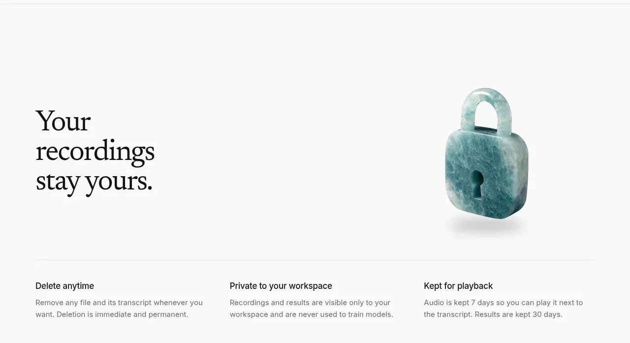
A spacious privacy section uses one strong statement, a sculptural lock visual, and three concise policy columns to reassure users about their data.
Prompt preview
## Reference images

Study these alongside the description below: hierarchy, rhythm, spacing, colour. Build for the product you are asked about, using this design language.

- Component: https://kage-design-assets.t3.tigrisfiles.io/components/maybloc/1877ee03-3cf3-49f7-b006-226ca2ea42de-1792217042-6.webp
- Full page it was cut from: https://kage-design-assets.t3.tigrisfiles.io/screenshots/maybloc/1877ee03-3cf3-49f7-b006-226ca2ea42de-1792216974687-full.webp
- Component on Kage: https://kage.design/component/maybloc-feature-grid-3

## Before you start
Ask what the user's product is, who it serves, and what brand voice and visual identity it should use. Apply the principles below to that product rather than reproducing the reference.

Create a light security section with a large serif statement on the left and an abstract original security object on the right. Beneath a thin divider, present three equal columns covering deletion, workspace privacy, and retention or access policy. Each column needs a short bold sans-serif label and two lines of muted explanatory text. Use ample white space, near-white #fafafa, #111111 headings, #666666 body copy, and a fine #e5e5e5 divider. Keep the illustration secondary to the policy content, use a soft shadow if needed, and make the layout collapse cleanly to one column on mobile.

Never: use the reference's logo, product name, copy, illustrations, imagery, or exact policy claims.
More components

 Data-to-action engine
Salience · Feature grid
Data-to-action engine
Salience · Feature grid
 Actionable alert workflow
Salience · Feature grid
Actionable alert workflow
Salience · Feature grid
 Trust proof and core outcomes
Salience · Feature grid
Trust proof and core outcomes
Salience · Feature grid
 Three-step implementation flow
Salience · Feature grid
Three-step implementation flow
Salience · Feature grid
 What analytics misses
Salience · Feature grid
What analytics misses
Salience · Feature grid

 Workflow features and capabilities
CrewTower Mod for Claude Code · Feature grid
Workflow features and capabilities
CrewTower Mod for Claude Code · Feature grid