 kage
meetpaw.app
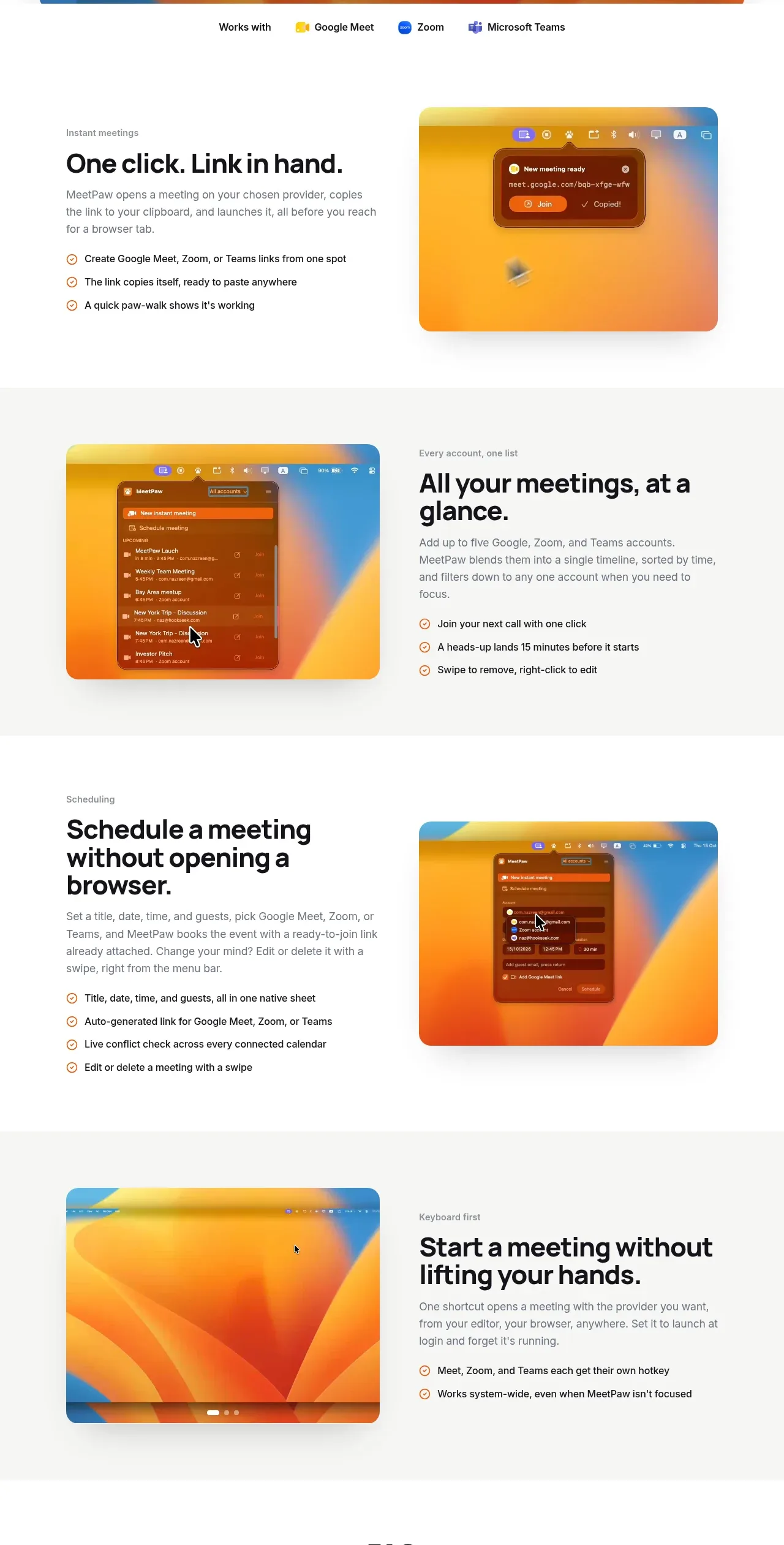
Design analysis
Four generous alternating feature bands pair concise benefit-led copy and checkmark bullets with rounded product visuals, using subtle background changes to separate the stories.
Prompt preview
## Reference images

Study these alongside the description below: hierarchy, rhythm, spacing, colour. Build for the product you are asked about, using this design language.

- Component: https://kage-design-assets.t3.tigrisfiles.io/components/meetpaw/a0a465d2-81ef-4df0-b440-a946faf696c8-1792389687-3.webp
- Full page it was cut from: https://kage-design-assets.t3.tigrisfiles.io/screenshots/meetpaw/a0a465d2-81ef-4df0-b440-a946faf696c8-1792389630481-full.webp
- Component on Kage: https://kage.design/component/meetpaw-feature-grid

## Before you start
Ask what the user's three or four strongest product capabilities are, which proof points support each one, and what interface visuals can represent them. Then create an original alternating feature sequence.

Build a vertical feature grid made of four horizontal bands. Each band should use a two-column layout inside a max-width container: approximately 44% text and 44% visual, with a large gap. Alternate the visual from right to left on successive rows to create movement and avoid a repetitive scan pattern. Give each row generous vertical padding of 76–104px. Alternate a white background with a very pale neutral background such as #f7f7f5, but keep the overall page calm.

For each feature, use a small eyebrow in 12–13px muted text, a strong 30–38px headline with tight line-height, a 15–17px explanatory paragraph in #6b6b6b, and a short list of two to four benefits. Render each benefit with a small outlined check or circular icon in the brand accent #c96b28, followed by 13–14px dark text. Visuals should be rounded 14–18px, have a subtle shadow, and use either a real product screenshot supplied by the user or an original CSS mockup. Keep text and imagery vertically centered, and ensure the layout stacks naturally on mobile with the copy before the visual when appropriate.

### Never
- Never use logos, product names, copy, illustrations, or imagery from the reference.
- Never copy the feature titles, bullet wording, screenshots, or exact row order.
- Never turn every feature into an isolated card; the alternating bands should read as one story.
More components
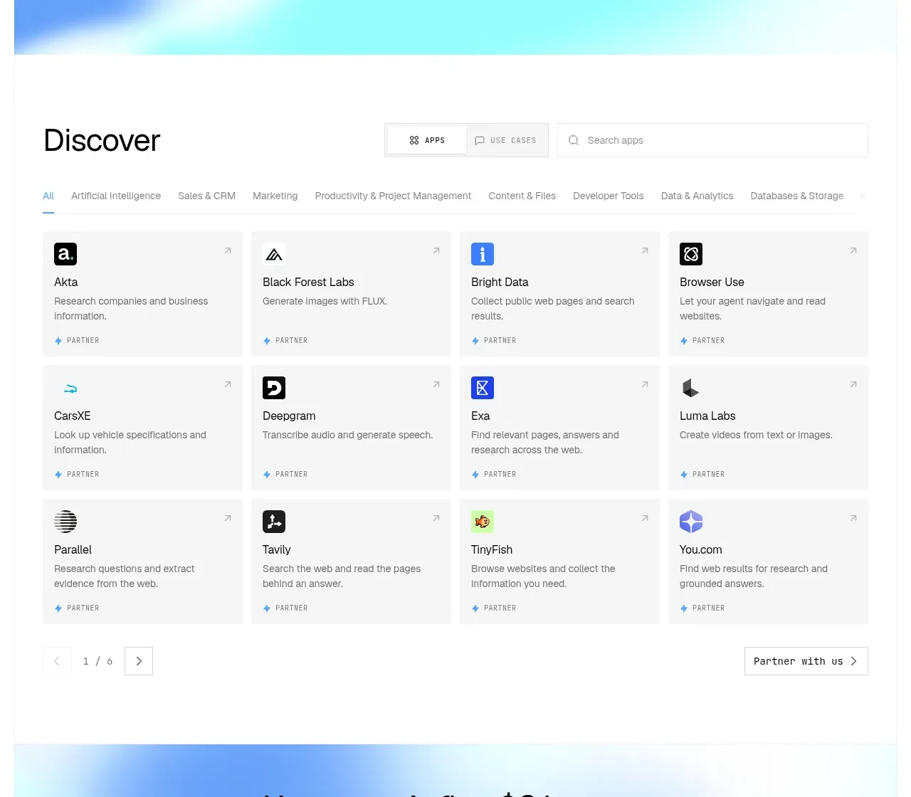
 Discover app directory
Composio Instant · Feature grid
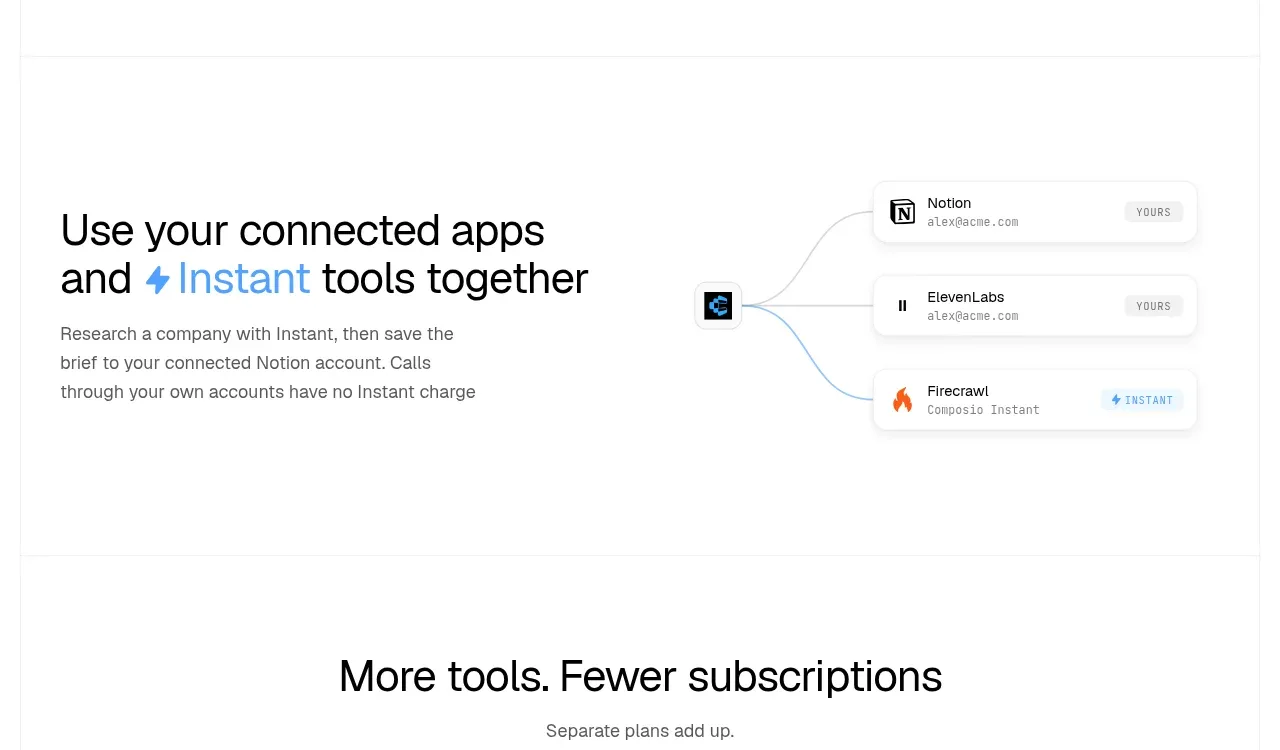 Connected apps workflow
Composio Instant · Feature grid
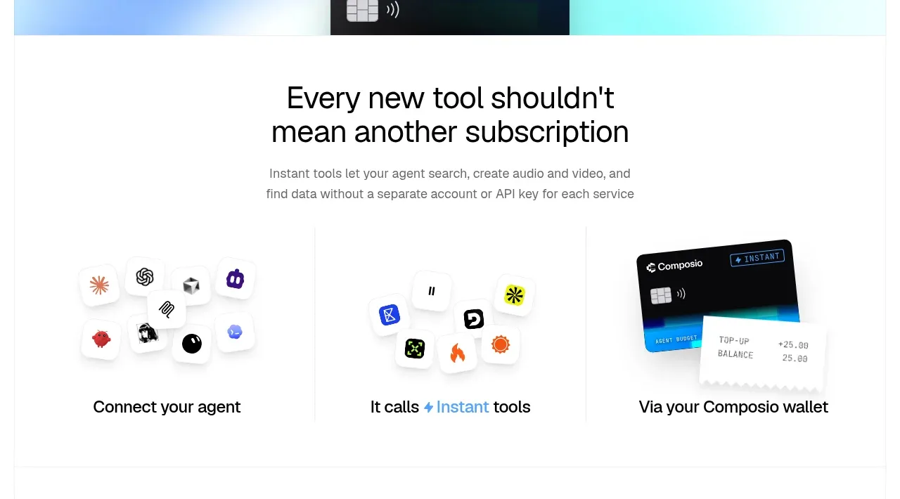 Three-part product workflow
Composio Instant · Feature grid
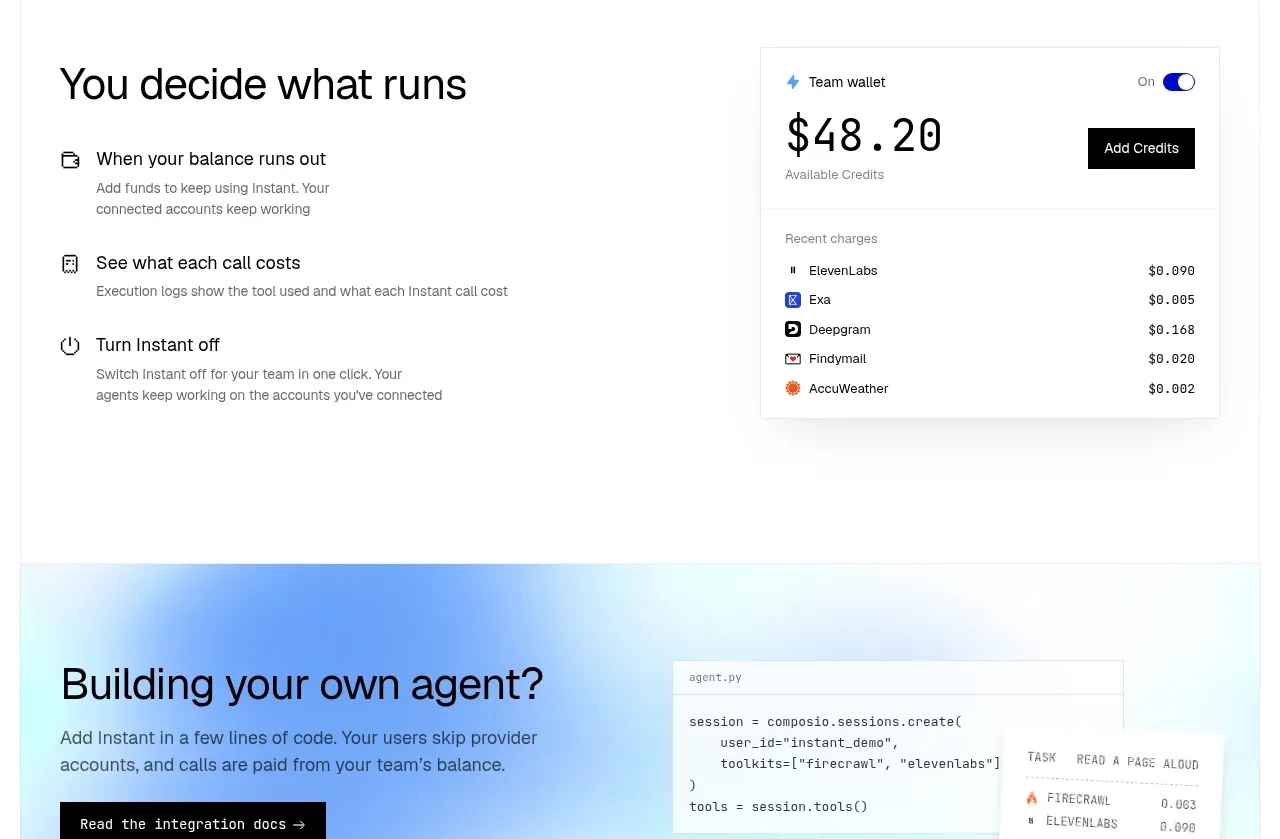 Spending controls
Composio Instant · Feature grid
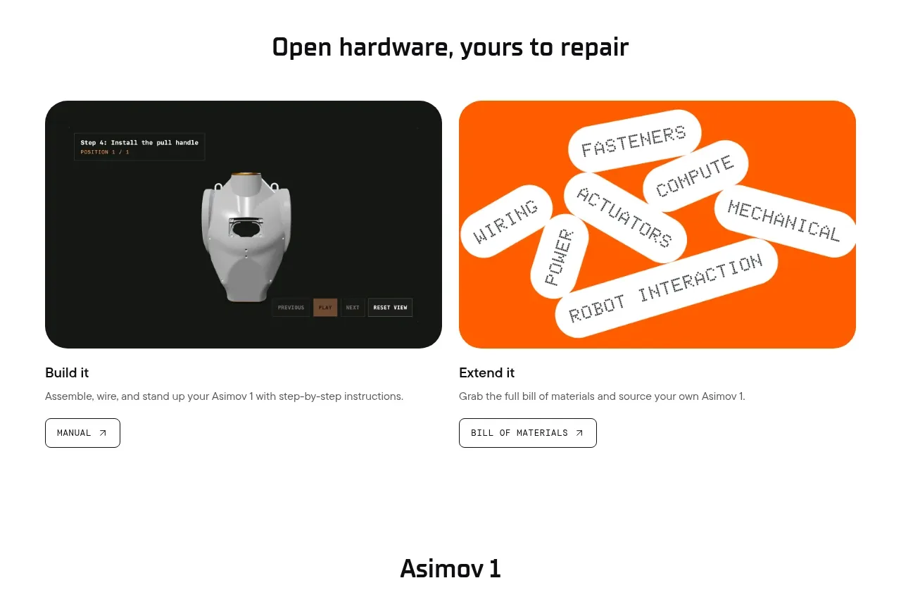
 Open hardware pathways
Asimov 1 · Feature grid
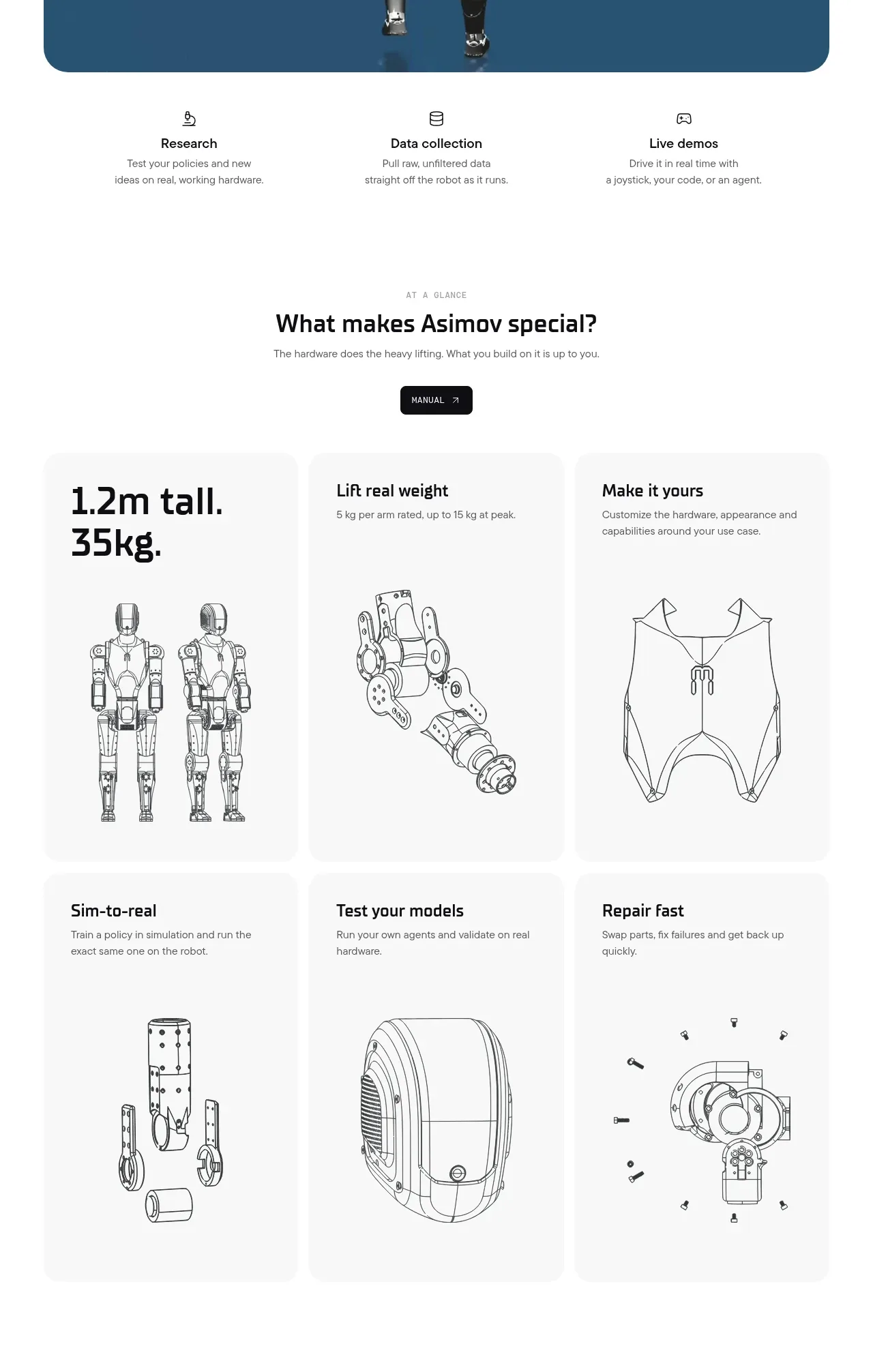 Capability overview and specification cards
Asimov 1 · Feature grid