kage
meetpaw.app
Design analysis
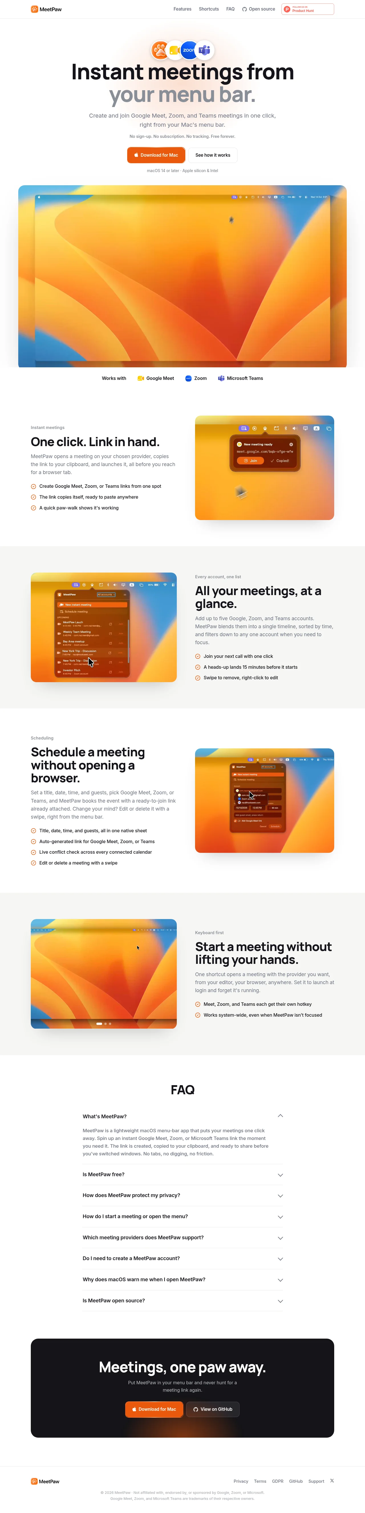
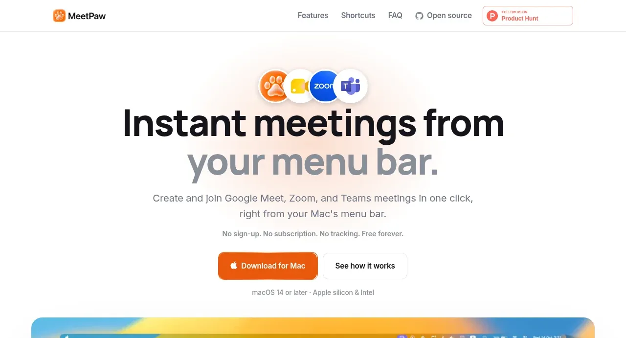
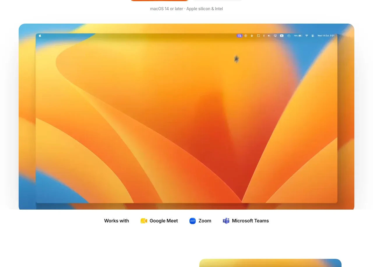
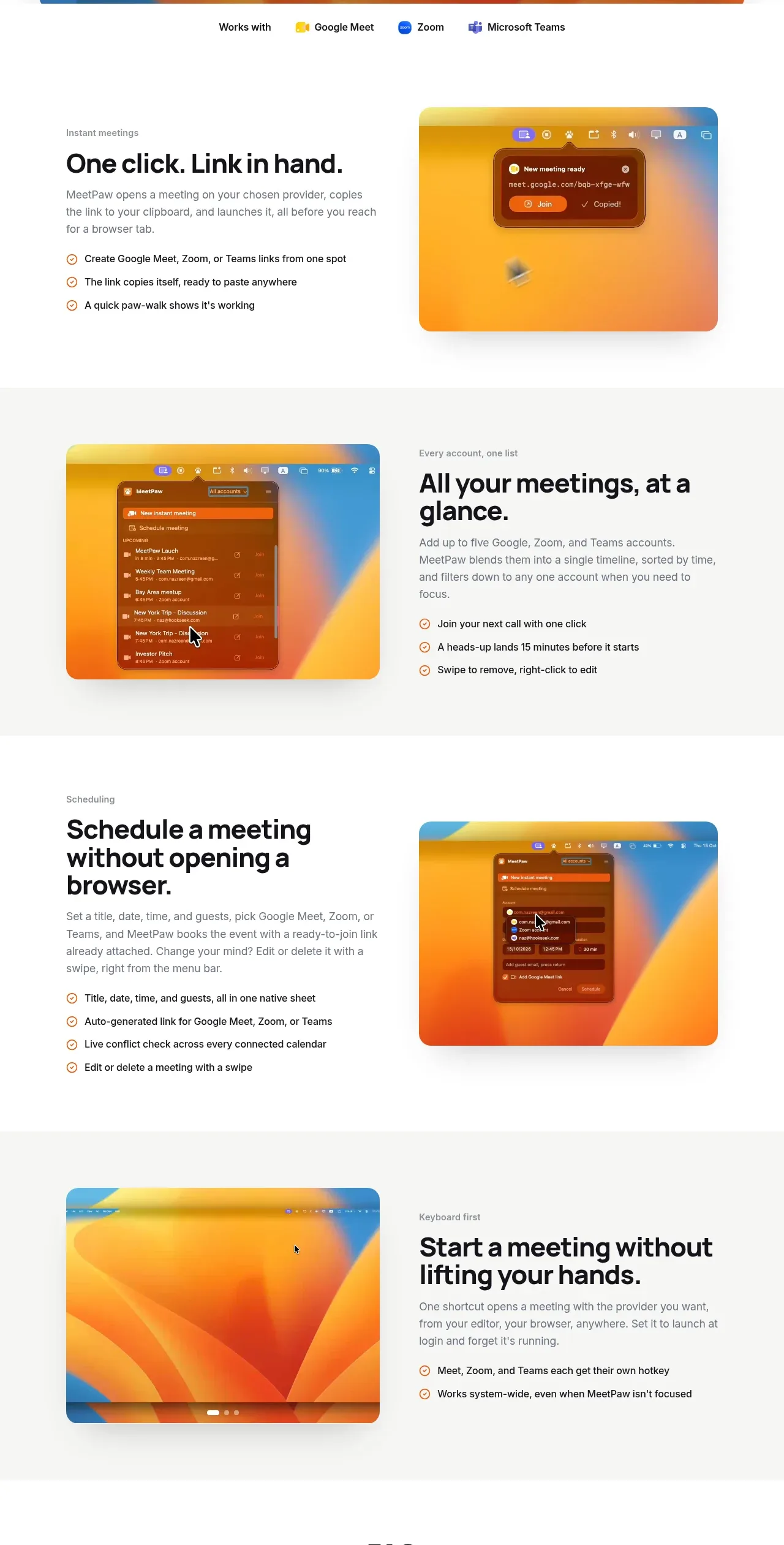
A warm, minimal product site that leans on real app screenshots: the hero stacks a provider-icon cluster, a two-tone headline (black first line, grey second) and dual pill CTAs above a full-width macOS desktop capture. Below, four feature rows zigzag text against rounded screenshot cards, with white and warm-grey bands alternating to pace the page, and every block reuses the same eyebrow/H2/checklist anatomy. It closes with a compact hairline FAQ accordion and a near-black rounded CTA card, holding a single orange accent throughout.
Prompt preview
## Reference images

Study these alongside the description below: hierarchy, rhythm, spacing, colour. Build for the product you are asked about, using this design language.

- Full page: https://kage-design-assets.t3.tigrisfiles.io/screenshots/meetpaw/a0a465d2-81ef-4df0-b440-a946faf696c8-1792389630481-full.webp
- Above the fold: https://kage-design-assets.t3.tigrisfiles.io/screenshots/meetpaw/a0a465d2-81ef-4df0-b440-a946faf696c8-1792389628534.webp
- Design on Kage: https://kage.design/designs/meetpaw-landing-page

## Before you start
Ask the user what product they are building, who it is for, and what brand assets they already have (name, colours, type). Wait for their answers before writing any code — everything below is applied to their product, not to the reference site.

## Page structure
1. **Top nav** — slim white bar: wordmark with a small icon on the left; four text links plus an external-link icon centre-right; a small third-party community badge in a red-outlined pill on the far right.
2. **Hero** — centred stack: a row of four small icons for services the product works with; a two-line display headline where line 1 is near-black and line 2 is muted grey; a two-sentence supporting paragraph; a one-line microcopy row ("no sign-up… free"); two pill CTAs side by side — a filled primary button with a platform glyph and a white secondary button with a light border; a final microcopy line with OS/hardware requirements.
3. **Hero screenshot** — a full-container-width, large-radius card showing the product running on a desktop, with a soft shadow.
4. **Compatibility strip** — a single centred row: a small "Works with" label followed by three third-party service names with their logos.
5. **Feature row 1 (white)** — text left / screenshot right. Grey eyebrow, bold H2, short paragraph, and a three-item checklist with circular check icons.
6. **Feature row 2 (grey band)** — screenshot left / text right, same anatomy; the screenshot shows the app's list UI inside a rounded card.
7. **Feature row 3 (white)** — text left / screenshot right; four checklist items this time.
8. **Feature row 4 (grey band)** — screenshot left / text right; two checklist items; small carousel dots under the screenshot card.
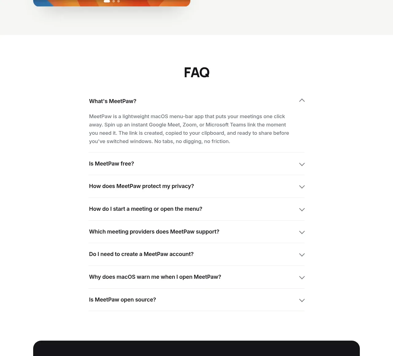
9. **FAQ** — centred H2; a narrow single-column accordion with hairline dividers; the first question is expanded by default with 3–4 lines of answer text, the rest collapsed with chevrons.
10. **Closing CTA** — a large near-black rounded card spanning the container: white display headline, one-line grey subtext, and two buttons (filled primary + dark secondary with icon).
11. **Footer** — light background: logo left; utility links (privacy, terms, data/GDPR, source repo, support, social icon) right; a centred two-line legal disclaimer with trademark attribution in small muted text.

## Design language
- **Accent discipline**: exactly one saturated accent (warm orange, ≈#F76B15) carries the whole page — primary buttons, check icons, and the logo mark only. Everything else is neutral: near-black text ≈#111111, grey body text ≈#565656, white surfaces #FFFFFF, warm-grey bands ≈#F5F4F2, hairlines ≈#E7E5E0, dark closing card ≈#181818.
- **Hierarchy**: headlines in a heavy geometric sans at display sizes (~56–64px hero, ~36–40px section H2s) with tight letter-spacing (−0.02em to −0.04em). Contrast lives inside the hero headline itself: line 1 near-black, line 2 grey. Body copy is small (15–16px), line-height ~1.6, capped at ~60 characters per line.
- **Eyebrow → headline → checklist pattern**: every feature block opens with a 13–14px grey eyebrow label, then the H2, then a 1–2 sentence paragraph, then 2–4 checklist items. Each item is one short sentence with a small circular outlined check icon in the accent colour.
- **Rhythm by banding**: alternate white and warm-grey full-width bands between feature rows and alternate the text/image sides (zigzag) so the eye re-enters each section from the opposite direction; stack text-above-image on mobile.
- **Screenshots as product proof**: every feature pairs with a real UI capture in a card with ~20–24px radius and a soft low-opacity shadow. Give captures a warm gradient "wallpaper" backdrop so light UI panels read clearly, and keep capture cards in a row the same height.
- **Buttons**: fully rounded pills, ~40–44px tall. Primary = accent fill, white label, small platform glyph. Secondary = white fill, 1px light border, near-black label. The dark CTA card inverts the pair: primary stays accent, secondary becomes a dark grey fill (≈#2A2A2A) with white label.
- **FAQ treatment**: max-width ~640px, hairline dividers only (no card borders), 16–17px semibold questions, grey answers, rotating chevron, first item expanded by default.
- **Spacing**: generous and even — ~96–120px vertical padding between sections, ~48–64px inside feature rows, consistent container max-width ~1120px.
- **Motion**: quiet and functional only — accordion expand/collapse, button hover darkening, subtle screenshot hover lift. No parallax or decorative animation.
- **Trust details**: a compact community badge in the nav and a trademark disclaimer in the footer add credibility; echo these with the user's own equivalents.

## Never
- Do not use the MeetPaw name, paw logo, mascot, or any of its copy or FAQ text.
- Do not use Google Meet, Zoom, Microsoft Teams, or Apple logos, icons, or product imagery, and do not name real third-party products unless the user's product actually integrates with them.
- Do not copy the macOS-style wallpaper or reproduce the reference screenshots.
- Do not reuse the reference's headline, tagline, section titles, or Product Hunt badge.
- Never present the result as MeetPaw or imply affiliation with any company in the reference.
Components from this page
All components
 Minimal product navigation
MeetPaw · Navigation
 Single-action product hero
MeetPaw · Hero
 Product preview gallery
MeetPaw · Gallery
 Alternating product capabilities
MeetPaw · Feature grid
 Accordion FAQ
MeetPaw · FAQ
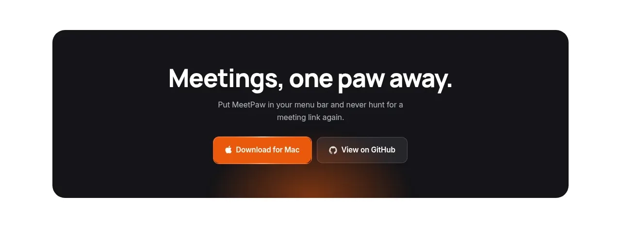 Dark conversion call to action
MeetPaw · Call to action
 Compact utility footer
MeetPaw · Footer