 kage
kage
mermaidonline.live
Design analysis
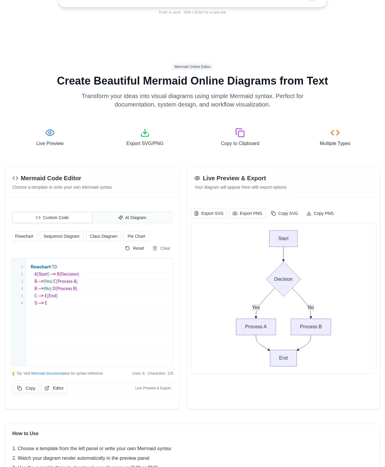
This section transitions from a repeated product promise into a practical two-column editor demo: code input on the left and rendered output/export actions on the right. A short capability row makes the workflow legible before the detailed panels.
Prompt preview
## Reference images

Study these alongside the description below: hierarchy, rhythm, spacing, colour. Build for the product you are asked about, using this design language.

- Component: https://kage-design-assets.t3.tigrisfiles.io/components/mermaidonline-live/7b9ecc63-d7b9-4b92-a5d2-b69508fba7f2-1792152743-2.webp
- Full page it was cut from: https://kage-design-assets.t3.tigrisfiles.io/screenshots/mermaidonline-live/7b9ecc63-d7b9-4b92-a5d2-b69508fba7f2-1792152710959-full.webp
- Component on Kage: https://kage.design/component/mermaidonline-live-feature-grid

## Before you start
Ask what kind of artifact the user's product creates, what the input/output workflow is, and what controls users need. Build a version for that product using the rules below.

Design a large product-demo section with a short centered label, heading, and supporting paragraph, then a four-item capability strip and a two-column workspace. The left panel should represent structured input with tabs, templates, controls, and a code-like editor; the right panel should represent live output with export and copy actions. Use white cards on #fafafa, thin #e7e7e7 borders, 10–14px radius, subtle shadows, and clear panel headers. Use blue, green, purple, and amber only as small semantic accents. Typography should be 14–18px for controls and 12–14px for helper text; maintain 24px card padding and consistent vertical rhythm. On mobile, stack the panels and keep the output preview usable horizontally. Make tabs, export buttons, reset/clear controls, and template chips visibly interactive.

Never: use logos, product names, copy, illustrations, or imagery from the reference.
More components

 Data-to-action engine
Salience · Feature grid
Data-to-action engine
Salience · Feature grid
 Actionable alert workflow
Salience · Feature grid
Actionable alert workflow
Salience · Feature grid
 Trust proof and core outcomes
Salience · Feature grid
Trust proof and core outcomes
Salience · Feature grid
 Three-step implementation flow
Salience · Feature grid
Three-step implementation flow
Salience · Feature grid
 What analytics misses
Salience · Feature grid
What analytics misses
Salience · Feature grid

 Workflow features and capabilities
CrewTower Mod for Claude Code · Feature grid
Workflow features and capabilities
CrewTower Mod for Claude Code · Feature grid